
How 10 Paint Colors and a Perfect Sink Defined This Flip

The Flip That Keeps Teaching Me Lessons
If the first phases of this flip were all about structural drama and the second was budget-breakthrough chaos, then this chapter is officially the paint-fueled emotional rollercoaster. We’re deep into the kitchen now — where every design choice either cements the cottagecore-modern dream or spirals into Blaise muttering about aneurysms. Spoiler: both happened.
Cabinets That Got the Glow-Up
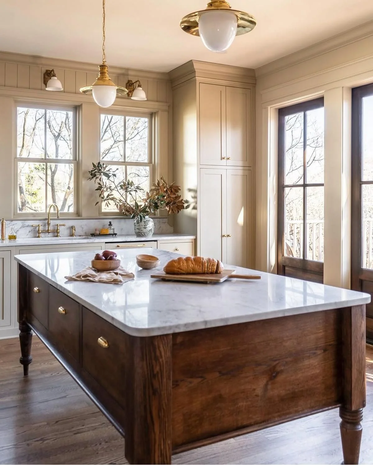
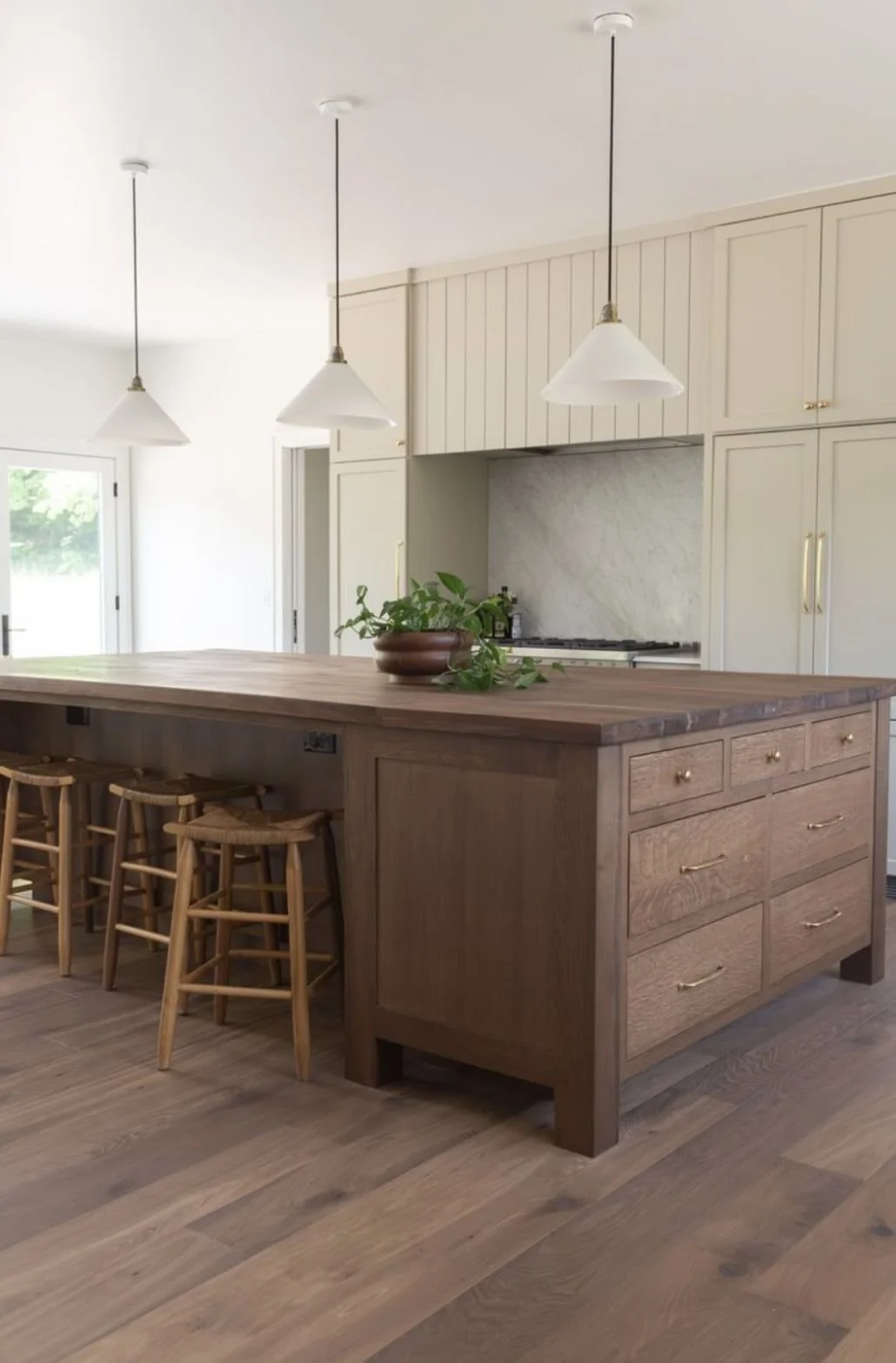
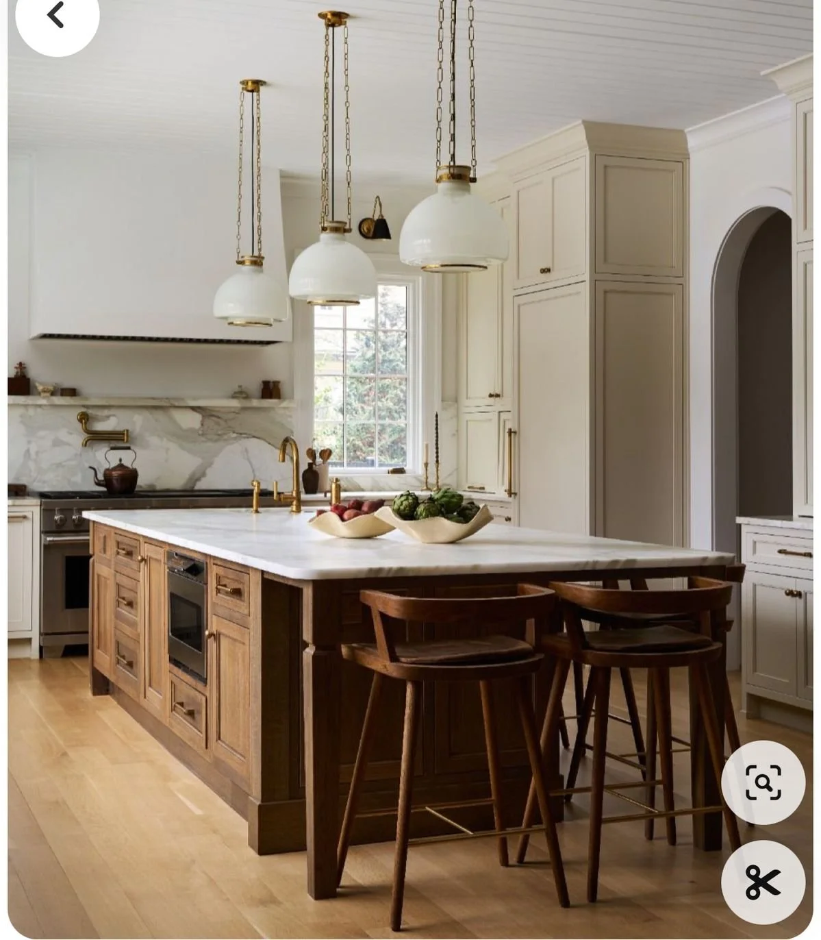
We finally committed: painted wall cabinets + stained island.
It’s the kitchen equivalent of a power couple — one side crisp and classic, the other warm and grounded. The painted wall cabinets keep the space grounded while the wood island delivers that moody, cozy hit I can’t live without. It’s modern cottagecore in one fell swoop.

The Great Range Relocation
Remember how we planned a 30″ in-island gas range? Yeah, that’s gone. Instead, we’re opting for a 36″ wall range. Moving it freed up the island for prep, storage, and seating while giving the range its own moment on the wall with more space to actually cook— a win-win if you ask me. Functionally, it’s a dream. Aesthetically? Total win.
The Sink That Stole My Heart
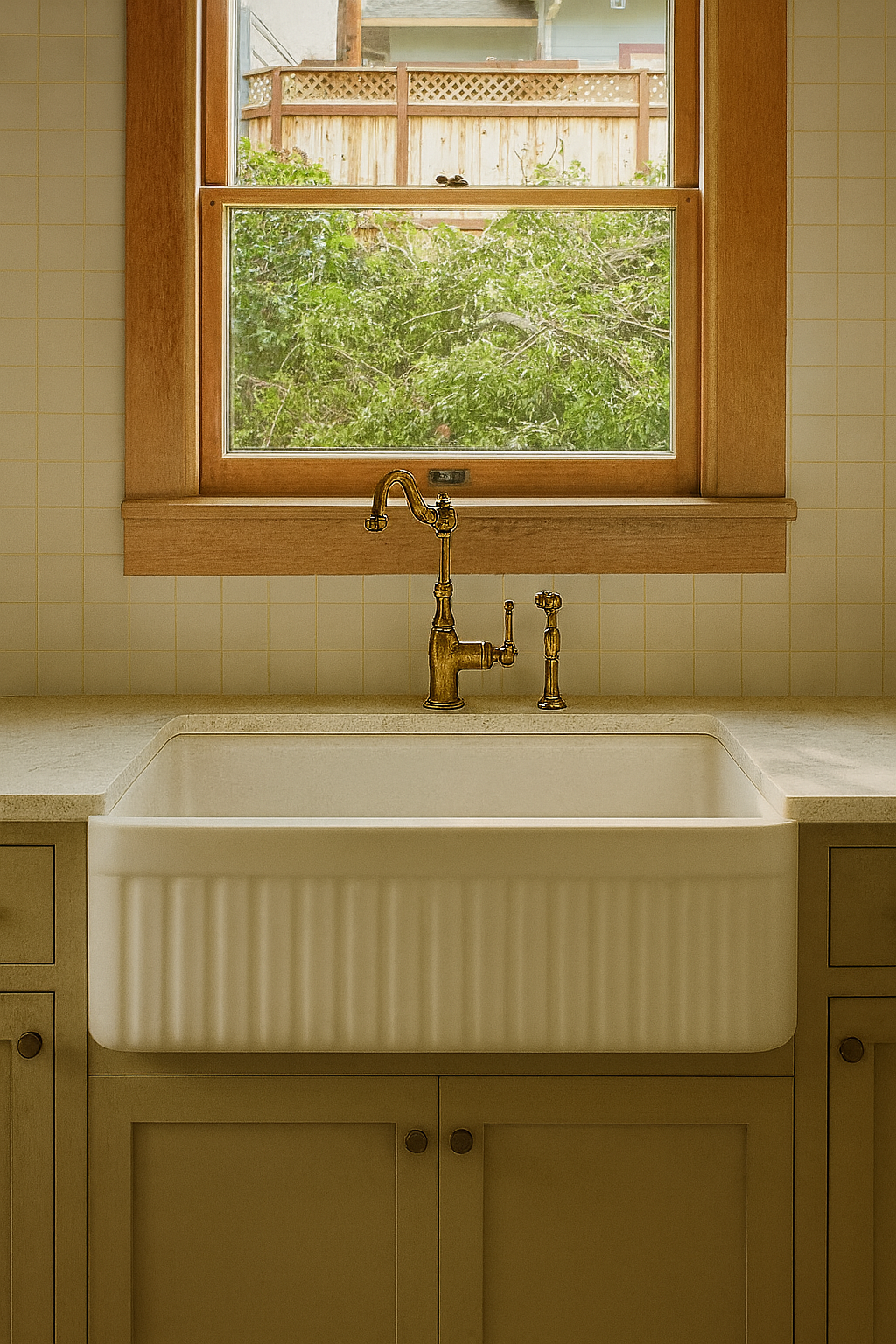
You know when you see the one? That’s how I feel about our sink. An apron-front fluted beauty with just enough heft to anchor the whole wall. Paired with a brass faucet, it’s equal parts romantic and practical. This was one of those decisions that Blaise and I were both gung-ho for the second I sent the link.

Top Row (Left to Right): Double Latte, Malabar, Garden Gate, Hot Cocoa, Maison Blanche
Bottom Row (Left to Right): Best Bronze, Samovar Silver, Delft, Shoji White, Waterloo
Ten Paint Colors. TEN.
Here’s where Blaise nearly lost it. We (aka me) landed on ten different paint colors for this house (and that’s not counting sheens). Walls, ceilings, trim, cabinetry — each got its own treatment. I insisted it was non-negotiable.
To avoid painter mutiny, we taped every single can with the code + sheen and matched that to the walls, trims, and ceilings. We even taped huge “DO NOT PAINT” signs on the wood paneling and window trim that we opted to leave as is. It looked like a paint-coded war room. But it worked, and the depth it’s giving each space? Worth every eye-roll from our paint crew.

Lighting Lock-in
After rounds of indecision, we’ve locked (almost) everything: brass pendants, sculptural sconces, and globe lights. They’ll tie together the (I’ll admit) excessive paint palette, carefully curated tile choices, and dreamy rich wood tones into one cohesive, cottage-modern glow.

When Chaos Finds Its Rhythm
This flip keeps teaching me that design is as much about the big-picture vision as it is about the tiny details that nearly break you (or your partner). Painting cabinets, relocating a range, obsessing over a sink, juggling ten paint colors, and finalizing lighting—it’s all adding up to a kitchen that feels like 105 Teche’s heart, and a house that feels like a home.
Next up? Tile installs, finalizing plumbing fixtures, picking out appliances, and a whole slew of fun things! Stay tuned.
FAQs
-
We wanted the best of both design worlds. Painted wall cabinets keep things light, clean, and airy — like a fresh exhale in the morning. But the island? That’s where we grounded the room. The stained wood brings in that rich, moody depth, adding contrast and cottagecore warmth without overwhelming the space.
But more than just aesthetics, this choice was rooted in respect: the original solid wood cabinets were high-quality, beautifully built, and worth keeping. Rather than ripping them out, we gave them a refresh — painting the uppers to modernize and brighten, while still making them functional, easy to clean, and durable for everyday use. It's a revival, not a replacement. Balance with personality and practicality.
-
Think of it as going from a well-fitting tee to a tailored blazer — same idea, way more impact. The 36" gas range gives us more burners, better functionality for serious cooking, and serious wow-factor for resale. Plus, once we moved it to the wall, we freed up the island to be all about prep, storage, and entertaining.
-
Oh, where do I start? It’s deep enough to handle real-life messes and pretty enough to anchor the kitchen wall while staying cohesive to the rest of the design (looking at you, fluted master bathtub!) With its apron-front silhouette and classic curves, it hits that perfect note between romantic nostalgia and modern utility. Add a brass faucet? I’m swooning.
But it’s not just a pretty face, it’s also intentional for the lucky buyers of this home. The undermount design means you can sweep crumbs and spills straight off the counter — no grout lines, no raised edges, no fuss. And the single-bowl format? Absolutely perfect for those giant Louisiana gumbo pots. It’s beautiful, yes, but also built to handle the kind of cooking that makes a kitchen feel like home.
-
Yes. And also, absolutely not. Sure most traditional flips don’t go this “hard in the paint” (I’m cringing at myself).
Every room tells its own story, and ten curated colors let us layer mood, tone, and intention throughout the home. It’s not chaotic — it’s deliberate depth. Some may think it’s unnecessary, but guests? They’ll feel it without even knowing why.
-
We ran that job site like a war room. Every paint can was labeled with its code and sheen. Then we matched each surface — walls, trims, ceilings — with taped labels in every room. Zero confusion, fewer mistakes, and just enough micromanaging to make Blaise deeply question his choice in flip partner.
-
We did. Staying within the same brand gave us better control over color consistency and paint quality— especially when dealing with multiple sheens and finishes. No surprises, just smooth transitions from wall to trim to ceiling. All the paint in this house came from Sherwin Williams, both Blaise and I are partial to their products.
-
Like a playlist with no skips. We curated shades that speak the same design language — subtle shifts in undertone and warmth — so each room has its own personality while still feeling like part of a whole. No jarring jumps, just beautiful flow. It was quite a feat, but after about 80 total hours of mock ups and crossed eyes, I sent one of my famous spreadsheets to Blaise and dealt with the raised eyebrows after the fact.