
From Renovation to Real Life: The Journey Continues
What started as a flip became a home. 105 Teche wasn’t just renovated—it was restored with care, depth, and layers of real life. This post walks you through the final moments, the emotional turns, and the design decisions that transformed a project into something personal.
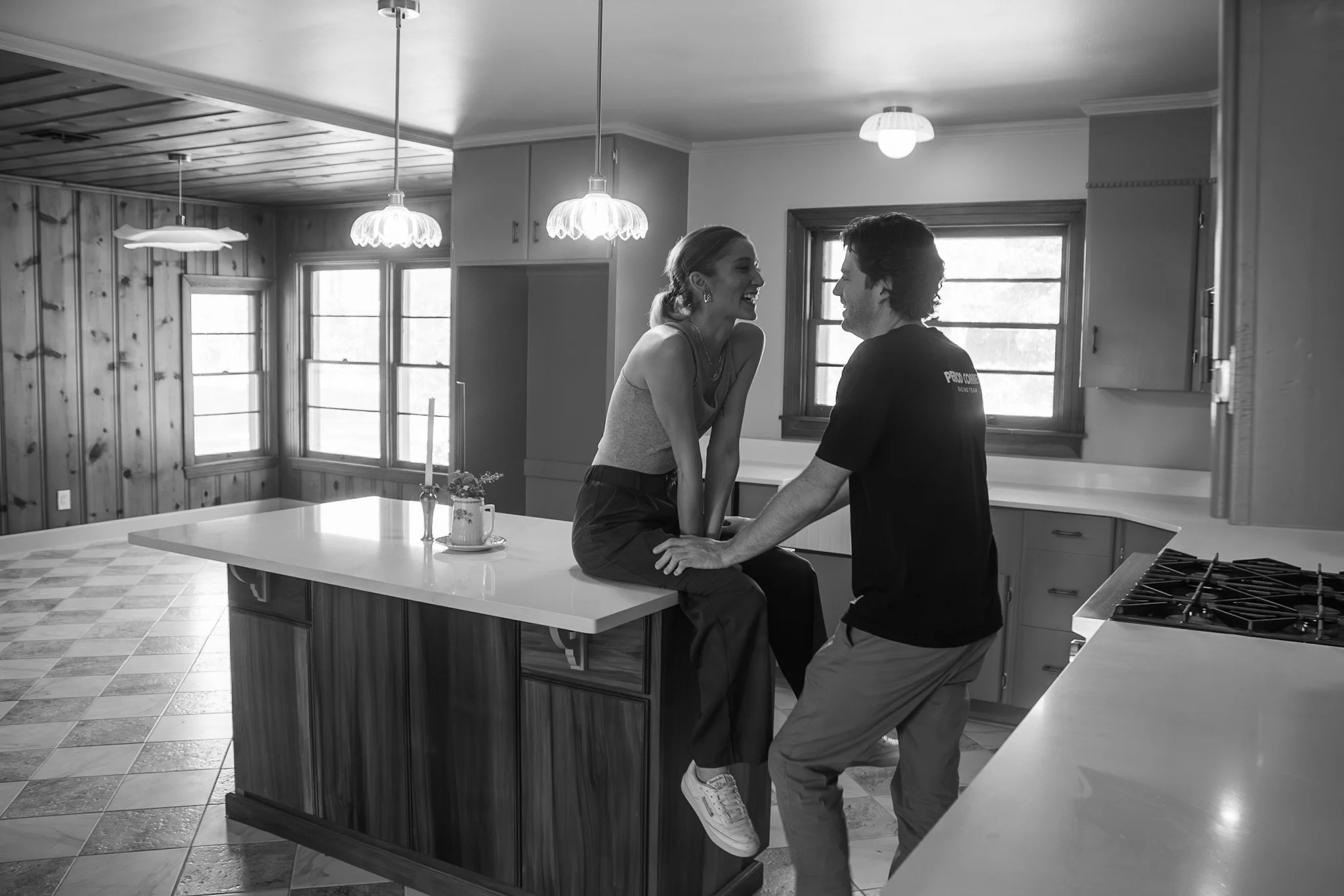
You know a house is done when you stop stepping over sawdust and start stepping into quiet.
Teche didn’t get finished on a schedule — she got finished on a feeling. There were 31‑hour runs (yes, literally) where I barely slept, a Sunday with Patrick and Evie where the air smelled like paint and ambition, and a moment that suddenly made all the chaos worth it: when Evie, mid‑sprint across what had finally become a clean floor, skidded to a stop and turned to me, wide-eyed: “Mommy? I fink dis house is almost done.”
In that second, the walls stopped being walls. The rooms stopped being rooms.
That was it. The shift.
Suddenly, this wasn’t a flip full of deadlines and dust. It was a house with lungs.
The second the house became present. Intentional. Ready to be lived in.

From Chaos to Calm Underfoot
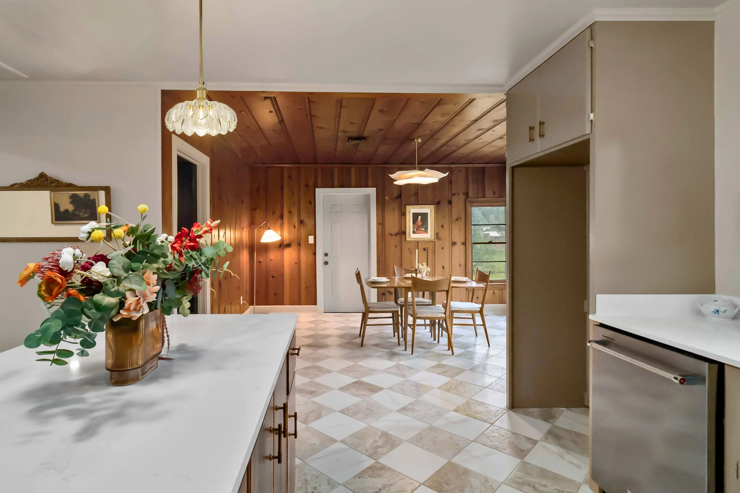
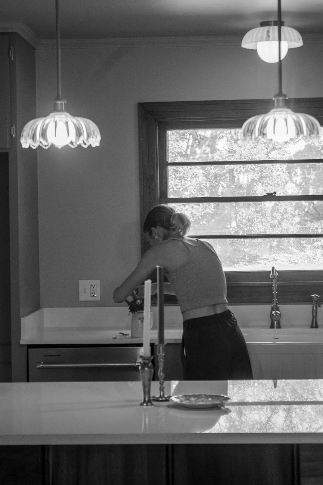
I’ve walked through enough flips to know what “listing‑day ready” often ends up meaning: floors still suffused with drywall dust, painter’s tape dangling from casings, baseboards coated in debris, hardware that doesn’t match. That’s never been my standard — and Teche made sure of it. By the time the final photoshoot rolled around, I had crawled on my hands and knees through eight hours of vacuuming, mopping, and hand‑polishing the original cypress tongue‑and‑groove walls and ceilings in the dining room.
Each pass wasn’t just about cleanliness — it was about respect. Respect for wood that had weathered decades, respect for a home that will carry decades more, and respect for whoever walks in next. This wood deserved reverence. It wasn’t just clean. It was cared for. Sure, I’m certain there is a paint touch up or 2, maybe a light fixture that needs adjusting, but nothing about this finished project feels rushed or careless.
This wasn’t fluff or finishing touches. The house didn’t just get wiped clean — it got given a second breath. Because if you’re going to ask someone to call a place home, the least you can do is make it feel sacred.
The Last-Minute Details That Made the Difference
Spare No Detail — Especially the Late‑Night Ones
Finishing a home isn’t glamorous. It’s in the tiny decisions that add up, the ones nobody notices, but can feel it when they’re missing.
The truth about finishing a home is that the smallest decisions take the longest.
The right hardware.
The correct temperature bulbs (because lighting matters).
Brass that actually patinas.
Paint touch-ups performed at hours when normal people sleep.
We swapped out every piece of tired, half-painted hardware. We aligned switch plates, patched corner joints, adjusted trim, polished surfaces until even the reflection felt deliberate. No band‑aids. No “good enough.” Not one corner was overlooked. It wasn’t about checking boxes — it was about asking the space to be ready, really ready.
And then came the staging — which was, admittedly, too fun for my own good. I styled until the rooms felt lived-in, not decorated; until every seat looked like someone had just stood up; until leaving the house felt genuinely difficult. Every surface looked like it had just been touched.
When you care — really care — you feel it. In the bones of the walls. In the grain of the wood. In the quiet hum of a space that finally, finally works.
Because Charm Shouldn’t Be a Victim of Renovation
Out front, I planted the cottagecore wildflower-inspired garden I’d dreamt up while drawing floor plans at midnight. Snapdragons. Jasmin. Creeping fig vine. Swaths of soft green stems and bursts of Red, yellow, and purple dancing in the Louisiana wind. It’s not for the MLS — and that’s fine. It’s for Sunday mornings, bare feet, and half‑drunk mugs of coffee in the quiet peeks of sunrise before the world stirs.
No spreadsheet calculates charm like that.
Because charm doesn’t just show up on paper — it settles in the bones of a place. And those are the details that stick with people, even when the finishes fade. But buyers feel it.
They always do.
This Isn’t a Flip. It’s a Rebirth
Call it heresy, but I almost hate the word flip for this project. The word feels too quick. Too transactional. Too empty. Flips are often all sheen and no substance — designed to photograph well and age poorly, to impress from the curb and disappoint once you open the cabinet doors.
Teche isn’t that. Not even close.
Let’s be clear: Teche wasn’t gutted and replaced. She was restored.
Where lesser flips rip out history and paste from Pinterest, this house got listened to. Her quirks were studied, not stripped. Her bones—solid cypress, aged brick, solid wood cabinetry—were never the problem. They were the blueprint.
Every change was a conversation between what she was and what she could be. Where to add softness. Where to hold the line. What to uncover, what to edit, and what deserved to stay exactly as it was.
Restoration is slower. It asks more of you. It doesn’t give you straight lines or clean answers. But it gives you soul. And that’s what Teche has now, tucked into every threshold and behind every re-hung door: a sense of self.
This wasn’t a flip.
It was a reclamation.
Of beauty. Of time. Of something worth keeping.


The Heart Behind the Work
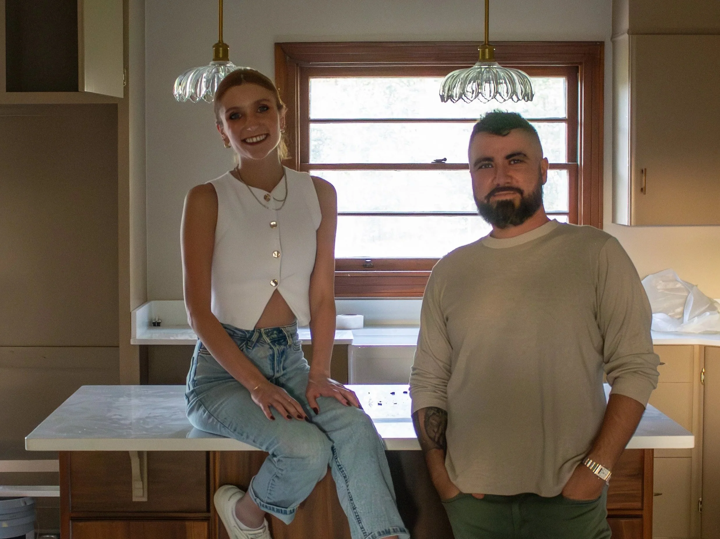
This house may have been my vision, but it never would’ve come together without the people who showed up when it counted.
Blaise—my PIC and voice of reason— never faltered when the foundation needed to be rebuilt, the gas company gave us a 5 week delay, or tile needed to be re grouted (ok maybe that last one wouldv’e gotten to him had it not been for me taking matters into my own hands with a trip to Floor & Decor and a grout float).
Ian quite literally saved our A-words when he stepped up and took the entire project into his own hands after our first project manager couldn’t hack it. He spent early mornings, late nights, and every moment in between rewiring for my (many) light fixtures, plumbed everything just right, and somehow made Teche a well-oiled restoration machine after walking into sheer and utter chaos. In all these weeks, I’ve never once seen the guy without a tool in hand, rolling up his sleeves, ready to do what needs to be done and do it right. I fear he’s stuck with me now, because I’ve never met another contractor who quite lives up to his standard.
Then there are the ones who put the work in for no reason other than a love for our crazy crew.
Patrick ran point on furniture hauls, dumpster runs, and more cleaning and landscaping than anyone should have to do after a full work week. Teagan rolled up her sleeves and helped me scrub, stage, and get Teche market-ready like it was her own.
And then there’s Wrigley—who somehow made space where there wasn’t any. She captured the soul of this place through her lens, pitched in for late-night cleanup parties, and kept Evie so entertained that she never even noticed how much time Mama was pouring into finishing touches.
Because of them, Teche didn’t just get finished. She got loved. And you can feel it in every photo, every corner, every little detail.
The Last Word
Teche isn’t perfect. She was never meant to be.
Perfection ages poorly anyway. What she is—what we built her to be—is ready. Ready for the things that actually make a house matter. The messy kitchens and undone laundry. The late dinners that stretch into second bottles and unplanned dancing. The tiny feet, the laughter in the hallway, the messes that mean something.
She can hold all of it.
She started as a flip—sure. But along the way, she asked for more. More care. More patience. More of us. And we gave it, piece by piece, in paint touch-ups at midnight and hands-and-knees floor polishing, in choosing the right lightbulb, not just a lightbulb.
By the end, this wasn’t a renovation. It was a restoration. A making-right. A letting-be.
Teche didn’t just get finished. She grew into herself.
And if we did our jobs right, she’s ready to grow with someone else now.
Ready to Meet Her for Yourself?
If you’ve made it this far, you already know—Teche isn’t just another house on the market. She’s layered, thoughtful, and quietly alive in a way that only happens when a home is given time, intention, and love.
She’s ready for real life now.
Maybe yours.
Schedule your showing here:

How 10 Paint Colors and a Perfect Sink Defined This Flip
At 105 Teche Drive, we painted the cabinets, stained the island, swapped in a 36″ gas range, and (yes) used ten paint colors. Add in the farmhouse sink I’m head over heels for, plus brass lighting magic, and this flip’s kitchen finally found its rhythm.

The Flip That Keeps Teaching Me Lessons
If the first phases of this flip were all about structural drama and the second was budget-breakthrough chaos, then this chapter is officially the paint-fueled emotional rollercoaster. We’re deep into the kitchen now — where every design choice either cements the cottagecore-modern dream or spirals into Blaise muttering about aneurysms. Spoiler: both happened.
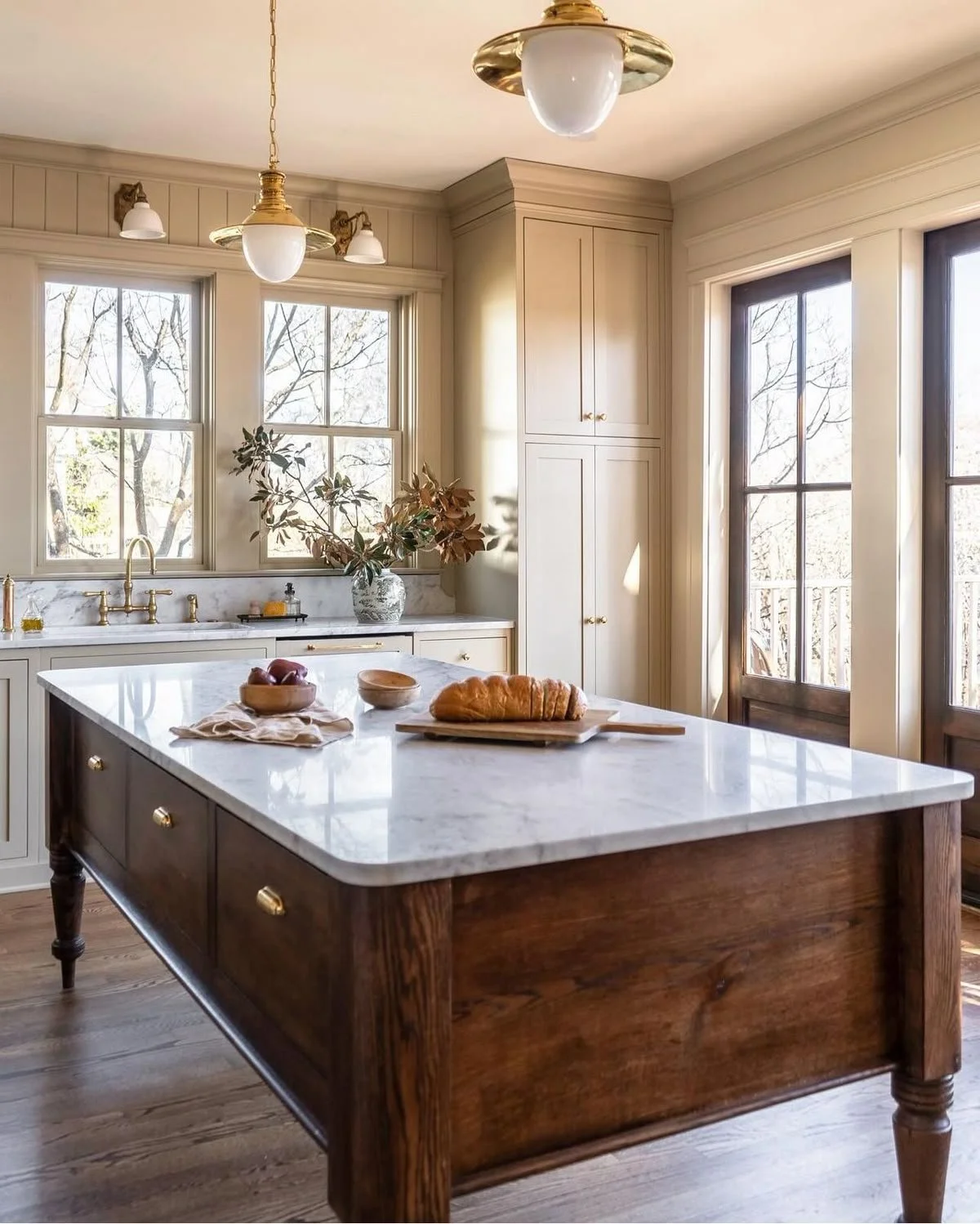
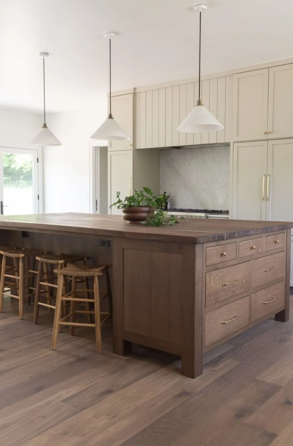
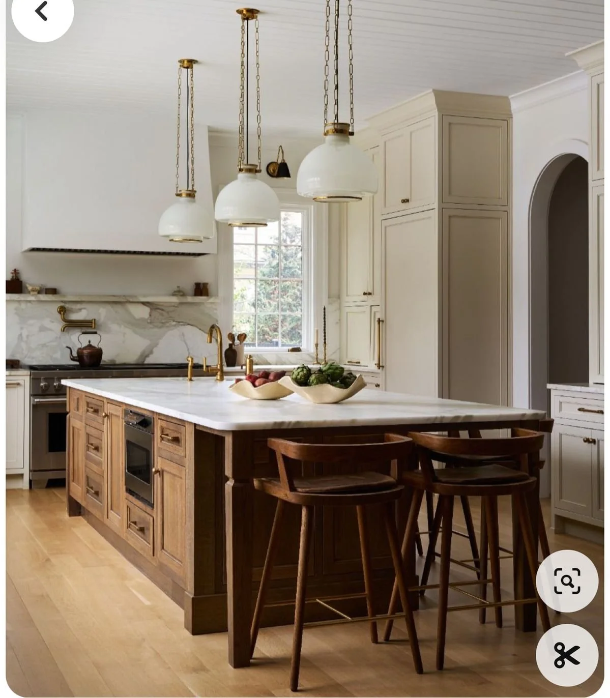
Cabinets That Got the Glow-Up
We finally committed: painted wall cabinets + stained island.
It’s the kitchen equivalent of a power couple — one side crisp and classic, the other warm and grounded. The painted wall cabinets keep the space grounded while the wood island delivers that moody, cozy hit I can’t live without. It’s modern cottagecore in one fell swoop.

The Great Range Relocation
Remember how we planned a 30″ in-island gas range? Yeah, that’s gone. Instead, we’re opting for a 36″ wall range. Moving it freed up the island for prep, storage, and seating while giving the range its own moment on the wall with more space to actually cook— a win-win if you ask me. Functionally, it’s a dream. Aesthetically? Total win.
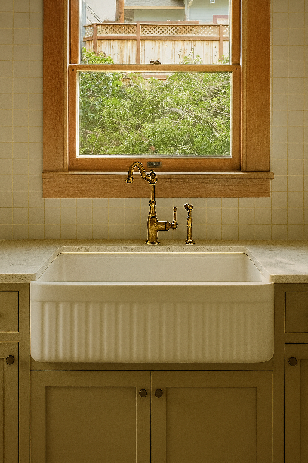
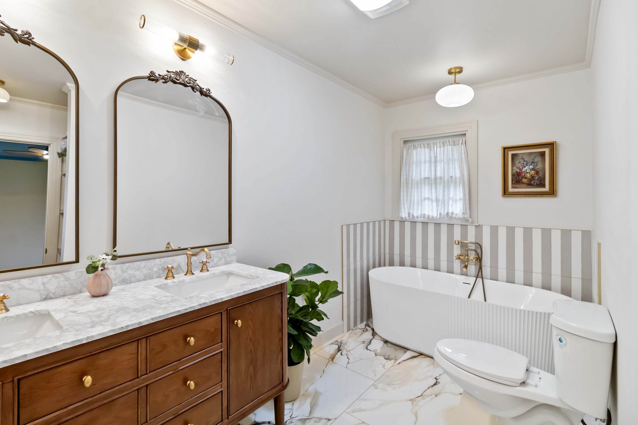
The Sink That Stole My Heart
You know when you see the one? That’s how I feel about our sink. An apron-front fluted beauty with just enough heft to anchor the whole wall. Paired with a brass faucet, it’s equal parts romantic and practical. This was one of those decisions that Blaise and I were both gung-ho for the second I sent the link.

Top Row (Left to Right): Double Latte, Malabar, Garden Gate, Hot Cocoa, Maison Blanche
Bottom Row (Left to Right): Best Bronze, Samovar Silver, Delft, Shoji White, Waterloo
Ten Paint Colors. TEN.
Here’s where Blaise nearly lost it. We (aka me) landed on ten different paint colors for this house (and that’s not counting sheens). Walls, ceilings, trim, cabinetry — each got its own treatment. I insisted it was non-negotiable.
To avoid painter mutiny, we taped every single can with the code + sheen and matched that to the walls, trims, and ceilings. We even taped huge “DO NOT PAINT” signs on the wood paneling and window trim that we opted to leave as is. It looked like a paint-coded war room. But it worked, and the depth it’s giving each space? Worth every eye-roll from our paint crew.

Lighting Lock-in
After rounds of indecision, we’ve locked (almost) everything: brass pendants, sculptural sconces, and globe lights. They’ll tie together the (I’ll admit) excessive paint palette, carefully curated tile choices, and dreamy rich wood tones into one cohesive, cottage-modern glow.

When Chaos Finds Its Rhythm
This flip keeps teaching me that design is as much about the big-picture vision as it is about the tiny details that nearly break you (or your partner). Painting cabinets, relocating a range, obsessing over a sink, juggling ten paint colors, and finalizing lighting—it’s all adding up to a kitchen that feels like 105 Teche’s heart, and a house that feels like a home.
Next up? Tile installs, finalizing plumbing fixtures, picking out appliances, and a whole slew of fun things! Stay tuned.
FAQs
-
We wanted the best of both design worlds. Painted wall cabinets keep things light, clean, and airy — like a fresh exhale in the morning. But the island? That’s where we grounded the room. The stained wood brings in that rich, moody depth, adding contrast and cottagecore warmth without overwhelming the space.
But more than just aesthetics, this choice was rooted in respect: the original solid wood cabinets were high-quality, beautifully built, and worth keeping. Rather than ripping them out, we gave them a refresh — painting the uppers to modernize and brighten, while still making them functional, easy to clean, and durable for everyday use. It's a revival, not a replacement. Balance with personality and practicality.
-
Think of it as going from a well-fitting tee to a tailored blazer — same idea, way more impact. The 36" gas range gives us more burners, better functionality for serious cooking, and serious wow-factor for resale. Plus, once we moved it to the wall, we freed up the island to be all about prep, storage, and entertaining.
-
Oh, where do I start? It’s deep enough to handle real-life messes and pretty enough to anchor the kitchen wall while staying cohesive to the rest of the design (looking at you, fluted master bathtub!) With its apron-front silhouette and classic curves, it hits that perfect note between romantic nostalgia and modern utility. Add a brass faucet? I’m swooning.
But it’s not just a pretty face, it’s also intentional for the lucky buyers of this home. The undermount design means you can sweep crumbs and spills straight off the counter — no grout lines, no raised edges, no fuss. And the single-bowl format? Absolutely perfect for those giant Louisiana gumbo pots. It’s beautiful, yes, but also built to handle the kind of cooking that makes a kitchen feel like home.
-
Yes. And also, absolutely not. Sure most traditional flips don’t go this “hard in the paint” (I’m cringing at myself).
Every room tells its own story, and ten curated colors let us layer mood, tone, and intention throughout the home. It’s not chaotic — it’s deliberate depth. Some may think it’s unnecessary, but guests? They’ll feel it without even knowing why.
-
We ran that job site like a war room. Every paint can was labeled with its code and sheen. Then we matched each surface — walls, trims, ceilings — with taped labels in every room. Zero confusion, fewer mistakes, and just enough micromanaging to make Blaise deeply question his choice in flip partner.
-
We did. Staying within the same brand gave us better control over color consistency and paint quality— especially when dealing with multiple sheens and finishes. No surprises, just smooth transitions from wall to trim to ceiling. All the paint in this house came from Sherwin Williams, both Blaise and I are partial to their products.
-
Like a playlist with no skips. We curated shades that speak the same design language — subtle shifts in undertone and warmth — so each room has its own personality while still feeling like part of a whole. No jarring jumps, just beautiful flow. It was quite a feat, but after about 80 total hours of mock ups and crossed eyes, I sent one of my famous spreadsheets to Blaise and dealt with the raised eyebrows after the fact.

Design Detox: Flipping the Switch on Lifeless Interiors
Once the darling of HGTV, builder-grade flips, and Realtors alike, millennial gray has officially worn out its welcome—especially in Lafayette. Today’s buyers want warmth, texture, and interiors that actually feel like home. From barn doors to all-gray everything, we’re breaking up with bland and embracing rich woods, earthy tones, and natural light. Ready to un-blah your space? Let’s talk staging, shopping, and selling with soul.
Why “Millenial Gray” has GOT to go

Remember when everything was gray? Cabinets, walls, curtains—HGTV perfection. But here in Lafayette, what once felt modern now comes off as cold and cookie-cutter.

Why Gray Took Over
It was the perfect neutral: easy to match, appealing to a broad audience, and a safe bet for resale. In the 2010s, gray was basically the Swiss Army knife of paint colors.
The Gray Problem:
Mood-Vacuum: Gray absorbs heat and character—great in chilly rooms, not in humid Louisiana spaces.
Overdone: Walk through Acadiana’s newer developments, and you’ll spot gray fatigue.
Characterless: Gray walls mute the vibrancy Lafayette buyers crave.

Other Overplayed Trends
Remember when every Pinterest board and HGTV episode was drooling over barn doors? Rustic charm! Farmhouse fantasy! Joanna Gaines-core! In Lafayette, they popped up everywhere—from River Ranch to subdivision flips.
At first, they gave open-concept homes a little architectural drama. But now?
They Don’t Slide Smoothly. Ever tried quietly closing one during a Zoom call or after a baby’s bedtime? That screech could wake the whole neighborhood.
Privacy? What Privacy? Unlike traditional doors, barn doors don’t seal fully. Great for aesthetics—not so much for bathrooms, bedrooms, or home offices.
Dust Collectors. That gorgeous exposed track? It collects every bit of South Louisiana pollen and dust, and good luck cleaning behind it.
Awkward Space Planning. They often block walls that could’ve held shelving or art—design sacrifices that don’t make sense anymore.
More Trendy Features That Lost Their Spark
Shiplap Everything
What started as a sweet nod to coastal charm turned into overkill. Entire walls—and sometimes ceilings—plastered in shiplap now feel like you’re living inside a wood crate. Minimal is in, not millwork mania.Industrial Lighting Overload
Matte black cage pendants and Edison bulbs were cool… until everyone had them. Now they feel dim, overdone, and kind of impractical in kitchens where actual visibility matters.Sliding Barn-Style Pantries
Looks charming, sure—but if you actually cook, you’ve probably knocked over a spice rack or two trying to maneuver the door open with one hand and a hot pan in the other.

2025 Aesthetic: Warm, Textured, Soulful
Think caramel taupe, olive greens, terracotta, and navy accents—2025 design outlook champions warmth and texture steadily.com. Layered neutrals and wood tones are finding a place in listings across River Ranch, Greenbriar, and downtown.

How to Update Warmly
Choose an accent wall in mustard or olive while keeping other walls neutral.
Swap cool-toned hardware for brass or bronze.
Introduce woven rugs and wooden blinds to soften edges.
Bring in greenery—plants are mood-enhancing and make gray feel more alive.


323 Thibodeaux Drive Lafayette, LA 70503, presented by Paige Gary, District South x Real Broker, LLC.
Case Study: Lafayette Spotlight
Take 323 Thibodeaux Drive, presented by the always incredible Paige Gary of District South x Real Broker LLC—this stunner skipped the tired millennial gray entirely. Instead, it showcased rich stonework, warm wood tones, and thoughtful textures throughout. The result? It sold at list price—$1.35 million—on its very first day on the market. Proof that Lafayette buyers are ready for luxury that feels warm, intentional, and refreshingly un-basic.

Bored of beige and ghost gray? I’ve got the antidote.
Done with gray’s dull embrace? Message me—whether you're staging a sale or hunting for homes with more heart.