
From Renovation to Real Life: The Journey Continues
What started as a flip became a home. 105 Teche wasn’t just renovated—it was restored with care, depth, and layers of real life. This post walks you through the final moments, the emotional turns, and the design decisions that transformed a project into something personal.
You know a house is done when you stop stepping over sawdust and start stepping into quiet.
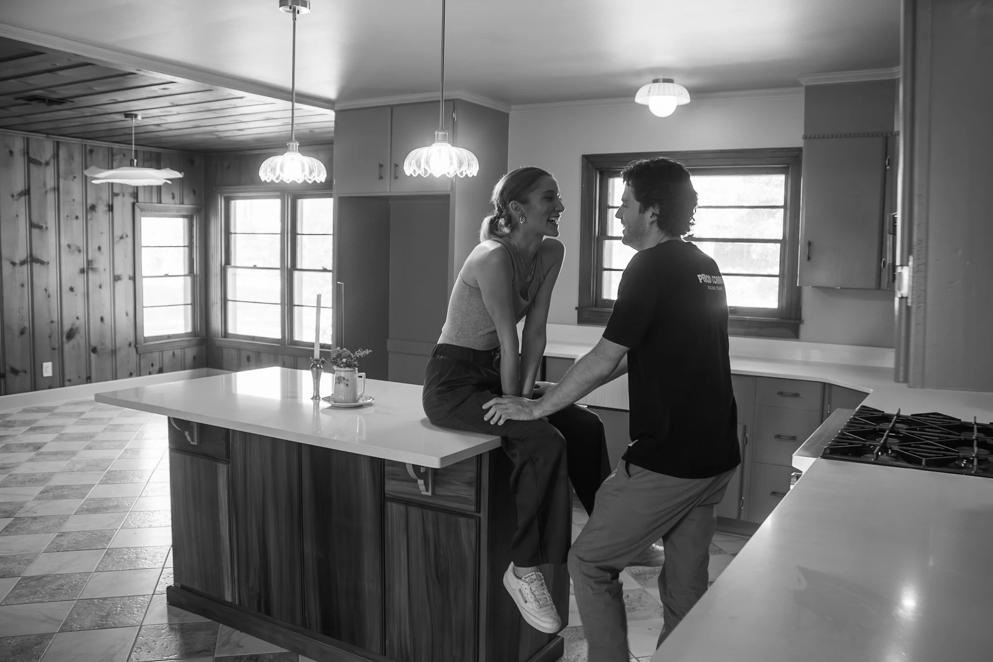
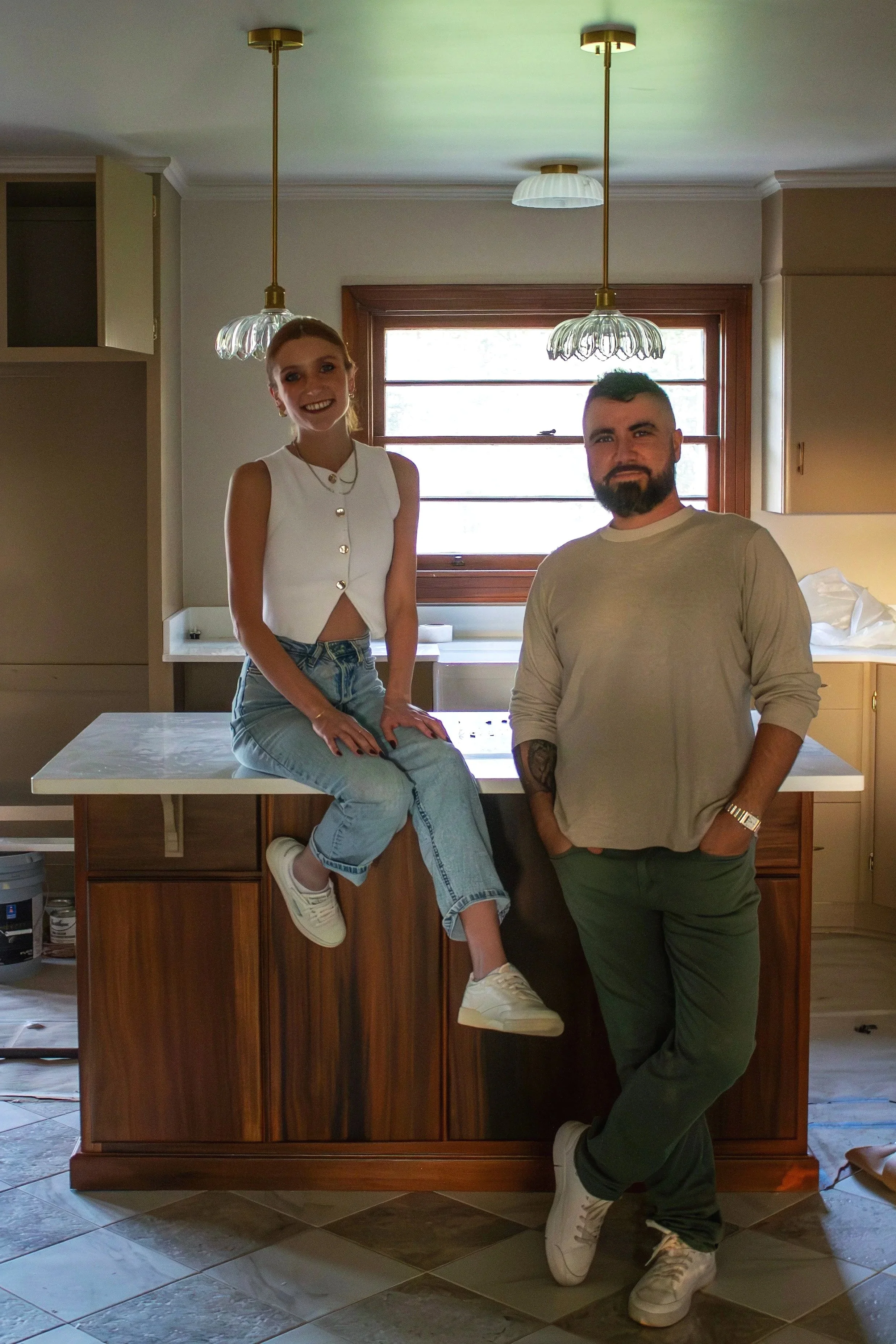
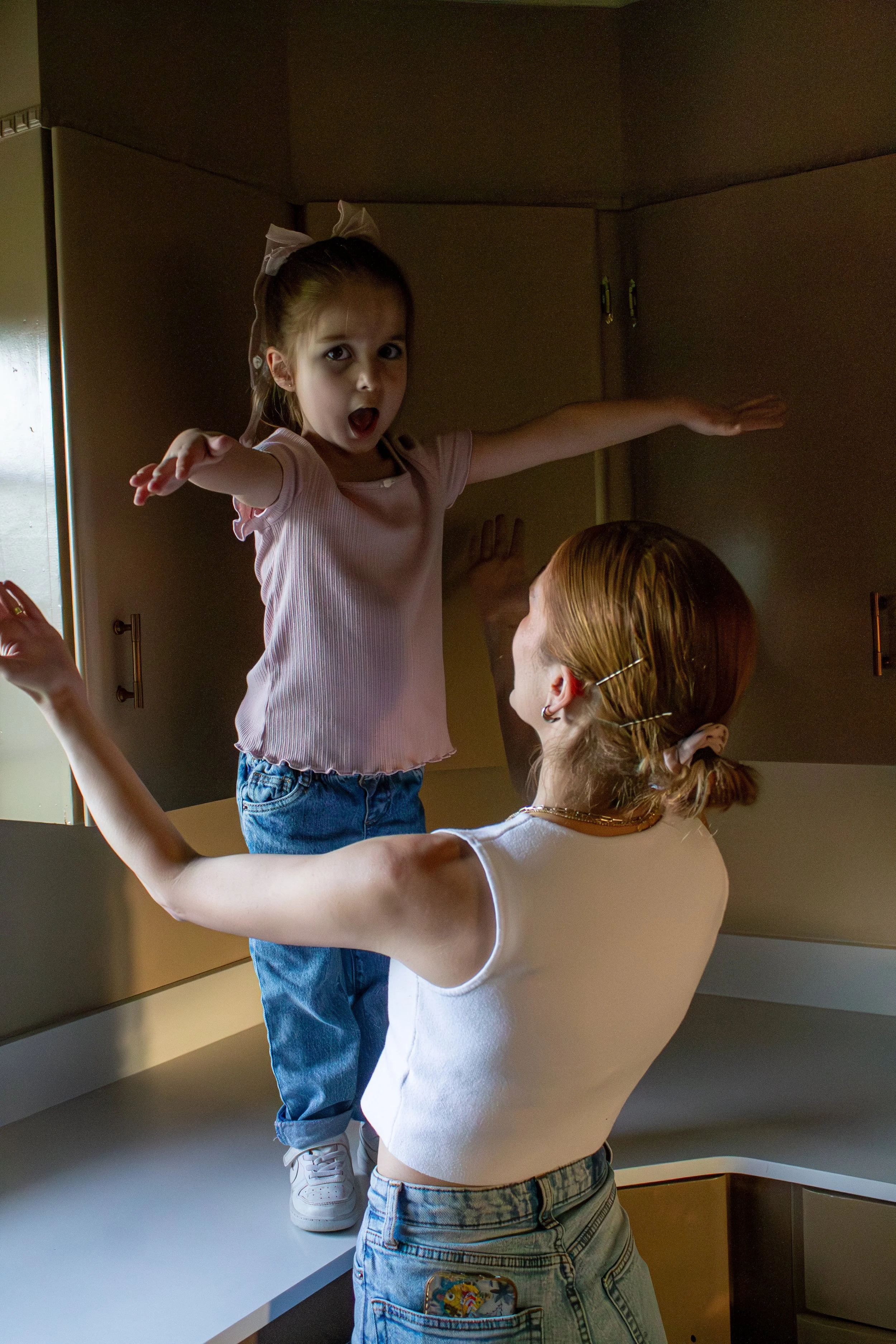
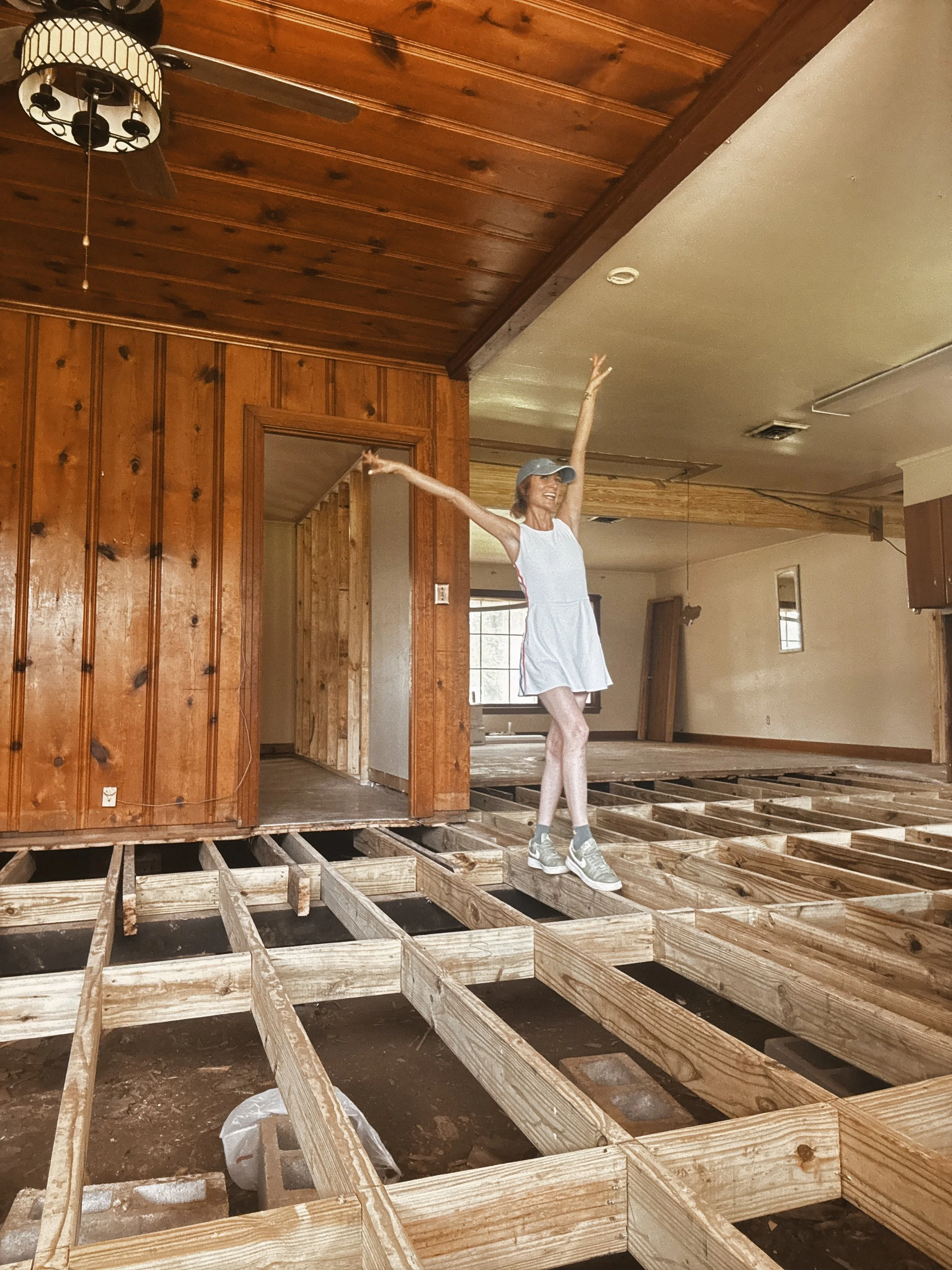
Teche didn’t get finished on a schedule — she got finished on a feeling. There were 31‑hour runs (yes, literally) where I barely slept, a Sunday with Patrick and Evie where the air smelled like paint and ambition, and a moment that suddenly made all the chaos worth it: when Evie, mid‑sprint across what had finally become a clean floor, skidded to a stop and turned to me, wide-eyed: “Mommy? I fink dis house is almost done.”
In that second, the walls stopped being walls. The rooms stopped being rooms.
That was it. The shift.
Suddenly, this wasn’t a flip full of deadlines and dust. It was a house with lungs.
The second the house became present. Intentional. Ready to be lived in.

From Chaos to Calm Underfoot
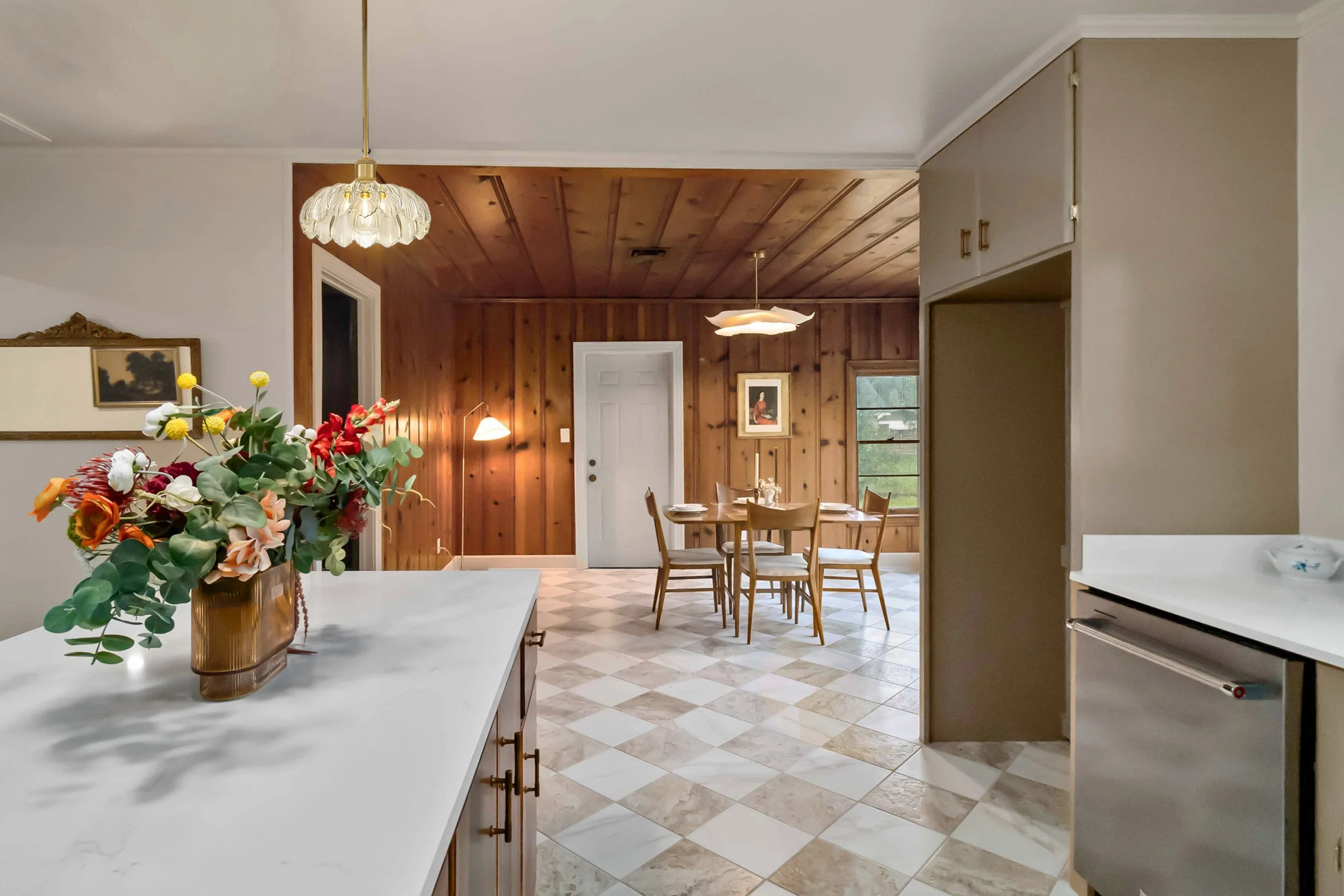
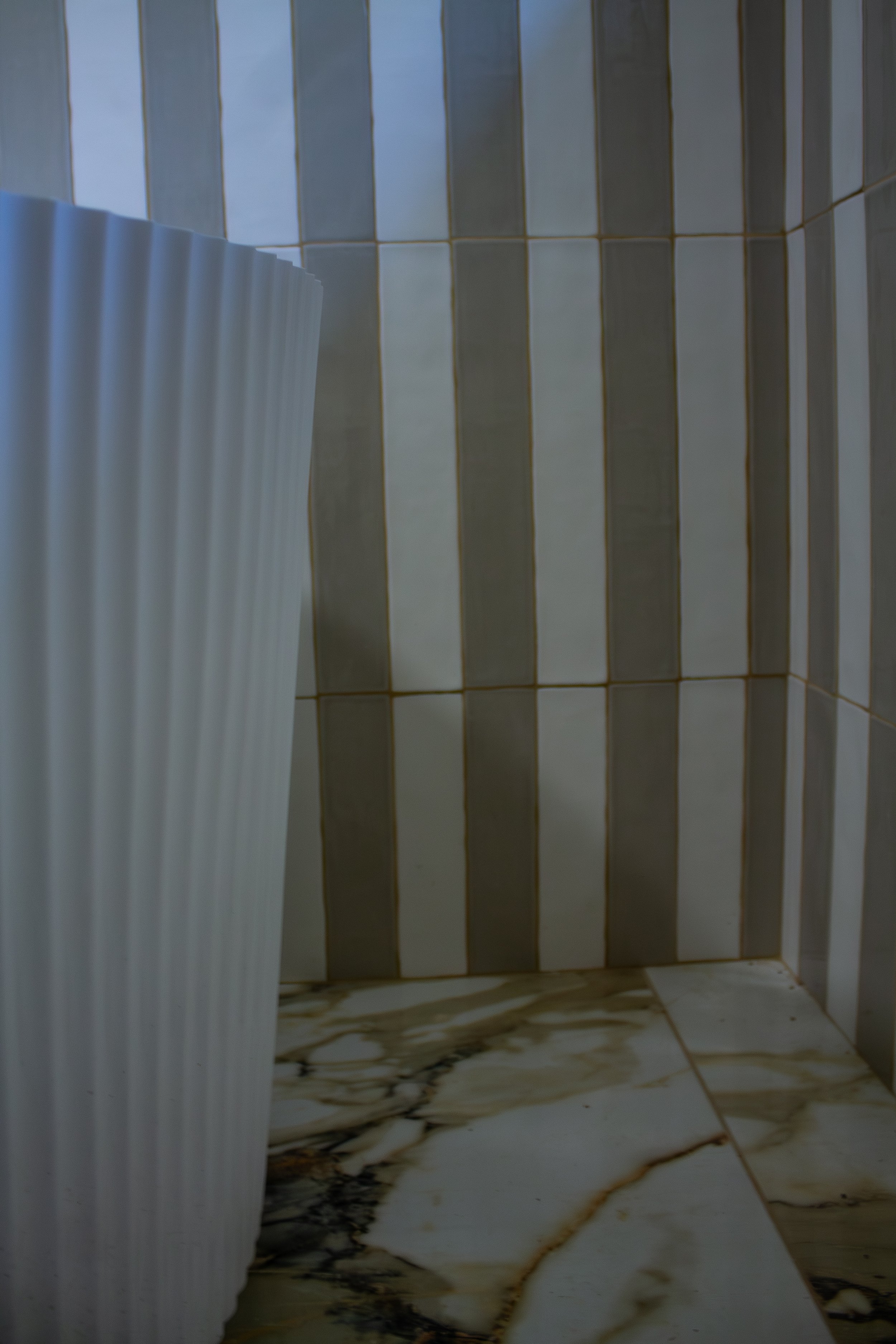
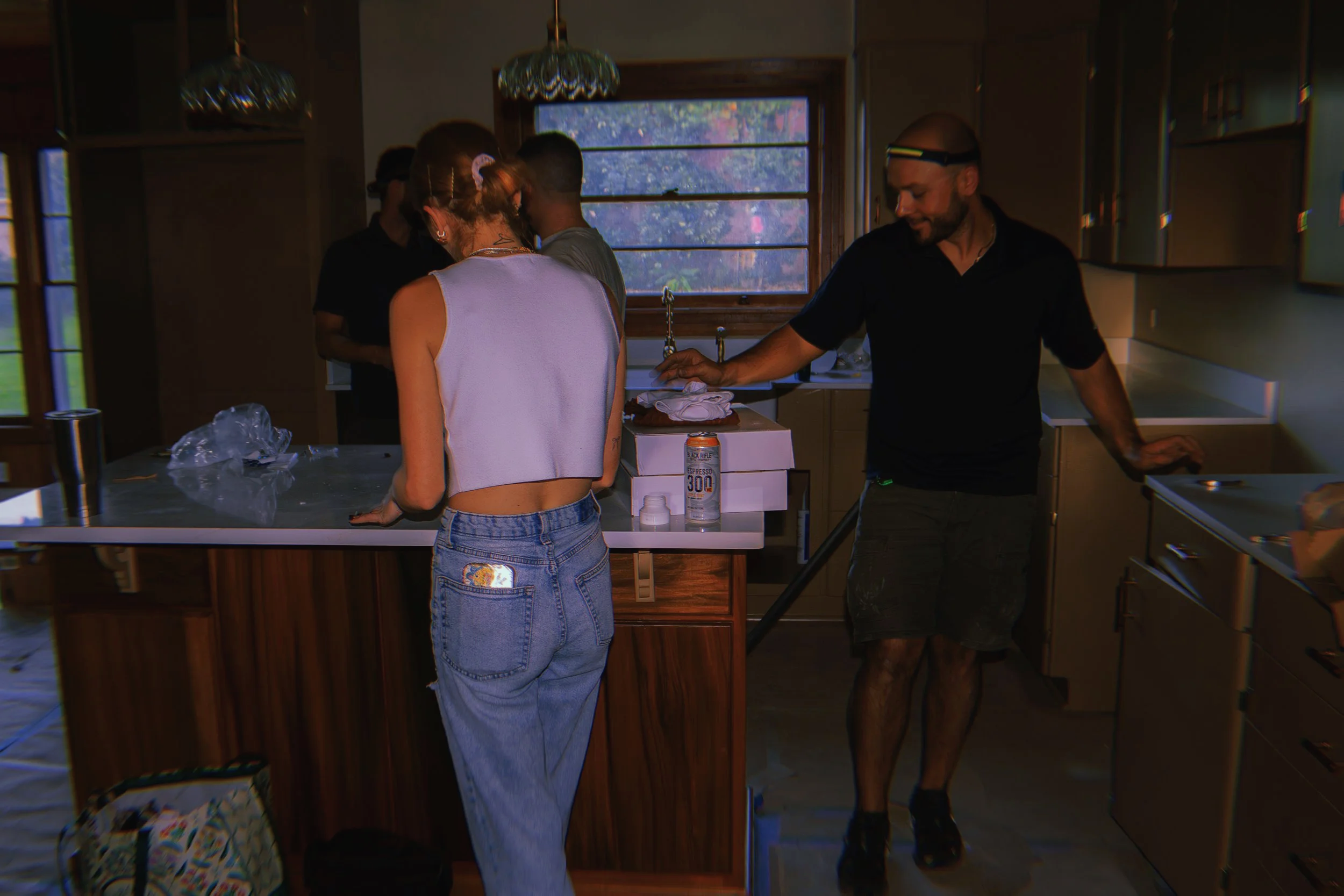
I’ve walked through enough flips to know what “listing‑day ready” often ends up meaning: floors still suffused with drywall dust, painter’s tape dangling from casings, baseboards coated in debris, hardware that doesn’t match. That’s never been my standard — and Teche made sure of it. By the time the final photoshoot rolled around, I had crawled on my hands and knees through eight hours of vacuuming, mopping, and hand‑polishing the original cypress tongue‑and‑groove walls and ceilings in the dining room.
Each pass wasn’t just about cleanliness — it was about respect. Respect for wood that had weathered decades, respect for a home that will carry decades more, and respect for whoever walks in next. This wood deserved reverence. It wasn’t just clean. It was cared for. Sure, I’m certain there is a paint touch up or 2, maybe a light fixture that needs adjusting, but nothing about this finished project feels rushed or careless.
This wasn’t fluff or finishing touches. The house didn’t just get wiped clean — it got given a second breath. Because if you’re going to ask someone to call a place home, the least you can do is make it feel sacred.
The Last-Minute Details That Made the Difference
Spare No Detail — Especially the Late‑Night Ones
Finishing a home isn’t glamorous. It’s in the tiny decisions that add up, the ones nobody notices, but can feel it when they’re missing.
The truth about finishing a home is that the smallest decisions take the longest.
The right hardware.
The correct temperature bulbs (because lighting matters).
Brass that actually patinas.
Paint touch-ups performed at hours when normal people sleep.
We swapped out every piece of tired, half-painted hardware. We aligned switch plates, patched corner joints, adjusted trim, polished surfaces until even the reflection felt deliberate. No band‑aids. No “good enough.” Not one corner was overlooked. It wasn’t about checking boxes — it was about asking the space to be ready, really ready.
And then came the staging — which was, admittedly, too fun for my own good. I styled until the rooms felt lived-in, not decorated; until every seat looked like someone had just stood up; until leaving the house felt genuinely difficult. Every surface looked like it had just been touched.
When you care — really care — you feel it. In the bones of the walls. In the grain of the wood. In the quiet hum of a space that finally, finally works.
Because Charm Shouldn’t Be a Victim of Renovation
Out front, I planted the cottagecore wildflower-inspired garden I’d dreamt up while drawing floor plans at midnight. Snapdragons. Jasmin. Creeping fig vine. Swaths of soft green stems and bursts of Red, yellow, and purple dancing in the Louisiana wind. It’s not for the MLS — and that’s fine. It’s for Sunday mornings, bare feet, and half‑drunk mugs of coffee in the quiet peeks of sunrise before the world stirs.
No spreadsheet calculates charm like that.
Because charm doesn’t just show up on paper — it settles in the bones of a place. And those are the details that stick with people, even when the finishes fade. But buyers feel it.
They always do.
This Isn’t a Flip. It’s a Rebirth
Call it heresy, but I almost hate the word flip for this project. The word feels too quick. Too transactional. Too empty. Flips are often all sheen and no substance — designed to photograph well and age poorly, to impress from the curb and disappoint once you open the cabinet doors.
Teche isn’t that. Not even close.
Let’s be clear: Teche wasn’t gutted and replaced. She was restored.
Where lesser flips rip out history and paste from Pinterest, this house got listened to. Her quirks were studied, not stripped. Her bones—solid cypress, aged brick, solid wood cabinetry—were never the problem. They were the blueprint.
Every change was a conversation between what she was and what she could be. Where to add softness. Where to hold the line. What to uncover, what to edit, and what deserved to stay exactly as it was.
Restoration is slower. It asks more of you. It doesn’t give you straight lines or clean answers. But it gives you soul. And that’s what Teche has now, tucked into every threshold and behind every re-hung door: a sense of self.
This wasn’t a flip.
It was a reclamation.
Of beauty. Of time. Of something worth keeping.

The Heart Behind the Work
This house may have been my vision, but it never would’ve come together without the people who showed up when it counted.
Blaise—my PIC and voice of reason— never faltered when the foundation needed to be rebuilt, the gas company gave us a 5 week delay, or tile needed to be re grouted (ok maybe that last one wouldv’e gotten to him had it not been for me taking matters into my own hands with a trip to Floor & Decor and a grout float).
Ian quite literally saved our A-words when he stepped up and took the entire project into his own hands after our first project manager couldn’t hack it. He spent early mornings, late nights, and every moment in between rewiring for my (many) light fixtures, plumbed everything just right, and somehow made Teche a well-oiled restoration machine after walking into sheer and utter chaos. In all these weeks, I’ve never once seen the guy without a tool in hand, rolling up his sleeves, ready to do what needs to be done and do it right. I fear he’s stuck with me now, because I’ve never met another contractor who quite lives up to his standard.
Then there are the ones who put the work in for no reason other than a love for our crazy crew.
Patrick ran point on furniture hauls, dumpster runs, and more cleaning and landscaping than anyone should have to do after a full work week. Teagan rolled up her sleeves and helped me scrub, stage, and get Teche market-ready like it was her own.
And then there’s Wrigley—who somehow made space where there wasn’t any. She captured the soul of this place through her lens, pitched in for late-night cleanup parties, and kept Evie so entertained that she never even noticed how much time Mama was pouring into finishing touches.
Because of them, Teche didn’t just get finished. She got loved. And you can feel it in every photo, every corner, every little detail.
The Last Word
Teche isn’t perfect. She was never meant to be.
Perfection ages poorly anyway. What she is—what we built her to be—is ready. Ready for the things that actually make a house matter. The messy kitchens and undone laundry. The late dinners that stretch into second bottles and unplanned dancing. The tiny feet, the laughter in the hallway, the messes that mean something.
She can hold all of it.
She started as a flip—sure. But along the way, she asked for more. More care. More patience. More of us. And we gave it, piece by piece, in paint touch-ups at midnight and hands-and-knees floor polishing, in choosing the right lightbulb, not just a lightbulb.
By the end, this wasn’t a renovation. It was a restoration. A making-right. A letting-be.
Teche didn’t just get finished. She grew into herself.
And if we did our jobs right, she’s ready to grow with someone else now.
Ready to Meet Her for Yourself?
If you’ve made it this far, you already know—Teche isn’t just another house on the market. She’s layered, thoughtful, and quietly alive in a way that only happens when a home is given time, intention, and love.
She’s ready for real life now.
Maybe yours.
Schedule your showing here:
Intentional, Edited, and Almost Done: Teche’s Not-Quite-Final Reveal
This isn’t your typical flip—and that was the point. From navy marble and unlacquered brass to layout shifts that make daily life feel better, 105 Teche wasn’t built to be perfect. It was built to meet you where you are.
The dust has settled, the last coat of paint is dry, and 105 Teche is no longer a before—she’s the after they warned you about. But make no mistake, this isn’t just a run of the mill flip. What began as a sagging structure with promising bones has been fully transformed into something soulful, intentional, and design‑forward. Every corner holds a detail, every surface a story.
As someone who eats, sleeps, lives, and breathes the world of real estate and interior design, I knew this house was about more than square footage and comps—it was a chance to blend architecture, artistry and authenticity. We’ve already touched on the major shifts—layout changes, structural reinforcements, the improved flow that now defines the space—but today I want to take you deeper. I want to walk you through the intention behind the selections, the moments of craftsmanship that flew under the radar, and the bold design calls that gave Teche her new identity. She’s almost market-ready, but we’re showing our cards early.
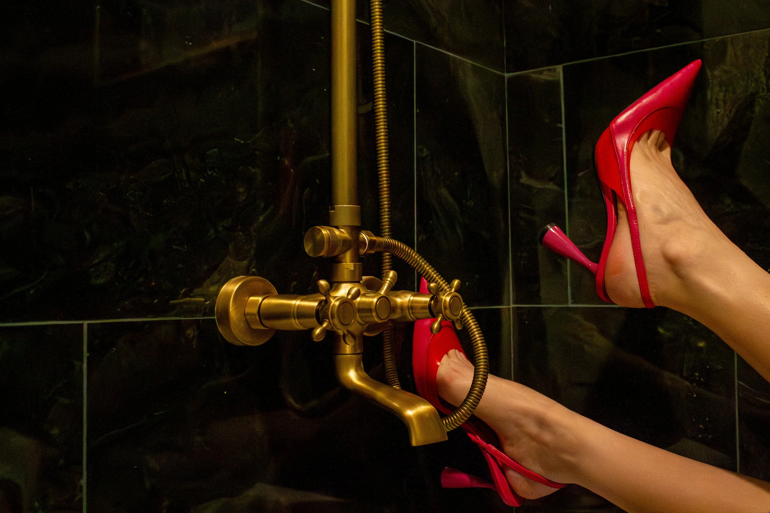
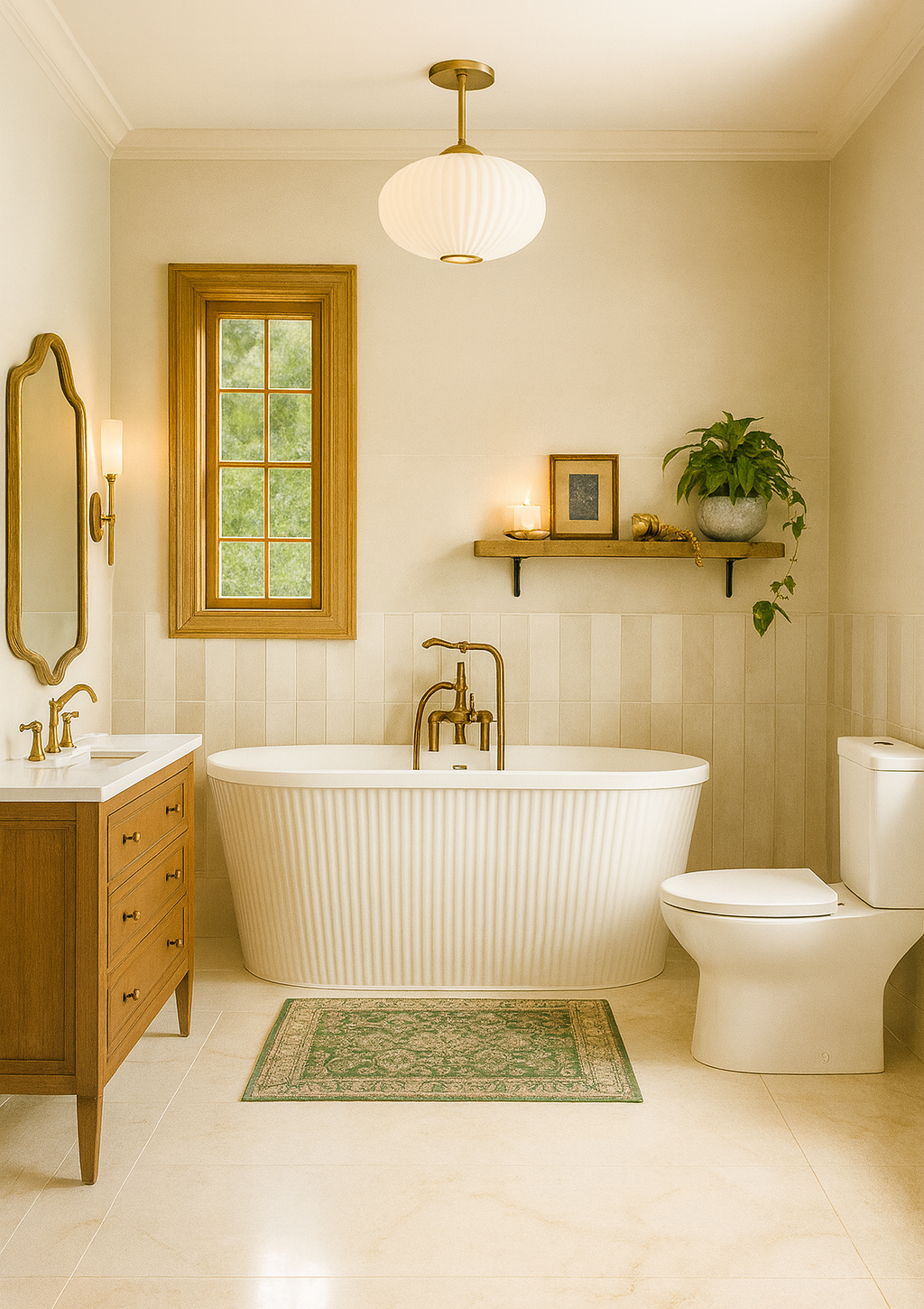
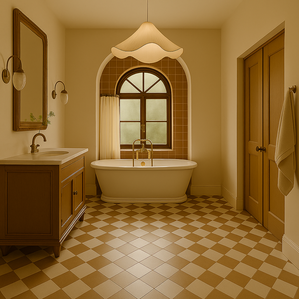
A Shower Moment, But Make It Cinematic
First stop: the bathroom that sets the tone, then takes it one giant step further. Dark, dramatic marble tile now flows up the walls, enveloping the space in moody sophistication. The intention was clear: we wanted contrast, texture and a hint of luxury that didn’t feel ostentatious.


The star in this space is the brass shower system. It doesn’t scream for attention, it wears like jewelry: precise, textural, and exactly right.
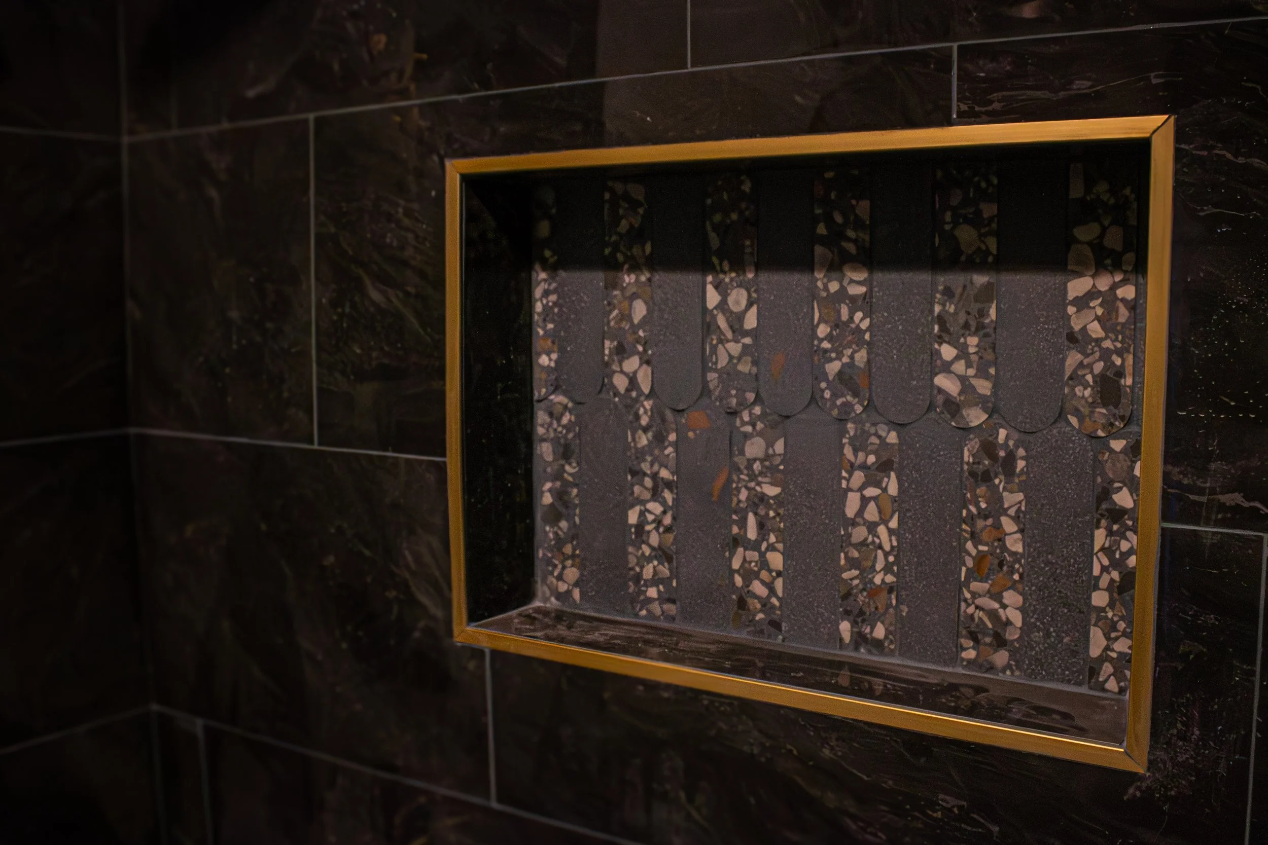
The shower niche is proof that a detail can be both functional and quietly show-stopping. The scalloped tile layout plays with repetition and restraint, alternating between bold, large-aggregate terrazzo and a finer, more grounded mix. It’s texture without visual noise. Framed in coordinating brass trim, the niche breaks through the dark marble surround with just enough warmth to catch light, not steal it. Every finish here is speaking the same language: edited, layered, modern. It’s the kind of designer bathroom detail that makes a space feel intentional, not overworked—proof that functional elements don’t have to disappear.
Why this works
Navy marble does the heavy lifting, creating a rich, dramatic backdrop that anchors the entire bathroom without begging for attention.
Brass finishes punctuate the room’s darker palette, adding warmth, reflectivity, and a sense of patina that connects the space to the rest of the home’s vintage-modern language. In a room of saturated tone, brass offers just enough light play.
The terrazzo niche adds a layered texture, a surprise detail that shifts the space from “luxury bathroom” to “bespoke design moment.”
The juxtaposition of dark, reflective stone with warm metal and articulated terrazzo demonstrates a controlled risk: bold, but rooted in restraint.
The added beaded moulding, painted to match the wall, bridges the gap between the brass trim and the rest of the space—keeping things cohesive, with just enough cottagecore to soften the modern edge.
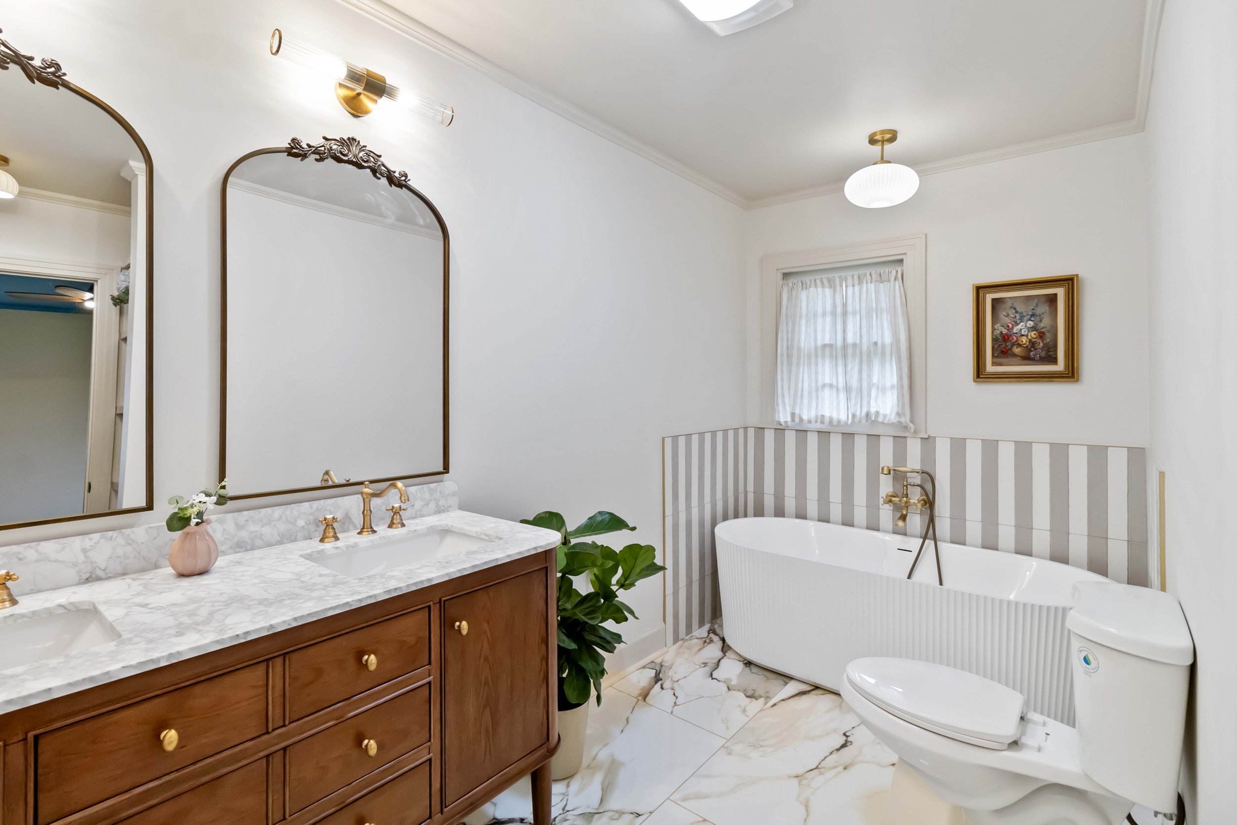
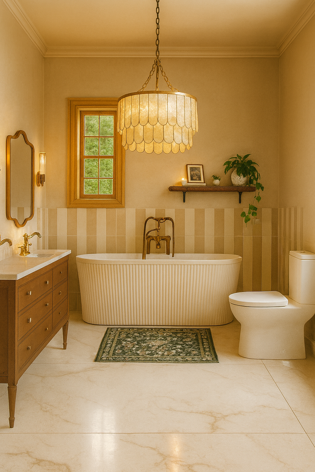
Soft Neutrals, Strong Lines: A Modern Take on the Primary Bath
From the moody intensity of the navy marble bath, we transition into something quieter—but no less considered. The primary suite bath trades saturation for softness. It’s calm. It’s architectural. A quieter kind of bold.
Hand-cut vertical stripe tile draws the eye upward, adding subtle movement and emphasizing height. On the floor, golden marble veining softens the geometry, grounding the room with a more organic pattern. The fluted freestanding tub sits at the center—sculptural but not showy, anchoring the space without feeling heavy.
And the wall-mounted brass faucet? Vintage-inspired, beautifully tactile, and quietly confident. It balances form and function the way great fixtures should—elegant, purposeful, and built to last.

Design intentions:
The vertical tile does more than stretch the walls—it gives the room rhythm. Quiet but deliberate, it keeps the space from feeling static.
Honey veined marble underfoot softens the structure. It adds just enough movement to ground the geometry without stealing the show.
The fluted tub is more sculpture than statement. It anchors the space, but doesn’t dominate it—form doing exactly what it should.
Antique brass fixtures bring warmth in all the right places. Wall-mounted, vintage-referenced, and chosen for the way they’ll age, not shine.
Nothing matches—but everything speaks the same language. The space isn’t coordinated. It’s composed.

Soft Utility: Where Design Meets Daily Use
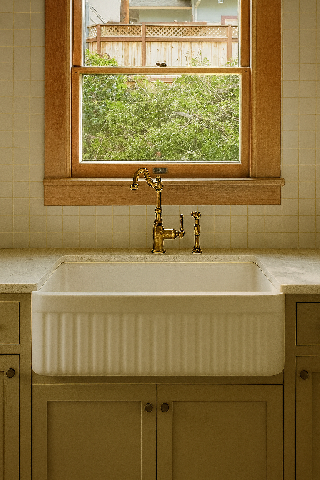
The original kitchen layout had the sink awkwardly shoved to the left of the window—a placement that made no sense functionally or visually. So we moved it. Centered it. Gave it a view.
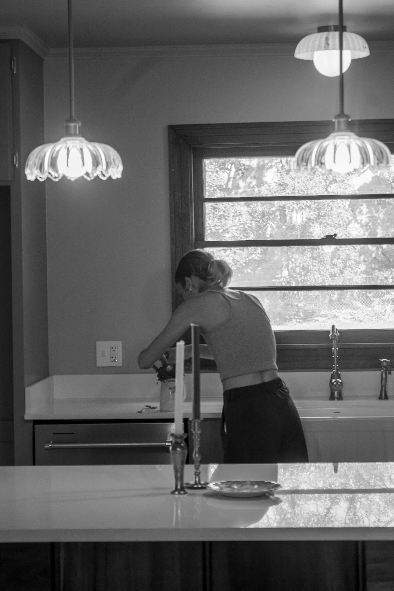
Now, the faucet sits exactly where it should: anchored beneath the window, framed by light, aligned with the outdoors. It's no longer an afterthought—it’s part of the composition. Everyday tasks feel just a little less routine when they happen in a space that was actually designed to be lived in. The unlacquered, vintage-inspired brass fixture ties back to everything Teche got right: cohesive, era-appropriate, and fully functional for real life.
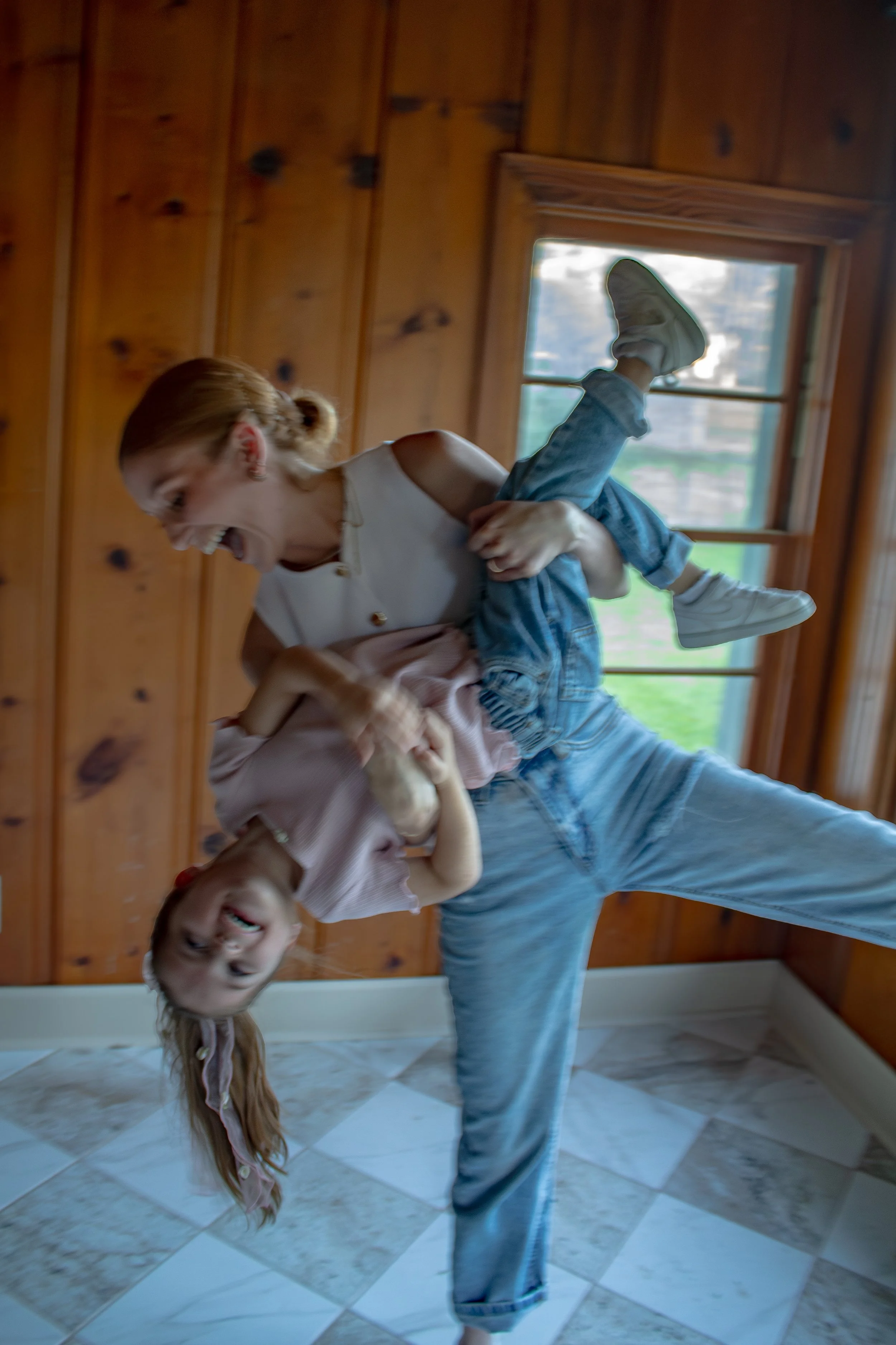
And because this house was always meant to hold life, not just stage it, we made sure to test that theory. This house was never meant to be precious. It was never about creating a space too perfect to touch—it was about designing a home that could take a breath, hold a moment, and look even better after it’s been lived in. We didn’t just design the kitchen to look good in photos. We let it live. Really live. We broke in the floor by dancing on it. We pressure-checked the layout by spinning in circles. We gave the countertops a real audit by letting a four-year-old climb on them and cackle at full volume.
And in those moments, something clicked. The design didn’t fall apart. It embraced us. The light landed in the right places. The foundation proved rock solid. The space worked—because it was made to. It’s easy to forget, in the world of curated stills and showroom-perfect walkthroughs, that homes are meant to be a little loud. A little messy. Full of little fingerprints and inside jokes.
What we built here isn’t just resale-ready—it’s life-ready, the good, the bad, and everything in between. And that’s the part you can’t fake. You can feel when a house was designed with heart. When someone thought about real life unfolding inside it. This kitchen isn’t just where you’ll plate dinner. It’s where someone will practice spelling at the counter, where you’ll take a breath between emails, where you might one day hold a tiny human mid-laugh and realize—you built something great.


A sink with a view is nice. A kitchen that holds a moment like this? Priceless.
The kitchen was never just about trendy cabinet colors—it had to work for actual life. Preferably loud, barefoot, and standing on countertops.
Not Just for the Photos
You don’t always notice good design in the moment. It’s not loud. It doesn’t announce itself. But it changes how you move—how you pause, how you breathe, how you connect. It shows up in the way a room supports your rhythm without interrupting it.
This kitchen wasn’t built for show, but to hold the weight of real life—quiet mornings, quick meals, late-night pacing, a glass of water at the end of a long day. If you feel more grounded in it without knowing why, that’s by design.
Design isn’t just visual—it's spatial memory. The kind that sneaks up later, when you walk into a different kitchen and realize something feels off.
Good design doesn’t insist. It just works—quietly, daily, and often without credit. But if it makes someone feel more at ease in their own space? That’s the point. Always was.
Built for the Life Inside It
While we arranged textures and details to impress, at the heart of Teche is the invitation to live. This home is not a showroom—it’s a backdrop for real life.
The final photo shoot, for example, wasn’t about perfection. It was about capturing laughter in the kitchen, glasses clinking under that sculptural light fixture, moments of arrival. Because houses don’t just become homes—they become scenes, core memories, integral parts of each and every one of us.
The Mindset
When we design a space, we’re not setting a scene—we’re creating space for real life to step in. The laughter, the mess, the late-night pacing, the slow mornings. We don’t cover that up. We make room for it.
The design choices matter (in fact I obsess over them). But what brings a house to life is always the people. The energy it holds. The stories that haven’t happened yet but feel close.
This one came together with the kind of team you want in your corner. The kind that knows when to push, when to pause, and when to crack open a bottle on the floor before the light bulbs are even in. It felt less like a project, more like a shared vision that actually landed.
Teche isn’t just nearing the finish line. She’s getting ready for whatever—and whoever— comes through the door next.

Joy, unstaged.
Next up: The finishing layers, the list-day plan, and a new standard for Lafayette flips.
The renovation’s nearly over—but the story’s just warming up.
This isn’t just a run of the mill flip rushed for the sake of a “for sale” sign, this is a chapter we still live in, breathe in, and show up for together. Our team, more like a scrappy collective than a crew, leaned into the chaos: hanging cabinet hardware in heels (guess who), collective panic over gas company delays, all hands on deck to decode my paint instructions and light fixture placements, drywall dust in shoes, and that moment when the door moldings finally aligned. We didn’t slip away silently—we stayed to peel back the final layer, untuck the details, and test how it all felt in real life. 105 Teche wasn’t built to be perfect.
It was built to meet you where you are.

And all the moments you see here? Captured beautifully by Wrigley Smith, who somehow managed to capture the mess, the magic, and all the quiet in between. You can follow her work here.
FAQs
-
A design-forward flip isn’t about packing a house with trendy upgrades—it’s about designing with intention, from structure to finish. It means asking better questions at every stage: How does this space function day-to-day? What should it feel like at 7 a.m. with sunlight pouring in—or after dinner when the house gets quiet? Instead of defaulting to resale-safe choices, we focused on proportion, flow, and timeless materiality. A flip doesn’t have to feel temporary or generic. It can feel collected, livable, and quietly bold.
Teche is that philosophy in practice. We moved the kitchen sink to align with the window—not just for symmetry, but to bring the outdoors into a daily ritual. We chose unlacquered brass because we wanted materials that age with the house. We added bead moulding and warm wood tones to soften harder lines, keeping one foot in her cottage roots while updating her for modern life. Every edit—from the terrazzo niche to the window casings—was made to support the space, not steal from it. It’s a house that was rethought, not just redone.
-
Because buyers feel the difference before they know what they’re looking at. You can walk into a house and instantly tell whether it was thoughtfully renovated or rushed to market. Details like unlacquered brass fixtures, bespoke cabinetry, or custom tile work don’t just look elevated—they signal care, longevity, and a point of view. And that’s what makes buyers fall for a home, not just buy it.
These aren’t upgrades for the sake of flash—they’re decisions that create emotional connection and perceived value. In a crowded market, the flips that linger are usually the ones that feel flat or forgettable. But when a home has been edited with intention—where the materials, palette, and layout all work in quiet harmony—buyers take notice.
But a design-forward flip doesn’t mean blowing the budget on luxury everything. We hunt for pieces that look high-end, feel durable, and still let the margins breathe. It’s about having a vision and refusing to settle—even if that means scouring every corner of the internet or every aisle at the big box stores. (Just ask Patrick—he watched me scroll through every faucet on Amazon and every vanity at Home Depot. Twice.) -
Start with an audit of your explore page. If everything looks the same, you’re missing the point.
Timeless design doesn’t come from copying, it comes from creating. It’s less about what’s popular and more about what holds up. Look for materials that wear in, not out. Real stone with natural quirks. Metals that patinate. Fixtures that feel like they belong to the house, not the Pinterest board.
You don’t need to blow the budget, you need to know what reads as considered. I’ve sourced Amazon faucets that pass for vintage and mixed them with polished stone and custom vanities without blinking. It’s about the composition, not the cost.
And yes, it takes time. Think: 74 open tabs, comparing the curve of spouts, filter settings set to “brass only,” endless photoshop renderings, and one poor contractor watching me spiral as I unpack the wrong fixture shipped from Amazon… again. But when the palette hits, the scale’s right, and nothing feels like it’s trying too hard? That’s when it works.
-
Start by letting the house speak—and actually listening. On that first walkthrough, before demo, before Pinterest boards, you can usually feel what the house wants to be. The lines, the light, the layout (even if it's broken)—they all leave clues. You’re not forcing a look onto a space. You’re pulling the right version of it out.
From there, staying on brand doesn’t mean stamping the same style onto every project. It’s about working within a consistent design language: warm metals, tactile materials, tonal restraint, layered contrast. Things that feel edited, not overworked. Even when the architecture shifts, your point of view doesn’t have to. You just calibrate the mix.
For me, that means brass shows up often, but it lands differently depending on the room. A fluted detail might move from sink to tile. A certain type of veining shows up again—not because it's a formula, but because it belongs.
It’s never about matching past projects, but about making the next one’s final product feel inevitable. Like it was always meant to look this way—even if it took some demo (and maybe even tears) to get there.
-
The work doesn’t stop at the final photo edit or when the staging pillows are fluffed. Once the listing hits, it turns into a sprint—but a curated one. It starts with how the story is told: social content that actually reflects the design process, captions that go beyond “just listed,” and visuals that show more than angles—they show intent.
The showings matter, but so does the experience within them. Lighting adjusted. Tools Gone. Kitchen island styled. Let the finishes speak. Let the layout guide. It’s about giving buyers space to feel something.
Then there’s the follow-through. The email responses that don’t sound templated. The detail sheets that highlight why that wall was opened up, why that faucet was chosen, why this flip doesn’t feel like a flip.
Because a buyer isn’t just walking into a house—they’re stepping into a decision. Maybe the biggest one of their lives to date. Our job is to make sure it all feels intentional. Every touchpoint, every room, every material—designed to not just show well, but live well.
-
We’re down to the final layer—the kind of details that most people overlook, but that actually make the space feel finished. A few light fixtures still need to be installed (yes, even more are coming). Laundry room cabinetry is next. Gas connection is scheduled so the new range can do its job.
We’re also swapping out a few pieces of door hardware—touchpoints again—and making sure every outlet and switch plate cover is matched and intentional. Paint touch-ups are happening, grout is getting sealed, and we’re walking the house with fresh eyes before the final tidy-up.
It’s not quite the big reveal yet. But almost.

From a Flip to a Feeling: How 105 Teche Became Lafayette’s Design Darling
Renovation progress looks good in theory — until your bathroom mirrors turn out to be auto parts. Between countertop wins, lighting surprises, and a few shipping misfires, the Teche Flip is still pulling off her modern cottagecore moment with suspiciously good humor.
There’s a shift that happens in every renovation—the day you walk in and realize the construction zone has quietly turned into a home. That’s where we’re at with 105 Teche Drive. The paint’s on, the floors are in, and the lighting is… somewhere between “en route” and “back-ordered.” The bathrooms? Drama. The kitchen? Straight from a Nancy Meyers fever dream, but, like…cooler.
It’s giving modern-luxe cottagecore with just enough edge to keep it interesting. And while Blaise ran off to elope (while I sobbed at home about how stunning and happy he and Teagan looked), our head contractor Ian and I kept the show running. Light fixtures in one hand, incorrect Amazon shipments in the other. Because the glow-up doesn’t wait for anyone, even the groom.
Here’s the latest update on the Teche Flip — AKA our favorite 70503 girlie in her renovation era.
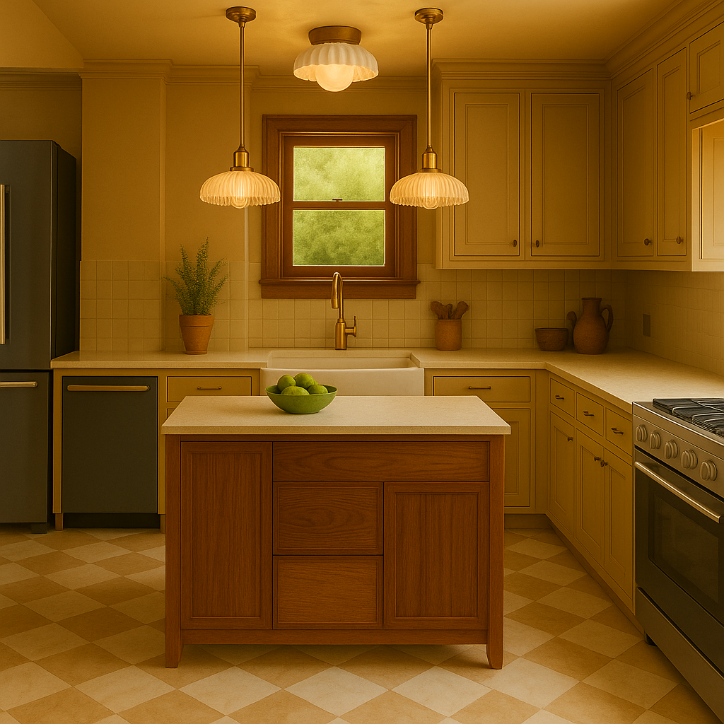
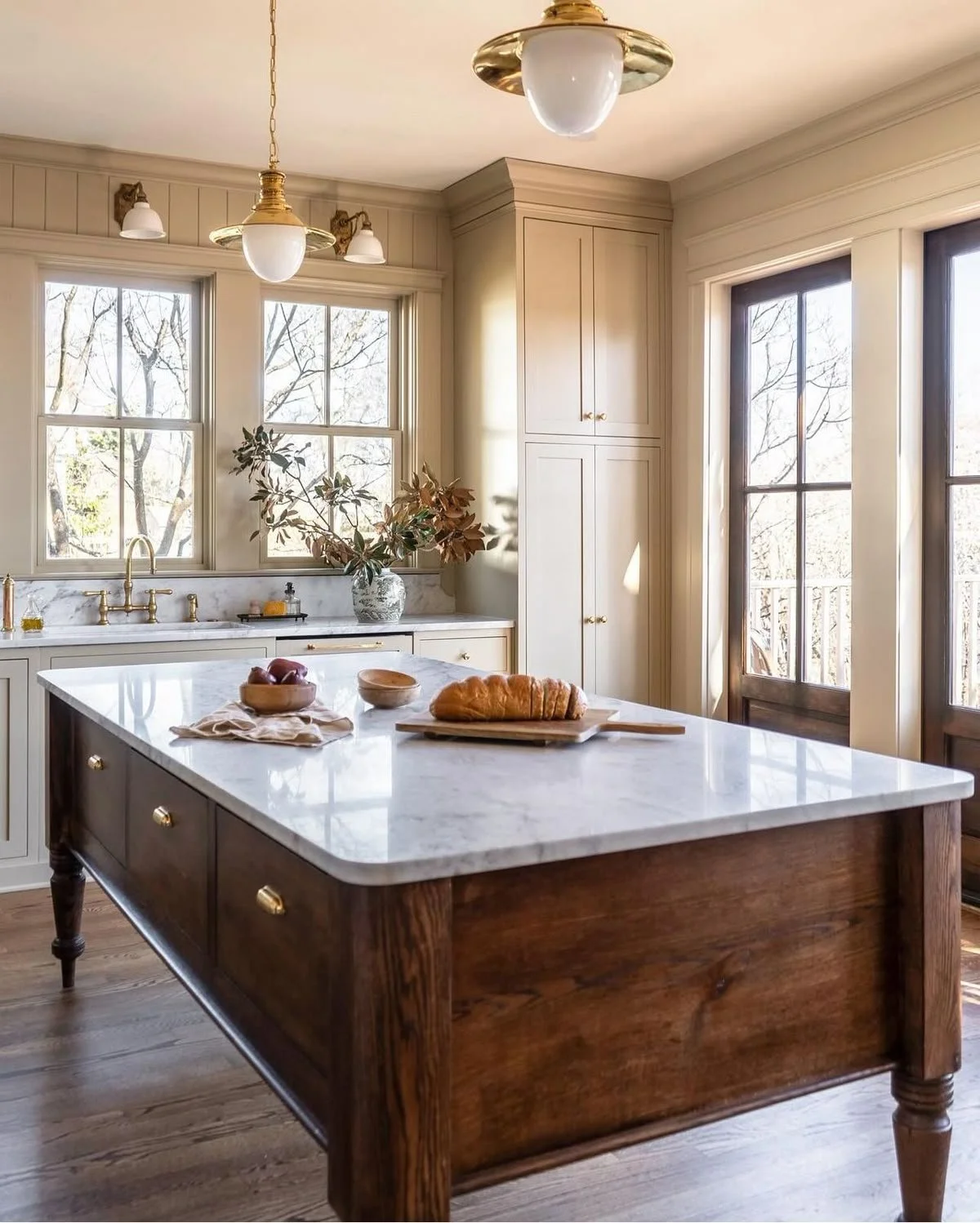
The Kitchen’s Power Couple: Veined Countertops + Vintage Pendants
The island has landed, and she’s the moment.
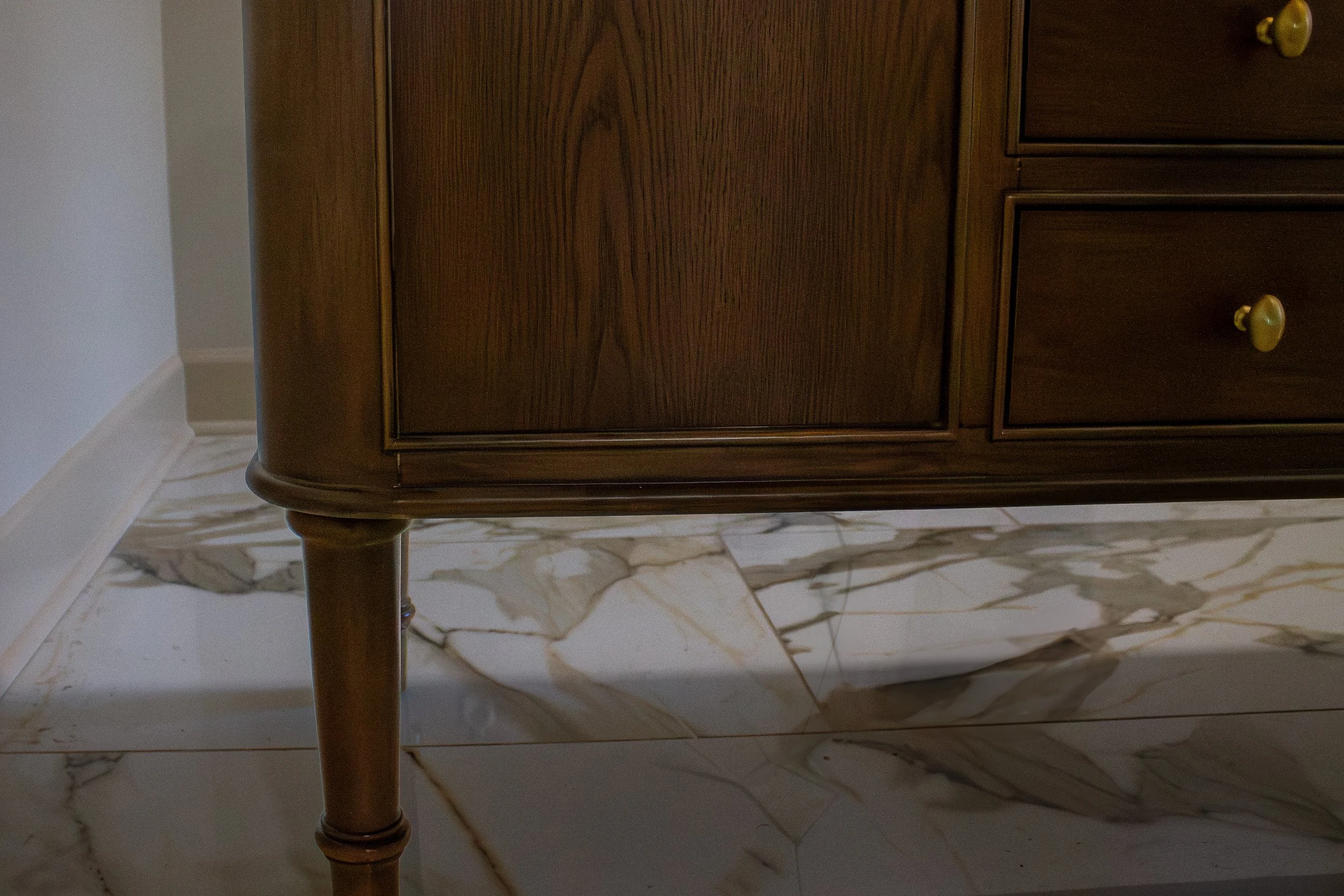
We went for rich stain with a warm, grounded midtone, somewhere between a walnut and acacia finish, with those deep espresso striations that catch the light just enough to show off the grain. It’s not too polished or too rustic. It has that intentional, lived-in sheen that feels like it’s been there long enough to earn its confidence.
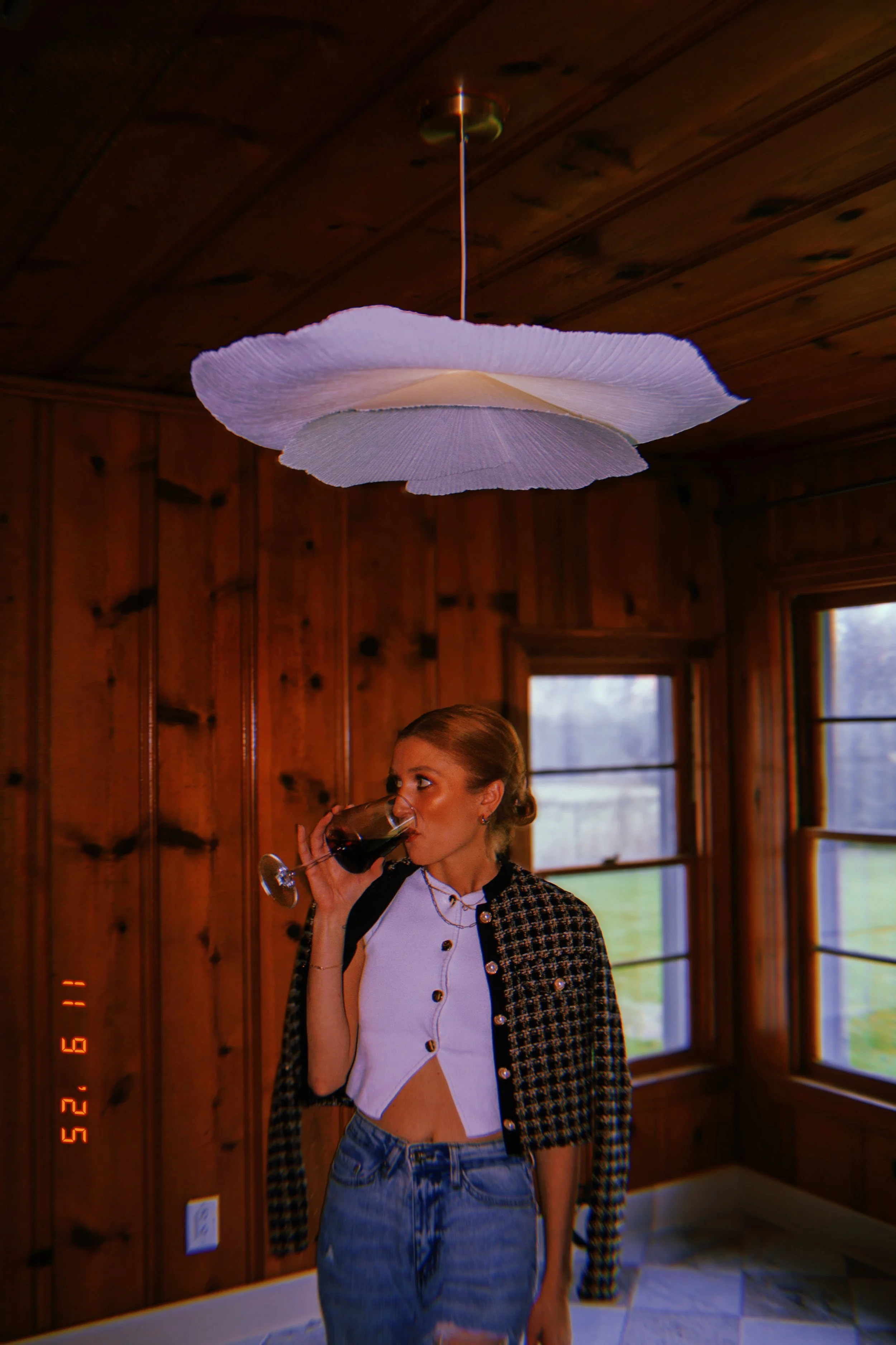
It’s doing exactly what it should: marrying the tone of the new floors with the original wood paneling in the dining room. The stain bridges those elements without competing: the cooler undertones of the flooring meet the honeyed warmth of the paneling halfway, and the island becomes the translator. Above it, a pair of vintage-inspired glass pendants will tie the look together. Their scalloped shades and subtle brass hardware feel familiar but refined — a soft nod to the home’s midcentury roots without dipping into nostalgia.
That continuity is what makes the Teche renovation feel considered instead of contrived. We didn’t erase the home’s original soul — we enhanced it. The untouched wood ceiling and walls in the dining now read as a deliberate design choice, not an afterthought, because the island carries that same organic depth forward. Something moody but still grounded. Topped with a thick Calacatta gold-veined quartz slab, it just quietly commands attention. As for the countertops along the wall cabinets? Simpler white quartz, so the island can actually be the anchor instead of fighting for attention.
This is where wine gets poured. Where gossip, business deals, pivotal life moments, and minor existential crises will happen. If you’re not leaning on this island mid-rant like it’s your scene partner, you’re missing the point.
Primary Bath: Vintage Brass Fixtures, Vertical Stripes, and a Hint of Main Character
Let’s start with the primary bath, because I don’t believe in saving the best for last.
We took a risk with hand-cut vertical tile arranged in a striped pattern, and it paid off big time. Paired with soft creamy walls and antiqued brass plumbing that looks expensive (but wasn’t), the whole room feels like a boutique hotel in Paris had a baby with a southern cottage.
The chandelier saga continues. The dining one was too big for the space. The bathroom one? ALSO too big for the space. So we pivoted—shifted the bath fixture to the dining room (taking the wood paneled dining room from “maw maw’s duck camp” to “modern cottage with a touch of romantic whimsy” ) and found a better-scaled one for the bath (fluted details win again). It’s all about the ability to pivot, keeping a (tired but keen) eye on proportions, and refusing to settle for “fine.”
Now the primary bath is all vintage brass fixtures, sculptural sconces, and just enough glow to make the paint color flex. Suddenly it’s not just a bathroom, it’s a vibe. Less Pinterest-core, more lived-in luxury. Personality-core with a capital P.

Guest Bath: The Moody One with the Niche (Literally)
In a word? She’s moody. We went full navy and onyx marbled tile in the shower, which makes the tub pop and adds just enough drama without going full batcave.
The real MVP here is the custom inset shampoo niche, finished in the same terrazzo tile as the floor — just cut into scallops in alternating scale, because you know I love a difficult detail. Brass trim finishes it off, and the deep navy ceiling ties it all together.
Still under construction, but the vision? Fully loaded.

Behind the Scenes: Still Messy, Still Magic
By this stage in any renovation, the universe starts to get a little bold with her sense of humor. Fixtures arrive cracked. Boxes show up missing the one part you actually need. And in our case, a certain supplier — looking at you, Bezos! — managed to send us a 2008 Honda Odyssey radiator instead of the pair of primary bathroom mirrors we ordered. (Close, but not quite.) It’s the part of the process where you stop asking why and just start asking how fast can I return this? But even with the shipping mishaps and dented egos, the house keeps moving forward — stubbornly, beautifully, almost in spite of us. We’re in the best part. The click moment. When design, function, and results finally agree on something.
I brought Evie through during demo months ago. Dust everywhere, a house held up by framing and vision alone. She stood on the porch and yelled, “Mama! Make this house beautiful!”
I’m happy to report: we did.
105 Teche Drive is becoming that balance of modern and nostalgic—a home with personality, presence, and no interest in playing by flip-book rules. What’s next: The last of the light fixtures, paint touch ups, final punch list, exterior cleanup, and prep for styling.
We’re almost at the part where I stop sweating about grout color and start posting listing links.
Stay tuned.
FAQs
-
We’re not doing beige boxes. Every decision has intention, texture, and a little rebellion baked in.
-
Lafayette light—rich hues, moody, and way too pretty to waste on gray paint.
-
By treating every project as a design story—not an inventory item.
-
We design for living, not for listing photos.
-
It’s a city that loves comfort and story. We design to reflect that.
-
We focus on long-lasting materials and timeless finishes over fast-trend choices.
-
Appliances, 1000 punch list items, final styling, and a photoshoot that’ll make all the dust worth it.
Teche’s Hot Girl Era: Paint Done, Floors Down, Fixtures Loading
We’ve officially entered the best phase of the Teche Flip—the glow-up. With moody cabinets, custom hardware, vintage tile, and the kind of kitchen island that demands a glass of wine, this house is finding its identity. Think warm tones, quiet luxury, and just the right amount of drama. Come behind the scenes as we break down the finishes, the flair, and the still-very-real countertop chaos.
That “Wait… It’s a Real House Now?” Moment
You know that feeling when a renovation crosses the threshold from “project” to “place you actually want to hang out in”? We’re there. 105 Teche Drive isn’t just a construction zone anymore—it’s giving modern-luxe moodboard meets actual livable space. Paint? Done. Cabinets? Finished. Floors? Laid. Fixtures? In transit. And let’s not forget the moody-stained kitchen island that’s been stealing focus like it’s auditioning for an Architectural Digest cover.

The Wall & Cabinet Saga: A Color Commitment Crisis Worth Having
I lost sleep over these paint colors. We chose ten. I tortured Blaise. But every drop of drama was worth it. The walls aren’t just painted—they’re dressed. Wrapped in creamy warmth, soft neutrals, and just enough contrast to keep it interesting. The cabinets complement without competing. It's giving restraint with a wink. Even my sometimes-grumpy-always-practical flip partner had to admit “I had my doubts, but somehow all of this works even better than you promised it would.” (Thanks for admitting I was right, Blaise!)
Design tip? Sometimes indecision is just dedication in disguise. And yes, I’ll die on that hill.
Let’s Talk About the Kitchen Island—Because It Deserves Its Own Section
This island isn’t just a surface; it’s a vibe. We went dark and moody, but kept the woodgrain visible—rich, grounded, a little mysterious. It says: “I host wine nights but also get sh*t done.” It anchors the space visually and emotionally. It’s not just the heart of the kitchen—it’s the soul of the flip.
I’ve already mentally styled it three ways. And yes, there will be a ceramic fruit bowl with one aggressively aesthetic pomegranate in at least one listing photo. Fight me.
Floors: She’s Grounded Now
Subfloor echoes? Gone. Now it’s solid, checkerboard tile and warm wood tones underfoot. The kind of flooring that makes you want to ditch your shoes and slow-walk through the house with a glass of wine like you’re in a Nancy Meyers movie.
We went for wide plank, matte finish—chic but not trying too hard. The last few corners are getting touched up, but the foundation of the home’s vibe is down, literally and stylistically.
Fixtures, Vanities & That Tub Surround: All the YES Moments
Let’s get into the real stars of this phase:
Vanities: Not just storage—statements. Think antique wood, soft-close everything, and a finish that whispers "spa" but still holds your dry shampoo stash.
Tub Surround: Custom, clean, but full of personality. It’s got that “you could definitely take a dramatic Sunday soak here” energy.
Lighting: All ordered. All on theme. Brass. Globes. Sconces. Drama. I’m lighting this house like it’s about to walk a red carpet.
There’s nothing quite like watching your Pinterest boards materialize into actual shipments arriving on site. If serotonin came in box form, it would look like pendant lights.
Touch Me Textures: The Hardware Edit
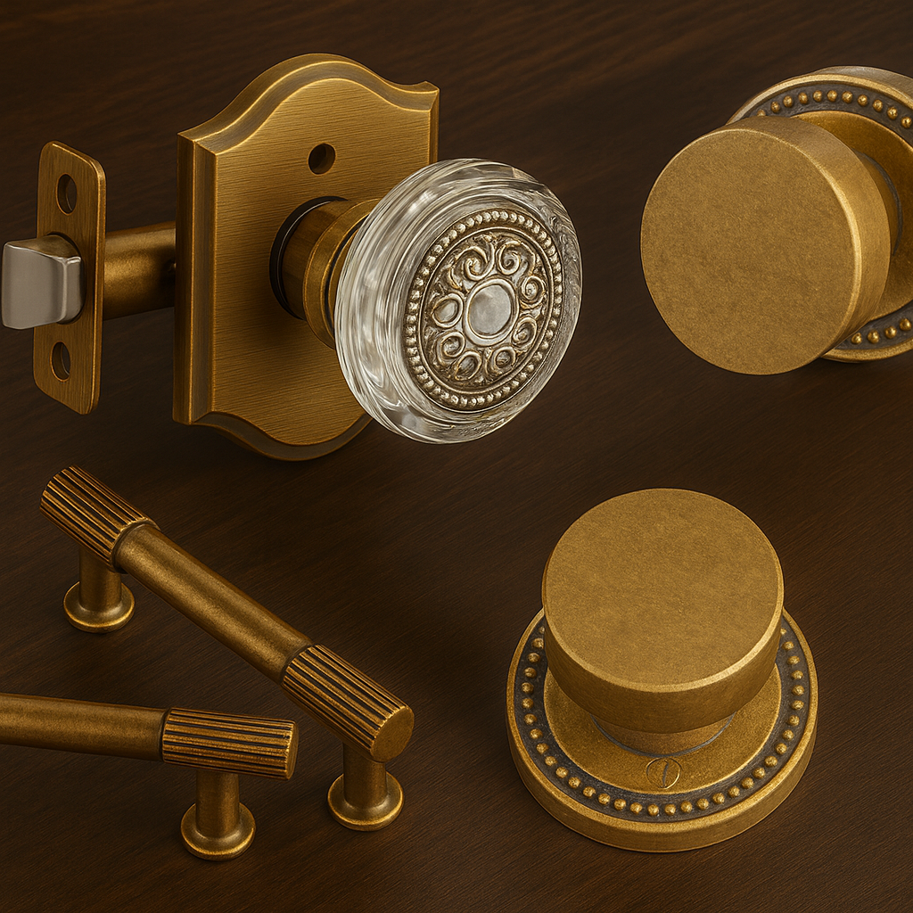
Let’s talk hardware—because she’s not just decorative, she’s the unsung hero of a well-dressed space. What may feel like trivial details to some are actually the most important part of bringing a space together— it’s ALL about the touch points. I went deep into the design rabbit hole and came out holding vintage-inspired brass beauties that are the literal definition of quiet luxury.
Antique Brass Cabinet Pulls
We’re talking warm aged brass with fluted grip detailing—bold without shouting, luxe without trying too hard. The texture gives just enough grip to feel intentional (read: not builder basic), and the profile hits that sweet spot between traditional and tailored. They’re the kind of pulls you notice after the fact—when you catch yourself running your hand over them because they just feel that good.
Fluted Bedroom Knobs
Don’t even get me started on these chunky circular knobs with beaded backplates. They’re giving vintage vault chic. A little industrial, a little Roman revival, and just enough edge to keep things modern without sacrificing the cottagecore aesthetic. I love how they ground the room—literally. There’s something quietly commanding about them. And yes, I did test them in every lighting condition like a psycho.
Glass + Brass Bathroom Doorknobs
As for the bathroom doors? We’re doing glass knobs set in aged brass rosettes with a slight Art Deco flair. It’s serving restored antique but make it curated. They sparkle in the best way—like a design Easter egg when the sun hits just right. You could be wearing a ratty robe and still feel like Old Hollywood just brushing past one of these.
These hardware choices don’t just finish the space—they elevate it. Like couture for your cabinets. Functional, yes. But mostly? Just straight-up FAB.
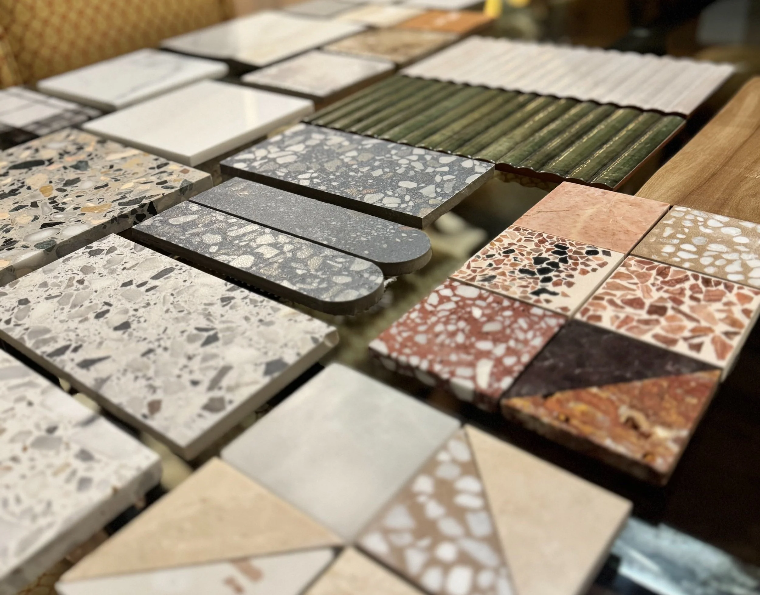
On Deck: Stone Slabs, Dreamy Tile, and Appliance Angst
Every good glow-up has a few cliffhangers. Here’s ours:
Countertops: I’m spiraling between quartz, soapstone, and one statement color that’s so unexpected I kind of love it.
Terrazzo Tile: The hall bath is getting it. Non-negotiable. It’s retro, modern, and quietly expensive-looking all at once. Literal design dream unlocked.
Appliances: Time to make decisions that are both aesthetic and functional. The big players. The stainless steel soldiers. The things that make a kitchen not just pretty, but powerful.
These aren’t just finishing touches—they’re identity-defining choices. The things that move the Teche Flip from "cute Instagram girl" to “she’s got a mortgage and a skincare fridge.”

The Vibe Check: Teche Flip, but Make It Personal
We’re living in the sweet spot of any renovation—the click moment. When everything begins to align. Walls have warmth. Floors feel finished. Light is coming. It’s not just a house anymore—it’s a whole mood.
Modern with a nostalgic wink. Elevated but not unapproachable. A little dramatic, a little romantic, and a whole lot of her.
And while countertops, terrazzo tile, and appliance decisions loom on the horizon, I’m allowing myself this moment of pause to say:
105 Teche is coming together—and she’s everything.

How 10 Paint Colors and a Perfect Sink Defined This Flip
At 105 Teche Drive, we painted the cabinets, stained the island, swapped in a 36″ gas range, and (yes) used ten paint colors. Add in the farmhouse sink I’m head over heels for, plus brass lighting magic, and this flip’s kitchen finally found its rhythm.

The Flip That Keeps Teaching Me Lessons
If the first phases of this flip were all about structural drama and the second was budget-breakthrough chaos, then this chapter is officially the paint-fueled emotional rollercoaster. We’re deep into the kitchen now — where every design choice either cements the cottagecore-modern dream or spirals into Blaise muttering about aneurysms. Spoiler: both happened.
Cabinets That Got the Glow-Up
We finally committed: painted wall cabinets + stained island.
It’s the kitchen equivalent of a power couple — one side crisp and classic, the other warm and grounded. The painted wall cabinets keep the space grounded while the wood island delivers that moody, cozy hit I can’t live without. It’s modern cottagecore in one fell swoop.

The Great Range Relocation
Remember how we planned a 30″ in-island gas range? Yeah, that’s gone. Instead, we’re opting for a 36″ wall range. Moving it freed up the island for prep, storage, and seating while giving the range its own moment on the wall with more space to actually cook— a win-win if you ask me. Functionally, it’s a dream. Aesthetically? Total win.
The Sink That Stole My Heart
You know when you see the one? That’s how I feel about our sink. An apron-front fluted beauty with just enough heft to anchor the whole wall. Paired with a brass faucet, it’s equal parts romantic and practical. This was one of those decisions that Blaise and I were both gung-ho for the second I sent the link.

Top Row (Left to Right): Double Latte, Malabar, Garden Gate, Hot Cocoa, Maison Blanche
Bottom Row (Left to Right): Best Bronze, Samovar Silver, Delft, Shoji White, Waterloo
Ten Paint Colors. TEN.
Here’s where Blaise nearly lost it. We (aka me) landed on ten different paint colors for this house (and that’s not counting sheens). Walls, ceilings, trim, cabinetry — each got its own treatment. I insisted it was non-negotiable.
To avoid painter mutiny, we taped every single can with the code + sheen and matched that to the walls, trims, and ceilings. We even taped huge “DO NOT PAINT” signs on the wood paneling and window trim that we opted to leave as is. It looked like a paint-coded war room. But it worked, and the depth it’s giving each space? Worth every eye-roll from our paint crew.

Lighting Lock-in
After rounds of indecision, we’ve locked (almost) everything: brass pendants, sculptural sconces, and globe lights. They’ll tie together the (I’ll admit) excessive paint palette, carefully curated tile choices, and dreamy rich wood tones into one cohesive, cottage-modern glow.

When Chaos Finds Its Rhythm
This flip keeps teaching me that design is as much about the big-picture vision as it is about the tiny details that nearly break you (or your partner). Painting cabinets, relocating a range, obsessing over a sink, juggling ten paint colors, and finalizing lighting—it’s all adding up to a kitchen that feels like 105 Teche’s heart, and a house that feels like a home.
Next up? Tile installs, finalizing plumbing fixtures, picking out appliances, and a whole slew of fun things! Stay tuned.
FAQs
-
We wanted the best of both design worlds. Painted wall cabinets keep things light, clean, and airy — like a fresh exhale in the morning. But the island? That’s where we grounded the room. The stained wood brings in that rich, moody depth, adding contrast and cottagecore warmth without overwhelming the space.
But more than just aesthetics, this choice was rooted in respect: the original solid wood cabinets were high-quality, beautifully built, and worth keeping. Rather than ripping them out, we gave them a refresh — painting the uppers to modernize and brighten, while still making them functional, easy to clean, and durable for everyday use. It's a revival, not a replacement. Balance with personality and practicality.
-
Think of it as going from a well-fitting tee to a tailored blazer — same idea, way more impact. The 36" gas range gives us more burners, better functionality for serious cooking, and serious wow-factor for resale. Plus, once we moved it to the wall, we freed up the island to be all about prep, storage, and entertaining.
-
Oh, where do I start? It’s deep enough to handle real-life messes and pretty enough to anchor the kitchen wall while staying cohesive to the rest of the design (looking at you, fluted master bathtub!) With its apron-front silhouette and classic curves, it hits that perfect note between romantic nostalgia and modern utility. Add a brass faucet? I’m swooning.
But it’s not just a pretty face, it’s also intentional for the lucky buyers of this home. The undermount design means you can sweep crumbs and spills straight off the counter — no grout lines, no raised edges, no fuss. And the single-bowl format? Absolutely perfect for those giant Louisiana gumbo pots. It’s beautiful, yes, but also built to handle the kind of cooking that makes a kitchen feel like home.
-
Yes. And also, absolutely not. Sure most traditional flips don’t go this “hard in the paint” (I’m cringing at myself).
Every room tells its own story, and ten curated colors let us layer mood, tone, and intention throughout the home. It’s not chaotic — it’s deliberate depth. Some may think it’s unnecessary, but guests? They’ll feel it without even knowing why.
-
We ran that job site like a war room. Every paint can was labeled with its code and sheen. Then we matched each surface — walls, trims, ceilings — with taped labels in every room. Zero confusion, fewer mistakes, and just enough micromanaging to make Blaise deeply question his choice in flip partner.
-
We did. Staying within the same brand gave us better control over color consistency and paint quality— especially when dealing with multiple sheens and finishes. No surprises, just smooth transitions from wall to trim to ceiling. All the paint in this house came from Sherwin Williams, both Blaise and I are partial to their products.
-
Like a playlist with no skips. We curated shades that speak the same design language — subtle shifts in undertone and warmth — so each room has its own personality while still feeling like part of a whole. No jarring jumps, just beautiful flow. It was quite a feat, but after about 80 total hours of mock ups and crossed eyes, I sent one of my famous spreadsheets to Blaise and dealt with the raised eyebrows after the fact.
From Chaos to Cottagecore: Teche’s Design Risks, Budget Breakthroughs & Cozy Aesthetic
Flips can feel like spreadsheets in disguise, but at 105 Teche, every risk seems to turn into reward. This Lafayette flip house is shaping up into a modern cottagecore dream—checkerboard floors DIY’d on a budget, moody wallpaper murals in the laundry room, vintage-toned brass fixtures, and paint colors chosen like a playlist. The result? A renovation that feels intentional, warm, and anything but cookie-cutter.

Real Talk Before the Pretty Pictures
Flipping a house is basically like signing up for a group project where you’re the leader, the note-taker, and the one buying snacks—except the snacks are $7,200 worth of tile you absolutely cannot justify.
That’s been the journey at 105 Teche. We started with a house that felt more “structurally haunted” than “dream home”. But after months of foundation fixes, roof replacements, and late-night design debates, it’s turning into something that’s both functional and… dare I say, pretty charming.
If you’ve been following along, you know the vibe has shifted from “what did I get myself into?” to “wait, is this about to be my best flip yet?” Let’s break it down—design risks, budget wizardry, and a heavy dose of modern cottagecore.

Modern Cottagecore Without the Cliché
When you hear cottagecore, you might picture mushroom mugs and gingham everything. Cute, but not sustainable when you’re designing for real buyers (and not just Instagram). What I’m aiming for here is modern cottagecore—which means blending cozy nostalgia with clean, livable updates. This renovation is about enhancing and staying true to the spirit of the home while still giving it the thoughtful updates that still make it not just livable, but a dream living space.
Think:
Textures that feel layered, not chaotic. Plaster walls, warm wood tones, textiles that look collected over time.
Colors with personality. Nothing sterile, nothing too “builder beige.” Just rich hues that feel alive without screaming.
Patterns in moderation. Checkerboard floors, wallpaper in unexpected spots, terrazzo-inspired tile. Small doses that make you pause, not panic.
The point is to create a house that feels warm and welcoming—but still fresh, functional, and move-in ready. A space with soul, not a Pinterest board cosplay.
Budget Tricks That Saved This Flip
I’m all for bold design choices—my budget, not so much. That’s where a little creativity (and a good dose of stubbornness) really saved the day.
Checkerboard Tile: Dream vs. Reality
In my head: a dramatic, magazine-worthy checkerboard floor running through the kitchen, dining, and laundry.
In reality: $7,200 quotes that made me laugh-cry into my calculator.
Solution? DIY. We got in the car, drove the Great American Race: Lafayette Flip Edition, and finally sourced affordable tile at Lowe’s, laid the pattern ourselves to make sure the thickness/exact LxW measurements were compatible for our pattern, and cut the cost down to a whopping $650. It was a little chaotic, a little back-breaking, but totally worth it. I stood firm on my design non-negotiable that shaped the project from day one, and the budget stayed intact.
Strategic Material Swaps
Sometimes it’s less about compromising and more about pivoting. Instead of overspending on “must-have” finishes, I found affordable dupes: terrazzo-inspired porcelain instead of true terrazzo, plaster-textured paint instead of imported limewash. Luxury materials for accents/small spaces, and tried and true budget friendly tile for larger footprints (while still being on trend and vibe obvi). Each choice keeps the aesthetic intact without tanking the bottom line.
Bathrooms That Refused to Be Basic
Bathrooms are always where flips can tip into either “safe and boring” or “sterile modern style departure” territory. Not at Teche.
Primary Bath
This space got the quiet confidence treatment:
Calacatta Marble inspired floor tile for subtle pattern and texture.
Fluted standalone soaking tub for the vibiest escape of all time.
A layout that feels functional and calm, not fussy.
It’s earthy and understated—but in a way that feels intentional.
Secondary Bath — The Dark Horse
This is the one that surprised me. It’s small, sure, but that just gave me permission to go bold:
Ocean-blue terrazzo floor tile (TileBar’s “Kobe Flakes Ocean Blue”)—playful and moody all at once.
Matte microcement navy shower walls—they absorb light, creating a cocoon-like vibe that makes the tub pop, while still introducing a more natural texture that ties the room into the design flow of the rest of the house.
Shower niche with arched alternating luxury tiles—the kind of unexpected detail that elevates the whole room.
When I shared the mockup with friends, the group chat exploded with heart eyes and “okay but what tile is that??” That’s when you know you’re onto something.

Tiny Details, Big Payoff
Cottagecore doesn’t really live in the oversized gestures—it’s in the details you almost miss at first glance, but can’t stop noticing later.
Like the wallpaper mural in the laundry room, turning what’s usually a “close the door and forget it” space into a spot that actually feels intentional (yes, even folding socks deserves a view). Or the addition of dentil trim accents, those subtle architectural touches that give otherwise plain edges a sense of craftsmanship.
Then there’s the vintage-toned brass plumbing fixtures—warm, lived-in, and just enough patina to avoid the too-shiny “new build” look. Pair that with paint colors chosen like a playlist—every shade in conversation with the next, cohesive without being predictable.
And of course, the lighting. Nothing random, nothing filler. Each fixture placed to shape the mood, not just illuminate it. The result? A house that doesn’t feel “flipped,” it feels considered. Designed. Like someone cared about the small stuff.

Conclusion — Still in Motion
Teche isn’t done yet, but the progress feels exciting. Risks are paying off, the budget hasn’t collapsed, and the house is finally shedding its “before” energy.
We’re heading toward the fun part—staging, finishing touches, and eventually listing—but for now, I’m just enjoying this in-between moment where vision and reality are finally syncing.
And yes, I’m still open to mirror and sconce suggestions. Or laundry wallpaper votes. Or any unsolicited design hot takes. You know where to find me.

Quick FAQs (Because People Always Ask)
-
A: Balance. Too much floral wallpaper and it screams costume, too many niche/trendy light fixtures and it feels cheap. But pair vintage-inspired touches (like brass fixtures and botanical artwork) with modern functionality (like updated layouts and smart lighting), and you get cozy luxury without kitsch.
-
A: Absolutely, when done right. Buyers love character, and the cottagecore aesthetic layers warmth into a renovation. The trick is being intentional: wallpaper in a laundry room instead of every wall, brass plumbing fixtures instead of builder-basic chrome. Those details sell (and I have the eager potential buyer DMs to prove it).
-
A: Paint. Always paint. At Teche, carefully chosen palettes gave each room personality without adding unnecessary budget spend. Lighting comes in second—swap one boring overhead for a statement fixture, and suddenly the whole vibe changes. These are also the most DIY friendly upgrades, and labor costs are always the first to get out of hand in a home renovation. Say it with me: Sweat Equity.
-
A: Like curating a playlist—you want every track to feel different, but still cohesive. Each color was chosen in conversation with the next. Neutrals with depth, moody accents for contrast, and no sterile whites in sight. Unlike most flips that have 2 colors: trim and wall, we really went for maximalism here in color and sheen variation.
-
A: Loaded question, but at the risk of oversimplifying I can attest to this: Buyers are leaning toward cozy, character-driven spaces. Think: textured walls, mixed metals, vintage-inspired furniture, and warm neutrals. The farmhouse-gray trend is fading, and personality is back in.
-
A: Because they make buyers stop and feel something. Anyone can recognize a mass-market flip. But a dentil trim detail or tiled shower niche tells people the house was designed, not just renovated. That’s the emotional hook. This also isn’t your typical “quick flip turned investment property,” at our price point and level of detail, this isn’t so much a “flip” as it is an upscale restoration destined to be a lucky buyer’s forever (or for a long time) home.
-
A: Spend where it matters—tile, fixtures, lighting—and save where you can DIY. At Teche, the checkerboard floor went from an almost 7 figure estimate to a little over $500 total with a scrappy Lowe’s hack. Buyers notice the design, not the receipt.
From Structural Fixes to Style Moves: The Teche Flip Gets Serious
What started as a modest midcentury brick home is quickly turning into something layered, livable, and full of surprises—like the window we uncovered mid-bathroom demo. From a brand new roof to a freshly framed third bedroom and a just-picked exterior palette, this flip is growing up fast. Catch the latest progress, design direction, and where we’re headed next.

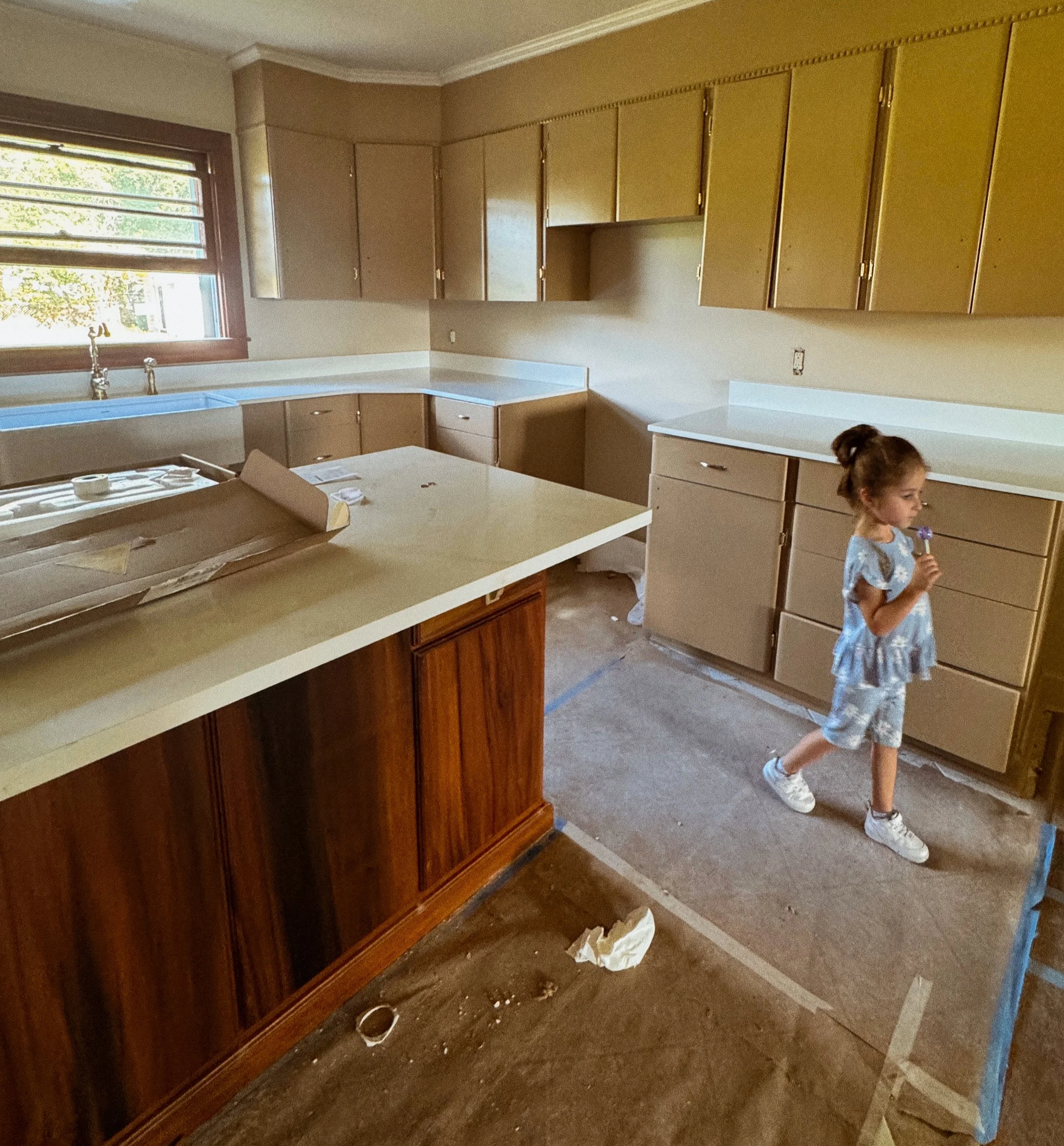
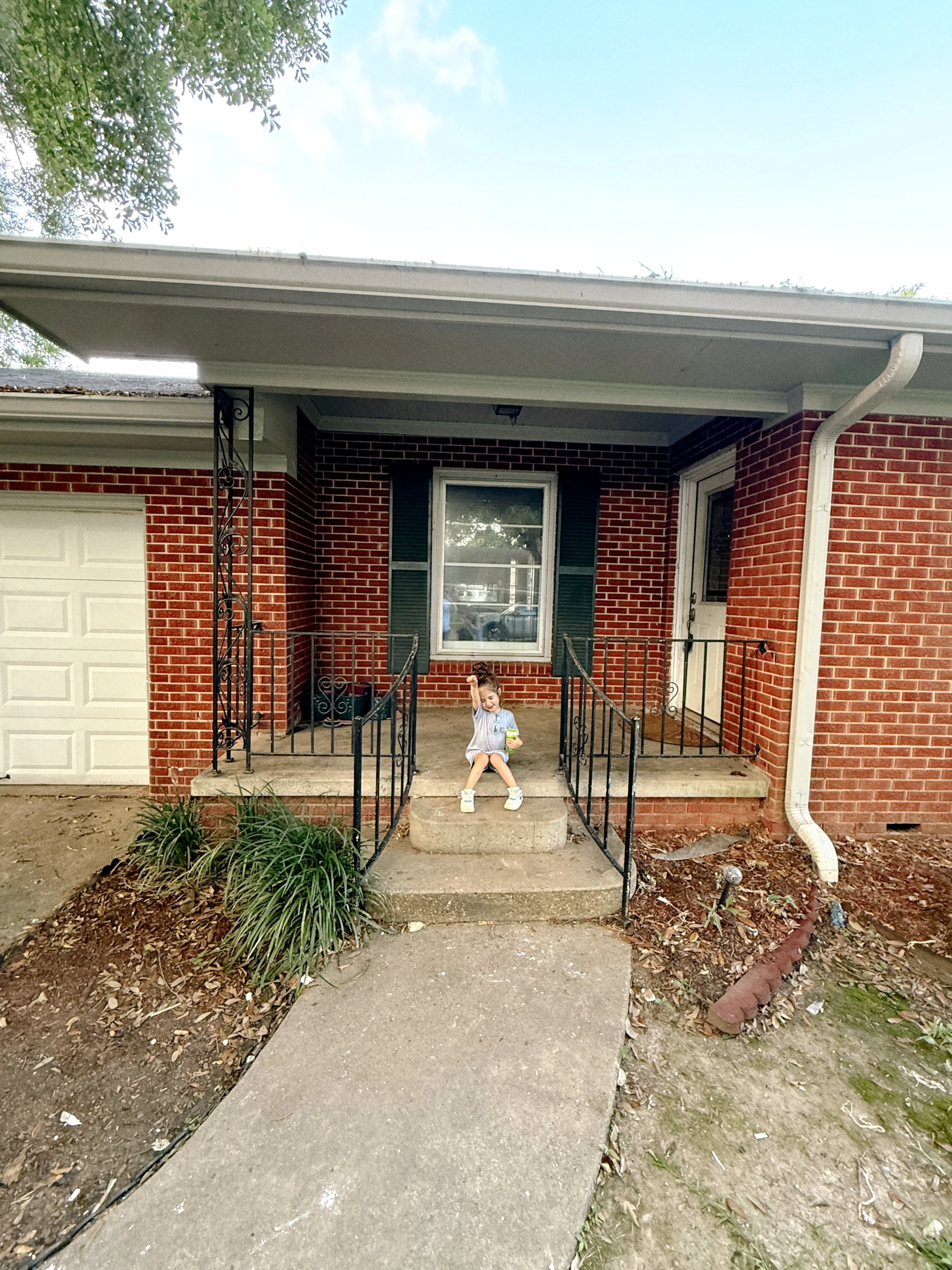
Future project manager vibes. Teche’s tiniest fan staking her claim on the porch before we even picked paint colors.
The Parts You Can't Undo—Now Done
We’re officially past “demo looks worse than it started,” and well into strategic chaos. The bones are stronger, the flow’s clearer—and we might have stumbled into literal bathroom daylight. Here’s your deep dive into the latest chapter at 105 Teche.
This phase is where most flips either start sinking or start making sense. For us? It’s the latter. We're laying the groundwork for something that looks effortless but is anything but. Every beam, every floorboard, every color swatch—it’s all part of the plan.
Built Different (Literally): The Foundation Overhaul
First thing we tackled? The literal foundation. We went full overhaul—ripped out every questionable board and rebuilt from the dirt up. It’s now level, sound, and ready for the next 50 years (or just a very chic resale). Not the sexiest part of a flip, but definitely the smartest. No more soft spots or “should this floor bounce?” moments.
A solid foundation doesn’t just mean safety. It means you can design without fear. Add tile without cracking. Move walls without guessing. Hang art where it should go, not just where studs happen to be. Trust—it’s worth it.
Yard Cleared. Vision Loading.
We finally said goodbye to the rogue tree stumps that were threatening to trip everyone who dared to enter. The yard has been fully cleared, leveled, and prepped for future landscaping—aka actual usability. It’s now giving “afternoon garden party” instead of “survival training course.”
Clearing the yard also made it easier to visualize the exterior’s future. Think garden beds, string lights, a gravel dining area, maybe even a vintage metal bistro set. We’re not overdoing it, but we’re definitely not letting this space be basic.

First draft of new floor plan for 105 Teche
Layout, Leveled Up: We Built a Real Third Bedroom (and a Non-Cursed Bath)
The old layout was doing the bare minimum. We’ve reframed the third bedroom and carved out a completely new space for the second bathroom—moving it from its former awkward situation inside the laundry room to a much more logical and functional location. Think thoughtful flow, modern layout, and way better vibes.
The third bedroom instantly ups the resale appeal, especially for second-home buyers or small families. It’s compact but intentional—no wasted square footage. The new bathroom location also brings symmetry to the home, making it more livable without tacking on unnecessary additions.

AI rendering of the space, not actual design plan.
Kitchen + Living Room Now Speaking Fluently
The major wall between the kitchen and living area? Gone. We installed a sleek support beam that holds everything up without cramping the open-concept style. The space now breathes. It’s brighter, more social, and finally feels like a space someone would actually want to live in.
Removing that wall changed everything. The natural light travels farther. The furniture layout options just multiplied. It no longer feels like three separate boxes—it feels like a home. The support beam gave us function and form, and it’s kind of the unsung hero of the flip so far.
Surprise! Natural light in the primary bath is now in the cards.
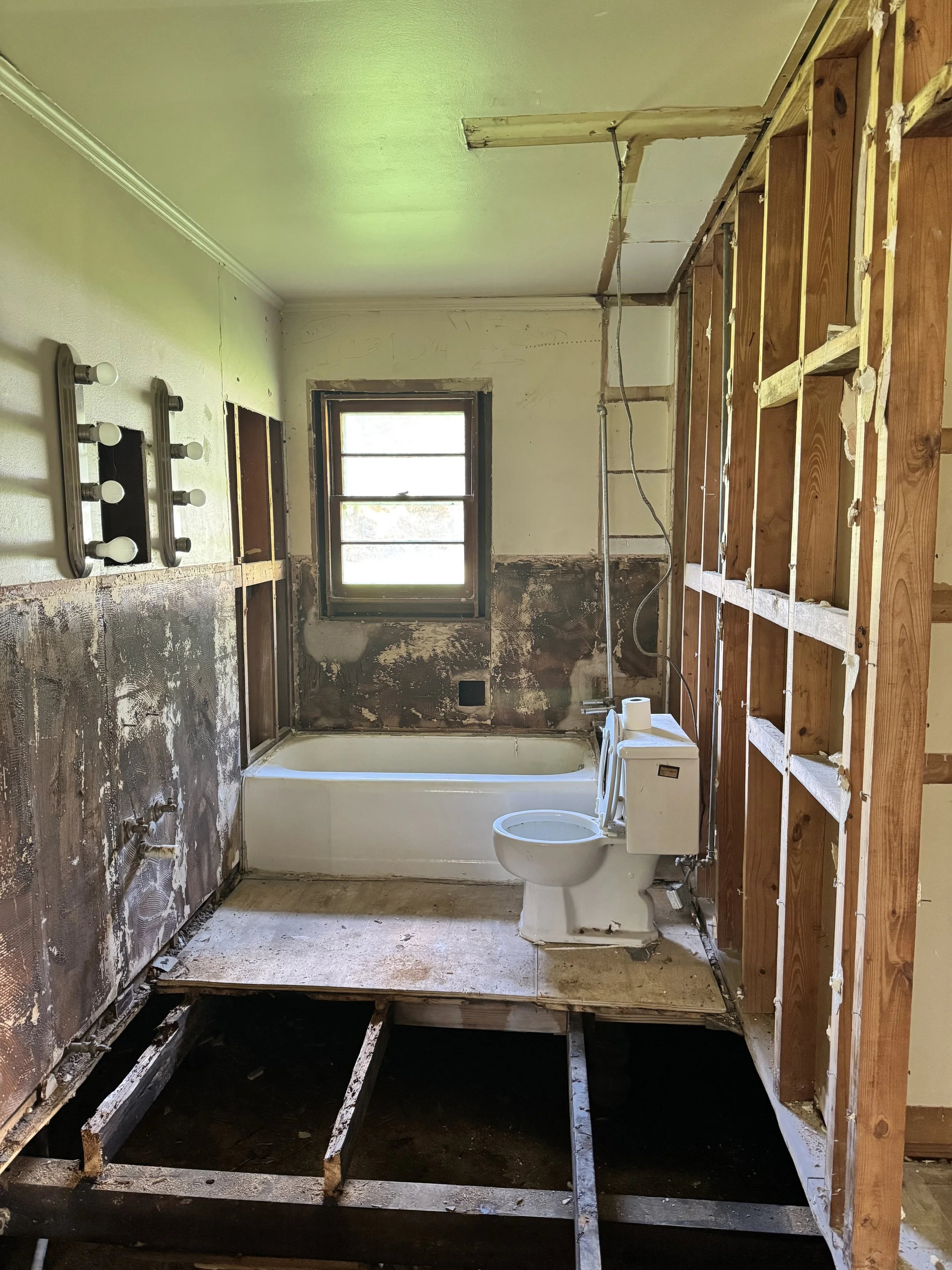
Demo Surprise: A Window We Didn’t Know We Needed
During bathroom demo, we uncovered what can only be described as a hidden gem: a completely covered-up window behind the old shower wall. It’s now a highlight in the future master bathroom plan—bringing in soft, natural light and instantly elevating the space. Sometimes demo gives back.
Finding that window shifted our entire bathroom design strategy. It gave us permission to lean into light tones and textures instead of compensating for a dark, moody space. Expect a spa-like layout with modern cottagecore undertones—brass fixtures, leafy textures, clean tile lines, and maybe a framed print that says something cheeky.
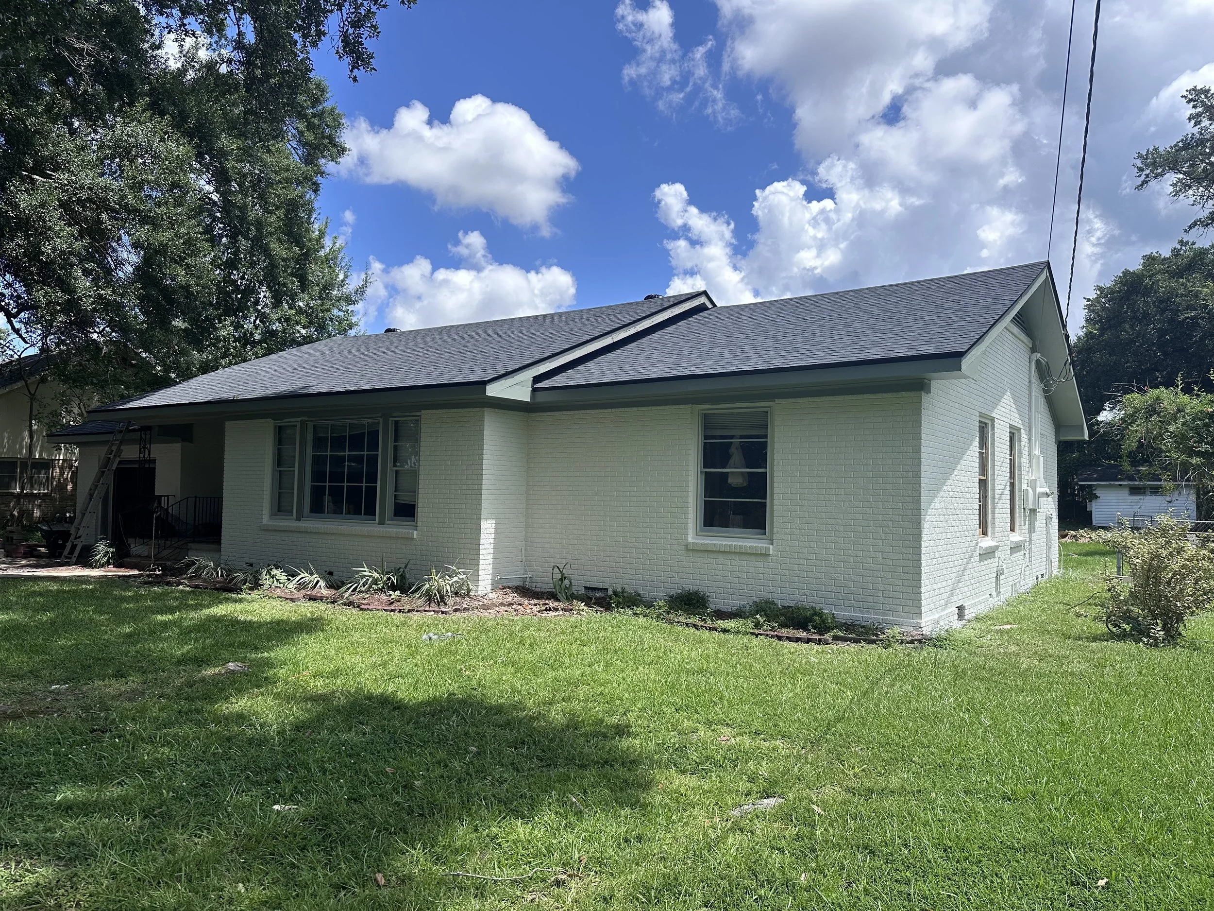
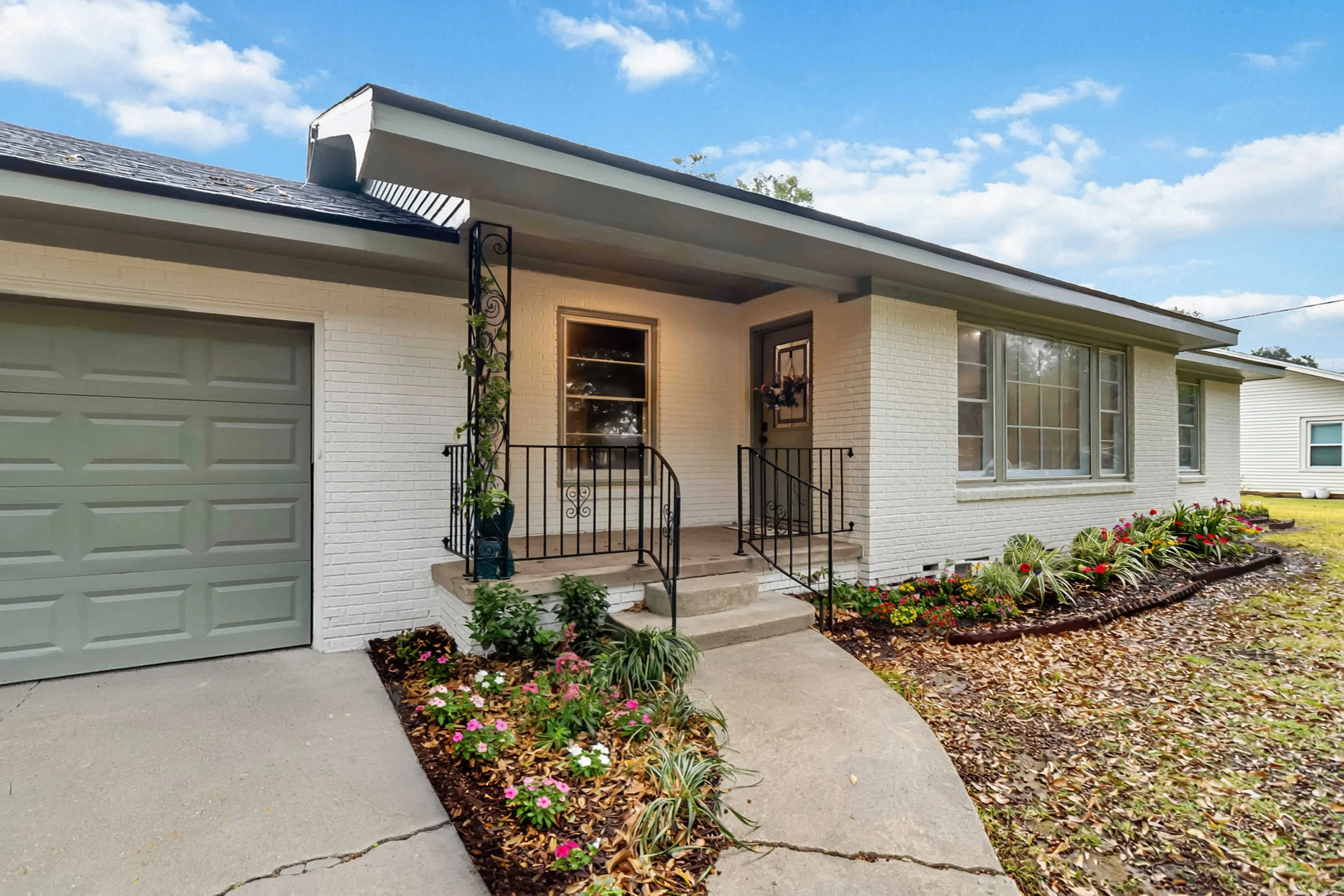
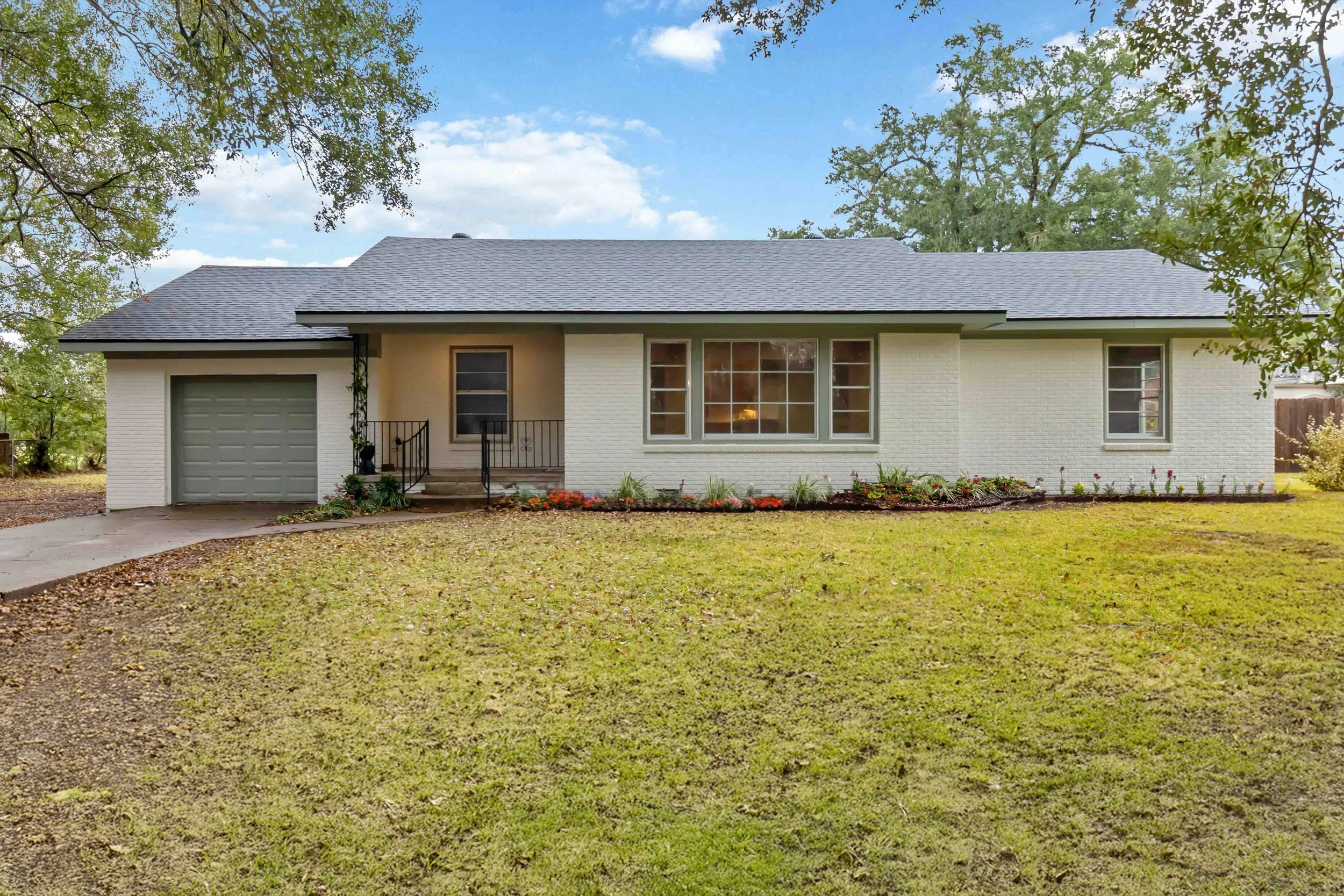
Fresh paint, a brand new roof, and major curb appeal—105 Teche’s glow-up is officially in motion. Greek Villa + Evergreen Fog never looked so good.
Teche Gets Dressed: Greek Villa Meets Evergreen Fog
We’ve officially chosen exterior paint colors and yes—they’re perfect:
Brick: Sherwin-Williams Greek Villa (SW 7551) – a warm, creamy white that reads timeless
Trim/Shutters/Ceiling: Sherwin-Williams Evergreen Fog (SW 9130) – a calming, muddy sage that feels earthy and modern all at once
It’s soft, inviting, and just the right amount of elevated. Very much “Lafayette traditional meets design-forward curb appeal.”
Painting the exterior is one of those moments where the house finally starts looking the way it feels. The palette is subtle but intentional—neutral enough to sell, distinct enough to stand out. Once it’s painted, it’s going to turn heads in the best way.
We’ve also installed a brand new roof. It’s not a flashy update, but a fresh roof equals clean lines, better insulation, zero leaks, and solid resale value. Sometimes boring is beautiful.
The current roof was holding—but barely. The new one ties the exterior together, quiets the house down, and just feels better. You don’t think about a roof when it’s done right. And that’s the goal.
A little photoshop imagination of the primary bath—mood, not blueprint. Expect warmth, curves, and cottagecore energy.
Plotting the Primary Suite: Smart Storage, Better Flow & No Weird Plumbing
With the bathroom now completely demoed, we’re officially in the planning phase for the new primary suite. The goal? A layout that actually works—zoned spaces, hidden storage, and brassy fixtures that feel vintage without the weird plumbing. We’re mapping everything out to maximize light (shoutout to the surprise window), optimize flow, and build in comfort without unnecessary square footage bloat.
We’re sketching out vanity placement, debating tile finishes, and figuring out if we can sneak in a linen closet without sacrificing breathing room. This is where the flip starts to feel personal—even if it’s for a future buyer.
The Flip’s Coming into Focus
This stage is less about Pinterest and more about priorities. It’s dusty, it’s structural, and it’s setting the stage for the finishes to shine. The big moves are done. The framework is in. Now we get to start layering in the charm.
Every choice now builds toward the reveal—the vibe, the livability, the resale moment. We’ve done the heavy lifting. Now it’s about doing the right pretty.
Q+A
-
We’re blending modern function with cottagecore charm—think natural textures, vintage-inspired finishes, brass details, and a floor plan that actually makes sense. It's Lafayette-traditional meets Pinterest-saved-with-intent.
-
We chose Sherwin-Williams Greek Villa (SW 7551) for the brick—creamy, timeless, and soft—and Evergreen Fog (SW 9130) for the trim, shutters, and porch ceiling. It’s organic, neutral, and very Lafayette-front-porch-chic.
-
We opened up the wall between the kitchen and living room, added a structural support beam, reframed the third bedroom, and relocated the second bathroom to a better spot within the main footprint. It flows now—without adding extra square footage.
-
While demoing the old master bathroom, we found a fully covered window behind the shower wall. It’s now a major design feature, bringing in natural light and completely changing the feel of the future primary suite. A literal bright spot.
-
We’re designing a functional, stylish suite with great flow, smart storage, and vintage-inspired finishes. Expect brassy fixtures, earthy textures, and a layout that feels custom without the custom-home price tag.
-
Every decision is a mix of what looks good and sells well in Lafayette. We’re preserving original charm (like wood cabinets), using timeless materials, and skipping low-ROI upgrades (like luxury appliances or major structural additions).
-
Because laundry room bathrooms are NOT it. The new layout puts the bathroom in a proper location, improves flow, and makes it actually usable for guests or future homeowners.
-
New roofs aren’t glamorous, but they’re essential. The updated roof will improve energy efficiency, resale appeal, and peace of mind—plus, it ties the entire exterior upgrade together.
-
Anyone who wants a space that feels intentional, looks good, and doesn’t require a full-on renovation just to function. It’s stylish, practical, and move-in ready—with enough charm to stand out and enough comfort to settle in. It’s ideal for anyone who appreciates good design without the pressure of doing it themselves. It’s cozy, practical, and pretty—in that order.

Design Detox: Flipping the Switch on Lifeless Interiors
Once the darling of HGTV, builder-grade flips, and Realtors alike, millennial gray has officially worn out its welcome—especially in Lafayette. Today’s buyers want warmth, texture, and interiors that actually feel like home. From barn doors to all-gray everything, we’re breaking up with bland and embracing rich woods, earthy tones, and natural light. Ready to un-blah your space? Let’s talk staging, shopping, and selling with soul.
Why “Millenial Gray” has GOT to go

Remember when everything was gray? Cabinets, walls, curtains—HGTV perfection. But here in Lafayette, what once felt modern now comes off as cold and cookie-cutter.

Why Gray Took Over
It was the perfect neutral: easy to match, appealing to a broad audience, and a safe bet for resale. In the 2010s, gray was basically the Swiss Army knife of paint colors.
The Gray Problem:
Mood-Vacuum: Gray absorbs heat and character—great in chilly rooms, not in humid Louisiana spaces.
Overdone: Walk through Acadiana’s newer developments, and you’ll spot gray fatigue.
Characterless: Gray walls mute the vibrancy Lafayette buyers crave.

Other Overplayed Trends
Remember when every Pinterest board and HGTV episode was drooling over barn doors? Rustic charm! Farmhouse fantasy! Joanna Gaines-core! In Lafayette, they popped up everywhere—from River Ranch to subdivision flips.
At first, they gave open-concept homes a little architectural drama. But now?
They Don’t Slide Smoothly. Ever tried quietly closing one during a Zoom call or after a baby’s bedtime? That screech could wake the whole neighborhood.
Privacy? What Privacy? Unlike traditional doors, barn doors don’t seal fully. Great for aesthetics—not so much for bathrooms, bedrooms, or home offices.
Dust Collectors. That gorgeous exposed track? It collects every bit of South Louisiana pollen and dust, and good luck cleaning behind it.
Awkward Space Planning. They often block walls that could’ve held shelving or art—design sacrifices that don’t make sense anymore.
More Trendy Features That Lost Their Spark
Shiplap Everything
What started as a sweet nod to coastal charm turned into overkill. Entire walls—and sometimes ceilings—plastered in shiplap now feel like you’re living inside a wood crate. Minimal is in, not millwork mania.Industrial Lighting Overload
Matte black cage pendants and Edison bulbs were cool… until everyone had them. Now they feel dim, overdone, and kind of impractical in kitchens where actual visibility matters.Sliding Barn-Style Pantries
Looks charming, sure—but if you actually cook, you’ve probably knocked over a spice rack or two trying to maneuver the door open with one hand and a hot pan in the other.

2025 Aesthetic: Warm, Textured, Soulful
Think caramel taupe, olive greens, terracotta, and navy accents—2025 design outlook champions warmth and texture steadily.com. Layered neutrals and wood tones are finding a place in listings across River Ranch, Greenbriar, and downtown.

How to Update Warmly
Choose an accent wall in mustard or olive while keeping other walls neutral.
Swap cool-toned hardware for brass or bronze.
Introduce woven rugs and wooden blinds to soften edges.
Bring in greenery—plants are mood-enhancing and make gray feel more alive.


323 Thibodeaux Drive Lafayette, LA 70503, presented by Paige Gary, District South x Real Broker, LLC.
Case Study: Lafayette Spotlight
Take 323 Thibodeaux Drive, presented by the always incredible Paige Gary of District South x Real Broker LLC—this stunner skipped the tired millennial gray entirely. Instead, it showcased rich stonework, warm wood tones, and thoughtful textures throughout. The result? It sold at list price—$1.35 million—on its very first day on the market. Proof that Lafayette buyers are ready for luxury that feels warm, intentional, and refreshingly un-basic.

Bored of beige and ghost gray? I’ve got the antidote.
Done with gray’s dull embrace? Message me—whether you're staging a sale or hunting for homes with more heart.

Living in a Time Capsule: What to Do When You’re Stuck with a Dated Rental Kitchen
Transform your dated rental kitchen with peel‑and‑stick backsplash, LED lighting, hardware swaps, and vintage flair—no landlord needed.

You walk in and—bam—you’re back in 1953. Pastel tile backsplash, clunky cabinets, appliances from another era. It’s vintage chic… until you try cooking anything beyond reheating pizza. But here’s the good news: you can completely transform your rental kitchen—no demolition, no permission, zero landlord drama.

Know Your Lease Boundaries
STOP! Put the power tools down. Most leases frown on permanent changes. Think drilling, painting, tearing things off walls. But smart décor? Totally fair game. You deserve a kitchen that feels you, not like a museum exhibit.

Rent‑Friendly Upgrades That Actually Work
Peel‑and‑Stick Backsplash
Vinyl and PVC options are cheap and easy; gel or faux stone look incredible—Bold advice: clean walls well, fill seams, use a hairdryer when removing, and pick neutral tones for versatility.
Contact‑Paper Counter Covers
Faux-marble or wood-grain films conceal laminate disasters and peel off cleanly at move-out. A personal favorite? Rub ‘n Buffed contact paper over a dishwasher to make it look like copper patina or brass. One TikTok tip: apply clear contact paper first to protect surfaces during removal .
Hardware Swaps
New drawer pulls and knobs are like jewelry for your kitchen—and removable. Choose warm metals like brass or copper for instant luxe appeal.
Plug-in Lighting
Under-cabinet LED strips or puck lighting brighten dark counters and create ambiance with zero rewiring.
Portable Storage: Carts & Open Shelves
Slim rolling carts tuck in gaps and add function. Floating shelves (command-strip mounted) offer style and utility. Small-space hero? Joseph Japanese-style cabinet organizer—doubles your storage, no drill needed.
Statement Rugs & Window Treatments
Kitchen runners hide scuffs and add personality. No-drill curtain rods soften the space and elevate window vibe.
Lean Into the Retro Charm—With a 2025 Twist
That pastel backsplash? Keep it—but layer on modern elements. Think mid-century mugs, enamelware, smart lighting, and open shelving. Embrace the nostalgia without sacrificing function.

When to DIY vs When to Embrace
DIY It: If the kitchen is functional but ugly—do tile, swap lighting, add decor.
Let It Be: If plumbing’s sketchy or cabinets sag—lean into the character and live with it (safely)
Can’t renovate? Doesn’t matter. You can reimagine. Share your kitchen pics—I'll help you make it look (and feel) like home.

The Open Floor Plan Debate: Love It, Leave It, or Learn to Live with It?
Open concepts look great in photos—but how do they actually live? Here’s how to know if they’ll work for your vibe, lifestyle, and noise tolerance.
Open floor plans—those dreamy layouts everyone chases in glossy listings—come with a warning label: not everybody wins. In Lafayette, we see the mix: group-chat brunches vs. remote-worker panic. When deciding between open air and cozy corridors, let me help you figure out if it’s love at first sight, or just subliminally imprinted in your mind.

Why Buyers Love Open Layouts
All the Light, All the Time
Sunlight moves freely from kitchen to living to dining—perfect for golden-hour coffee or brunching under Acadiana skies. No dark corners, no cave vibes.
Effortless Entertaining
Hosting feels way less chaotic when you’re not shouting through a wall. You can stir the gumbo, refill the wine, and still stay in the convo.
Small Footprint, Big Energy
Even a cozy Ranch or starter home feels major with fewer barriers. Open layouts stretch the vibe—and make every square foot feel intentional.

Why Others Aren’t So Open to the Idea
Echo Central – Noise travels far. Kids watch cartoons on the couch? You’ll hear it in the home office next door.
Clutter on Display – One messy pile in the living area ruins the whole space. Zero walls = zero escape.
Zero Privacy Zones – Zoom call? Forget it if the kids are home. Hosting a large dinner party? There’s something to be said for the art of conversational zones.

How to Zone Like a Design Genius
Layer Rugs & Furniture
Define zones using rugs. Position a sectional to create a nook without needing walls.
Strategic Bookcases & Shelves
Use double-sided shelves as dividers; they provide structure and storage without losing open-flow vibes. Feeling extra wild? Opt for a sleek mid century slat divider like the one pictured above.Space Planning With Color and Texture
Try painting an accent wall, partitioning out a reading nook with wallpaper, or hanging curtains a little higher on the wall.Area Lighting
Task lighting in one zone, ambient in another. Different light tells each area what role to play.

112 Avoyelles Drive, Lafayette, LA 70508
What Actually Works in Lafayette: Layouts Buyers Love
Lafayette buyers are not one-size-fits-all—and neither are the homes that work for them. But here’s what’s trending (and selling):
Open flow + purposeful definition
Homes that feel open but still have some smart breaks—think arched entryways, soft ceiling transitions, or built-in nooks—are total crowd-pleasers.High ceilings, lots of windows
These aren't just pretty—they make your home feel bigger and brighter, even when square footage is average. (Humidity tip: more airflow = happier living.)Pocket offices & flex zones
Buyers are loving hybrid layouts with that one little space for a desk, a yoga mat, or a post-Zoom-decompression moment. Open doesn’t have to mean everything exposed.Indoor-outdoor blends
Glass sliders to patios, covered outdoor kitchens, and breezy connections to backyards help Lafayette homeowners live large—without needing more interior walls or leaving doors open to the Louisiana heat, humidity, and gulp critters.

Touring Tip-Offs: How to Feel a Floor Plan, Fast
Forget blueprints. When you walk into a space, your body will tell you more than any listing ever could. Here's what to look for:
Where does your eye go?
If everything’s in view and it feels overwhelming, that might be a red flag. Great open plans guide your focus without visual chaos.Try your lifestyle on it
Mentally cook a meal. Have a phone call. Where do you toss your keys? Is the Grande Formal Dining Room a waste of space for your on-the-go lifestyle? Or have you been missing the dedicated space for family meals? If the layout feels exhausting to live in—even in your imagination—it’s not the one.Test the vibe, not just the square footage
It’s not about how big the room is—it’s how it functions. A 1,600 sq ft home can feel more luxurious than a 2,200 sq ft one if it flows right.Noise check = non-negotiable
Bring a friend. Turn on the faucet, the fan, the TV. Can you hear each other clearly from different corners? If not, you’ve got an echo problem.

The Open Floor Plan Litmus Test: What Works for You
Let’s be real: not every lifestyle thrives in an open layout. Some people want the light and freedom; others just want a door they can close and a wall that hides dishes. Here’s your cheat sheet:
Choose Open If:
You love to host, crave natural light, and want to keep the vibe flowing from kitchen to couch to cocktails. Open plans are perfect for big family brunches, casual game nights, or just not feeling boxed in.Choose Zones If:
You work from home, value acoustic privacy, or prefer your messes out of sight. A hybrid layout or strategic partitions (think slatted dividers or floating bookshelves) might be your best friend.The Truth?
Most people want something in between. Total openness can feel exposed. But closed-off rooms can feel claustrophobic. The sweet spot? Layouts that flow with your daily rhythm—not against it.Pro Tip:
You don’t need four walls to create structure. Good furniture placement, lighting, and subtle separations can make even the most open space feel like it was designed just for you.

Open doesn’t mean perfect—and I know the difference. Let’s find a home that flows with your life, not against it. I’ll guide you through the subtleties: sight lines, noise levels, and livability you won’t find in a Zillow scroll.
Bonus: I bring snacks and spatial awareness (and a laser measurer!)

Design Plans, Delusions, and My First Lafayette Flip
Just closed on my first Lafayette flip at 105 Teche Drive—and let’s just say, it’s about to go from “wait, what?” to wow. I’m keeping the good bones (hello, original cabinets) and reworking the rest with a vibe that’s somewhere between earthy cottagecore and cool, clean modern. If you’re into smart space planning, bold-but-budget-aware design, and behind-the-scenes renovation chaos—you’ll want to follow this one.

Big news from 105 Teche Drive!
Blaise Verret, a fellow Lafayette Realtor, and I have officially teamed up to embark on a house flip that’s part grit and part artistry, designed to marry modern living with timeless charm. This is the first of its kind for us, and as the project unfolds, we’re excited to share every intentional choice, creative curveball, and practical upgrade planned for the space. If you’ve been following along on my social media, you’ve already seen the video and those shining before shots—it’s real. Today, I’m sharing the grounded design plans, the fun delusions creeping in, and why every choice matters to Lafayette buyers like you.

The Real Talk: What I’m Actually Doing
Preserving Character and Timeless Details
When you walk into a home, it speaks to you. For 105 Teche Drive, it was whispering, "Keep me grounded, I’ve got a history you can’t manufacture." That’s exactly what we plan to do.

Original Wood Kitchen Cabinets
These solid, mid-century beauties just needed a little love. Modern kitchens are often dominated by cookie-cutter cabinet sets, but these wood cabinets bring warmth, individuality, and a nod to Lafayette’s personality. A fresh stain or a soft matte finish will give them a new lease on life while keeping their vintage appeal intact.

Ceiling + Wall Wood-Paneling
Far from the dark paneling of decades past, these walls are textured, elegant, and steeped in nostalgia. Paired with updated lighting and lighter accents, it promises to exude intentional design rather than basement rec-room vibes.
Preservation like this isn’t about budget shortcuts; it’s about celebrating the bones of the home.

Maximizing Space with Smarter Planning
With 1,650 sq. ft. to play with, the challenge was ensuring the existing layout worked for today’s lifestyle. This flip is a study in floorplan optimization. Every room serves its purpose, and every adjustment adds functionality without unnecessary square footage.
Reconfiguring the Primary Suite
We’re converting the current layout into a more substantial primary suite. Think walk-in closet and a bathroom designed to pamper. It’s a space that says, “Welcome home; you earned this.”
Relocating the Second Bathroom
Right now, the second bathroom awkwardly lives in the laundry room, and to call it a bathroom in its current condition is a stretch. The fix? Relocating it into the living area footprint. Every square inch will now add value for both daily living and resale.
By optimizing the use of space, we’re proving that it’s not about how much square footage you have, but how well you use it.

The Design Direction
Every decision bubbles up to a central design ethos. At 105 Teche Drive, we’re merging modern freshness with cottagecore home style, creating a finished product that is both aspirational and accessible.
Here’s how we’re doing it:
Color Palette: Warm whites and muted taupes provide a clean canvas, while sage greens and soft blues keep it serene. An occasional moody contrast (charcoal or navy) will add depth.
Brass Fixtures: Hardware and light fixtures channel vintage sophistication. Imagine the kind of brassy glow you’d find in an old Paris café, updated for today.
Timeless Elements: Tile shapes and patterns that never feel dated, combined with textures that invite you to touch every surface.

The Mulligan List
If the Budget Stretches, Here's the Wish List
Checkerboard Floors: What’s more Instagram-worthy than modern checkerboard floors in the kitchen and laundry? They’re timeless yet trendy, making both spaces feel vibrant and inviting.
Statement Granite Kitchen Island: The kitchen island will act as the star of the show. With a bold granite slab, it’s the place where morning coffee, weekend baking, and family dinners all come together.
Wallpaper Accents: Picture an ornate vintage-inspired print behind the bed in the primary suite or on a statement wall in the dining area. It’s the kind of detail that people won’t forget.
Timeless Tile Trends: We’re bringing in both function and flair with elegant, clean lines for the shower tile and backsplash. These are touches that age gracefully yet feel utterly fresh.
If we can pull these off within the budget, they’ll add serious personality while delivering a high return on investment.
None of these are dealbreakers, but if we land under budget or feel the ROI is there, these are ready to be greenlit.

The Nope File
What’s Not Worth It (for This Flip)
Every great flip requires hard decisions about what NOT to pursue. For this project, a few ideas are landing firmly in the "nope" category, and here’s why.
A 2-car garage expansion: While nice-to-have, expanding the garage ultimately isn’t worth it. Permitting is painful, the roofline shift is $$$, and costs would strain the budget without offering much in resale ROI.
Refinishing original wood floors: I wanted to love them, but they’re too far gone. The labor and cost outweigh the aesthetic reward. It’s better to replace them with new flooring that honors the home’s charm in a way that yields a higher quality result for the future buyers.
Viking appliances: Stunning? Yes. Necessary? Not even close. Most buyers want reliability and decent brand names, not ultra-luxury labels. Instead, we’ll focus on stylish yet accessible options that appeal to a wider pool of buyers.

105 Teche Drive, Lafayette, LA 70503
Why 105 Teche Drive Matters for Lafayette Buyers
What makes 105 Teche Drive special isn’t just in the details we’re putting into it; it’s in the people we’re designing for. From young professionals to first-time homeowners and seasoned buyers seeking a charming second home, this flip is built for those who want balance.
Dream Features + Practical Design: Thoughtfully planned upgrades ensure the home feels indulgent and functional all at once.
A Space for Everyone: Whether you’re relaxing in your upgraded primary suite or hosting a garden barbecue in the massive backyard, every space serves its best purpose.
This isn’t just another flip; it’s an opportunity to enhance how people in Lafayette live and connect with their space.

Have Your Say (And Follow Along!)
Here’s the rundown for 105 Teche Drive so far:
Preserving the authenticity and charm of its bones (hello, original wood cabinets)
Optimizing every square inch for smarter living (floorplan optimization is key)
Dreaming big with features like checkerboard floors and statement granite
Infusing the perfect balance of modern and cottagecore aesthetics
Have thoughts about our approach? Questions about the process? Or maybe you just want a sneak peek at the next step? Drop your comments below or sign up for our newsletter below. I’m sharing insider details, behind-the-scenes progress, and plenty of design debate moments throughout. Come along for the ride, and who knows? Your input might just inspire the final look.
FAQs
-
Our goal is to be market ready by fall. August 1 is the ideal completion date, but September 1 wouldn’t have us pulling our hair (or each other’s) out.
-
These cabinets are full of character and craftsmanship. Refurbishing them not only stays true to the home’s original character, but also frees up valuable materials dollars that are better utilized for the luxury finishes that you’re bound to fall in love with. :)
-
Cottagecore is about soft palettes, natural materials, and cozy, nostalgic vibes that make spaces feel warm and lived-in.
-
Absolutely. A smarter and more functional layout makes the home feel larger, more practical, and more desirable to future buyers.
-
Yes! Track progress on Instagram, Facebook, or subscribe to our Flip newsletter!

Lafayette’s Hottest Home Design Trends for 2025: What Buyers Are Loving
Lafayette’s home design scene in 2025 is all about elevated living—with a little Southern flair. Think statement kitchens with Viking ranges, smart storage that feels custom-built, and rich colors that break free from cookie-cutter white. Whether you’re staging to impress or upgrading your forever home, these Lafayette, LA design trends blend sophistication with personality in all the right ways.

112 Avoyelles Drive, Lafayette, LA 70508
Lafayette, Louisiana isn’t just a hub of culture and cuisine—it’s also a hotbed of stylish, functional home design. As we step into 2025, local buyers are more design-conscious than ever. Whether you're staging to sell or updating your forever home, understanding Lafayette's unique design trends will give you a competitive edge. Here’s what’s dominating the scene in Acadiana homes this year.
Warm, Earthy Color Palettes with Cajun Character

2025 is ushering in colors inspired by nature and the Louisiana landscape. Think mossy greens, rich terra cottas, cypress blues, and sandy neutrals. These colors create a calming environment and complement Lafayette’s natural light.
Hot Tip: Use matte finishes and two-tone color blocking to make a room pop without overwhelming it.
Open Concept Is Evolving—Think ‘Zoned’ Open Spaces

The open floor plan isn't gone, but it’s being reimagined. Buyers now prefer layouts that offer visual openness while defining individual spaces for work, play, and privacy. Sliding glass doors, built-in bookcases, or ceiling treatments create division without closing off the space.
Southern Modern: The Perfect Lafayette Style Fusion

Lafayette buyers are loving a modern twist on Southern architecture. This trend mixes clean lines and minimalist decor with rustic elements like reclaimed wood, wrought iron, and French doors. Black window frames and barn-style lighting are major favorites.
Why It Works: This aesthetic feels fresh yet timeless—ideal for Lafayette's blend of tradition and innovation.
Smart Kitchens with Intentional Design

Today’s Lafayette kitchens are embracing a modern, fresh design that blends luxury with practicality. Homeowners are gravitating toward clean lines, soft neutrals, and intentional storage solutions—like oversized walk-in pantries, built-in spice drawers, and concealed appliance garages. Statement pieces like a Viking stove or custom range hood are becoming the heart of the kitchen, marrying performance with high-end style. While the overall aesthetic is leaning contemporary, there's a noticeable shift away from the all-white look. Bold, colorful backsplashes and painted cabinetry—especially in muted blues, greens, and clay tones—are making a strong comeback, adding warmth and personality to these elevated spaces. Quartz countertops with gentle veining continue to outshine marble for their durability, low maintenance, and sophisticated appeal, but granite islands in statement blues and greens are beginning to make an appearance as well.
Outdoor Living That Extends the Home
Outdoor spaces in Lafayette are now extensions of the home, not afterthoughts. Covered patios with ceiling fans, outdoor kitchens, fire pits, and screened seating areas are becoming must-haves. Landscaping with native plants like Louisiana Iris and gulf muhly is on the rise.
Energy Efficiency Meets Aesthetics

Eco-friendly upgrades are trending across all price points. Homeowners are integrating smart thermostats, tankless water heaters, and solar panels with design-forward thinking. Expect sleek, modern solar shingles and energy-efficient windows that don’t compromise style.
Design Choices That Help Sell Faster

If you're preparing to list, subtle but strategic upgrades make a big difference. Fresh paint in trending colors, replacing outdated light fixtures, and staging with local artwork or Cajun touches can speed up offers and increase perceived value.
Top 3 Quick Wins:
Install statement lighting in dining areas
Upgrade cabinet handles and bathroom mirrors
Use light linen drapes to enhance natural light
Lafayette Style Is All About Balance

The Lafayette design scene in 2025 reflects what the region itself stands for—balance between old and new, tradition and innovation, utility and beauty. Whether you’re designing your dream home or preparing to sell, these trends ensure your space resonates with today's buyers.
Need advice on upgrading your Lafayette home for resale?
Contact me today for a complimentary design consultation that aligns with the local market trends!