
Teche’s Hot Girl Era: Paint Done, Floors Down, Fixtures Loading
We’ve officially entered the best phase of the Teche Flip—the glow-up. With moody cabinets, custom hardware, vintage tile, and the kind of kitchen island that demands a glass of wine, this house is finding its identity. Think warm tones, quiet luxury, and just the right amount of drama. Come behind the scenes as we break down the finishes, the flair, and the still-very-real countertop chaos.
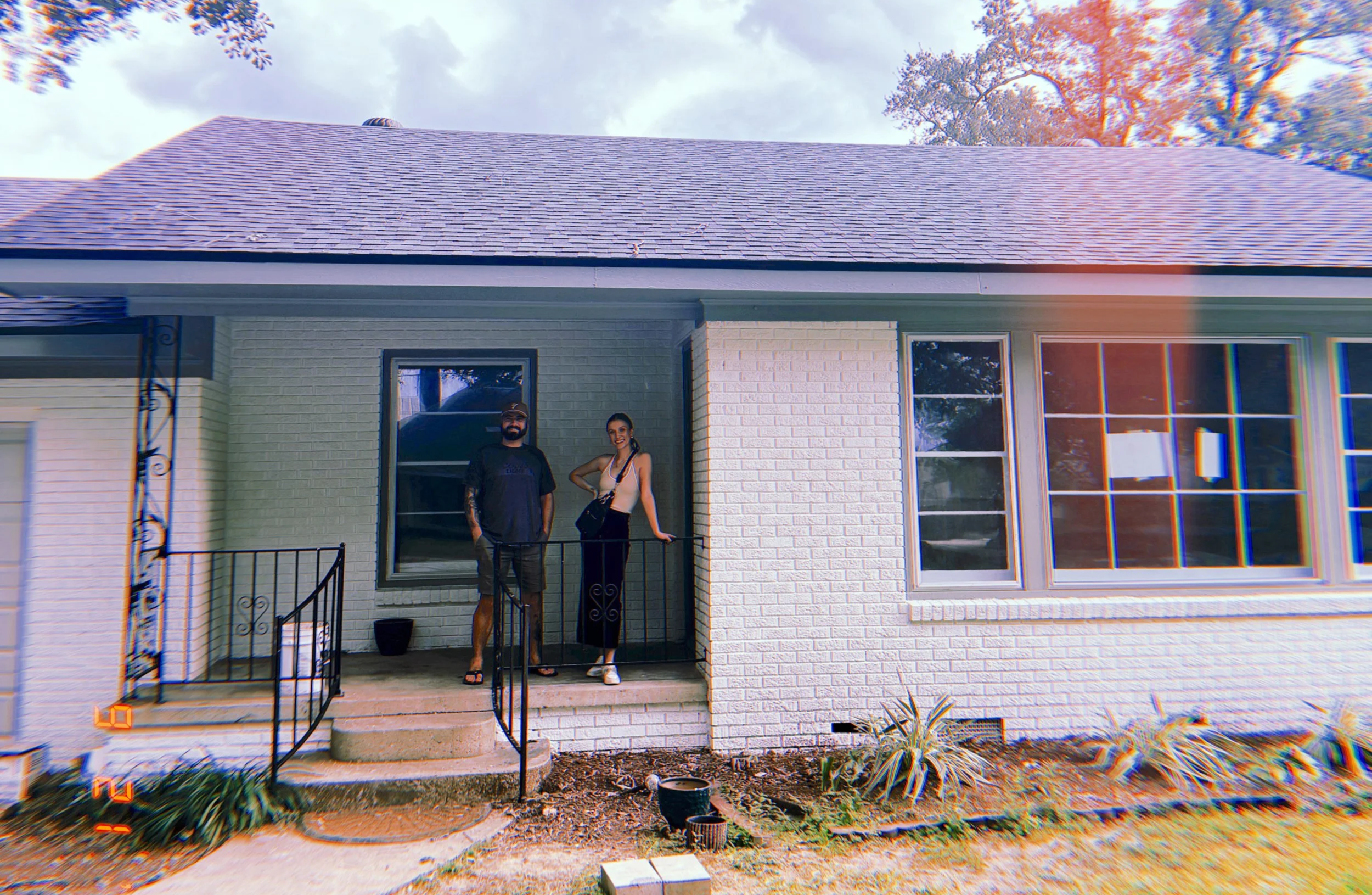
That “Wait… It’s a Real House Now?” Moment
You know that feeling when a renovation crosses the threshold from “project” to “place you actually want to hang out in”? We’re there. 105 Teche Drive isn’t just a construction zone anymore—it’s giving modern-luxe moodboard meets actual livable space. Paint? Done. Cabinets? Finished. Floors? Laid. Fixtures? In transit. And let’s not forget the moody-stained kitchen island that’s been stealing focus like it’s auditioning for an Architectural Digest cover.

The Wall & Cabinet Saga: A Color Commitment Crisis Worth Having
I lost sleep over these paint colors. We chose ten. I tortured Blaise. But every drop of drama was worth it. The walls aren’t just painted—they’re dressed. Wrapped in creamy warmth, soft neutrals, and just enough contrast to keep it interesting. The cabinets complement without competing. It's giving restraint with a wink. Even my sometimes-grumpy-always-practical flip partner had to admit “I had my doubts, but somehow all of this works even better than you promised it would.” (Thanks for admitting I was right, Blaise!)
Design tip? Sometimes indecision is just dedication in disguise. And yes, I’ll die on that hill.
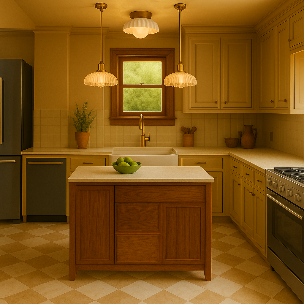
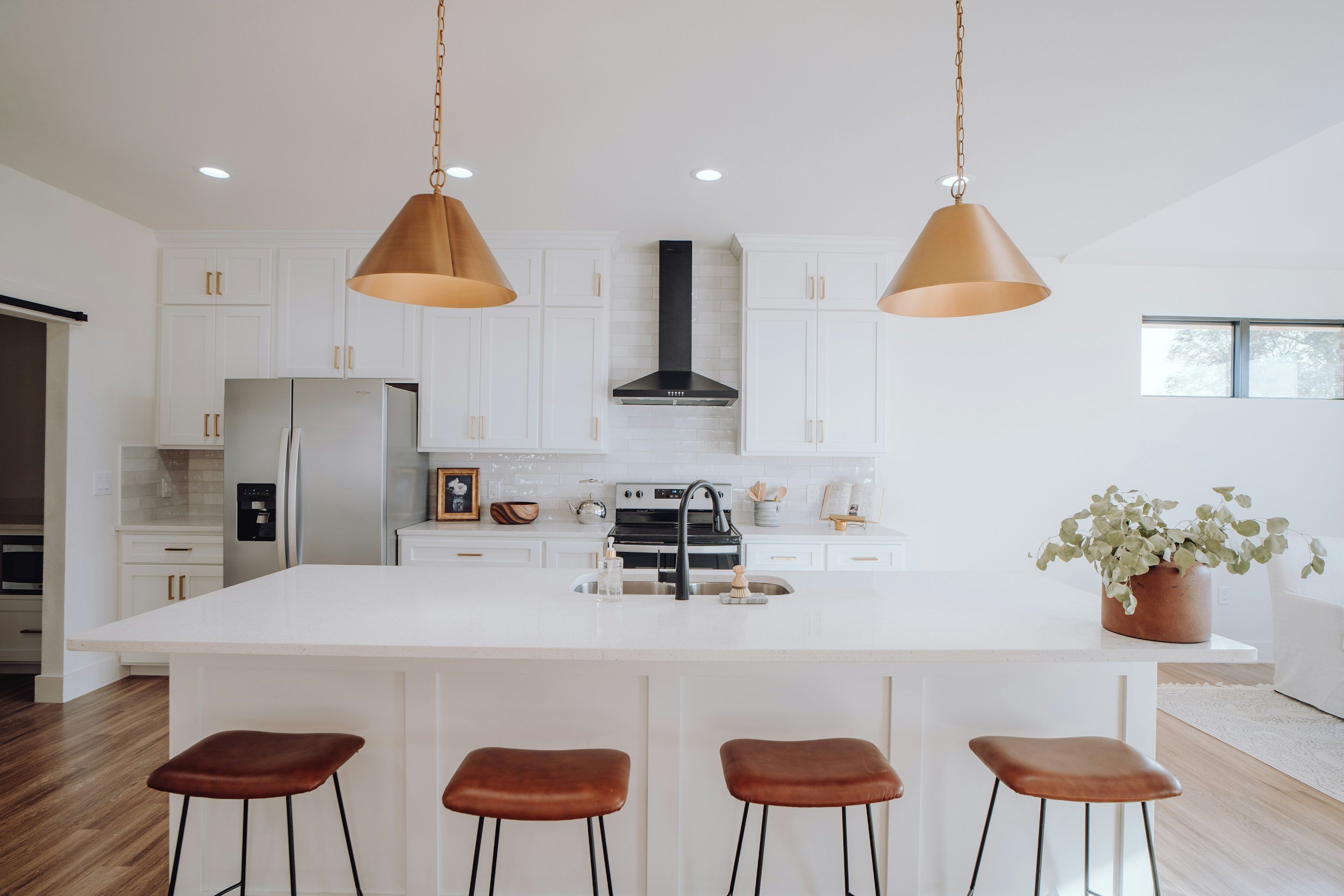
Let’s Talk About the Kitchen Island—Because It Deserves Its Own Section
This island isn’t just a surface; it’s a vibe. We went dark and moody, but kept the woodgrain visible—rich, grounded, a little mysterious. It says: “I host wine nights but also get sh*t done.” It anchors the space visually and emotionally. It’s not just the heart of the kitchen—it’s the soul of the flip.
I’ve already mentally styled it three ways. And yes, there will be a ceramic fruit bowl with one aggressively aesthetic pomegranate in at least one listing photo. Fight me.
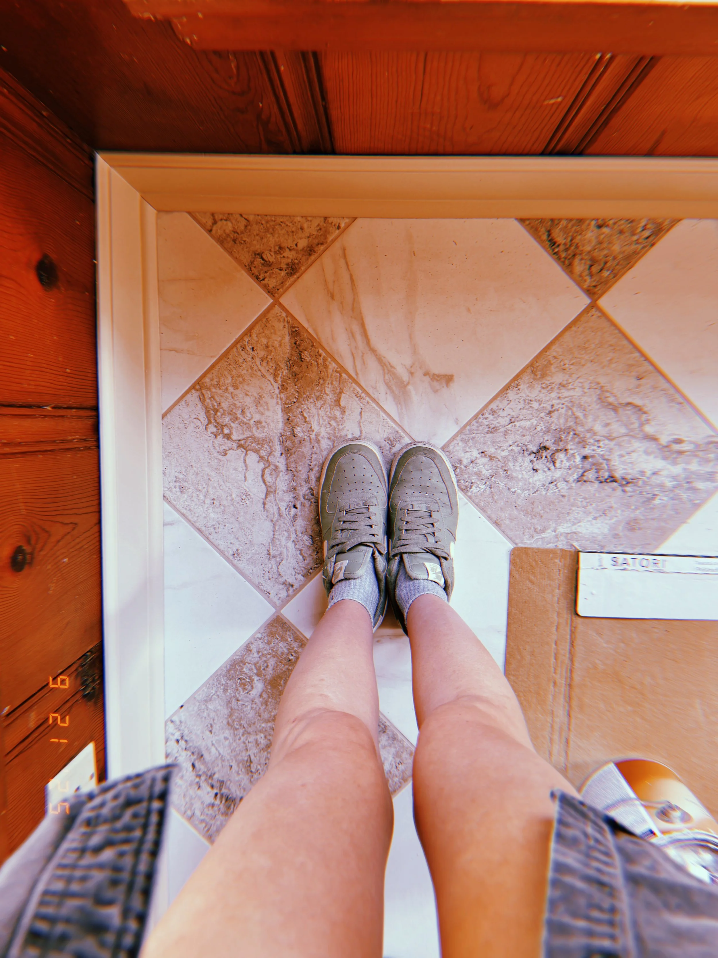
Floors: She’s Grounded Now
Subfloor echoes? Gone. Now it’s solid, checkerboard tile and warm wood tones underfoot. The kind of flooring that makes you want to ditch your shoes and slow-walk through the house with a glass of wine like you’re in a Nancy Meyers movie.
We went for wide plank, matte finish—chic but not trying too hard. The last few corners are getting touched up, but the foundation of the home’s vibe is down, literally and stylistically.
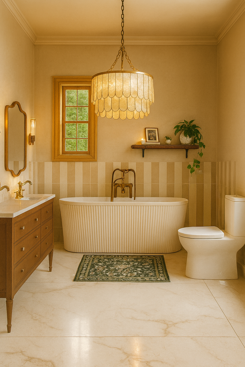
Fixtures, Vanities & That Tub Surround: All the YES Moments
Let’s get into the real stars of this phase:
Vanities: Not just storage—statements. Think antique wood, soft-close everything, and a finish that whispers "spa" but still holds your dry shampoo stash.
Tub Surround: Custom, clean, but full of personality. It’s got that “you could definitely take a dramatic Sunday soak here” energy.
Lighting: All ordered. All on theme. Brass. Globes. Sconces. Drama. I’m lighting this house like it’s about to walk a red carpet.
There’s nothing quite like watching your Pinterest boards materialize into actual shipments arriving on site. If serotonin came in box form, it would look like pendant lights.
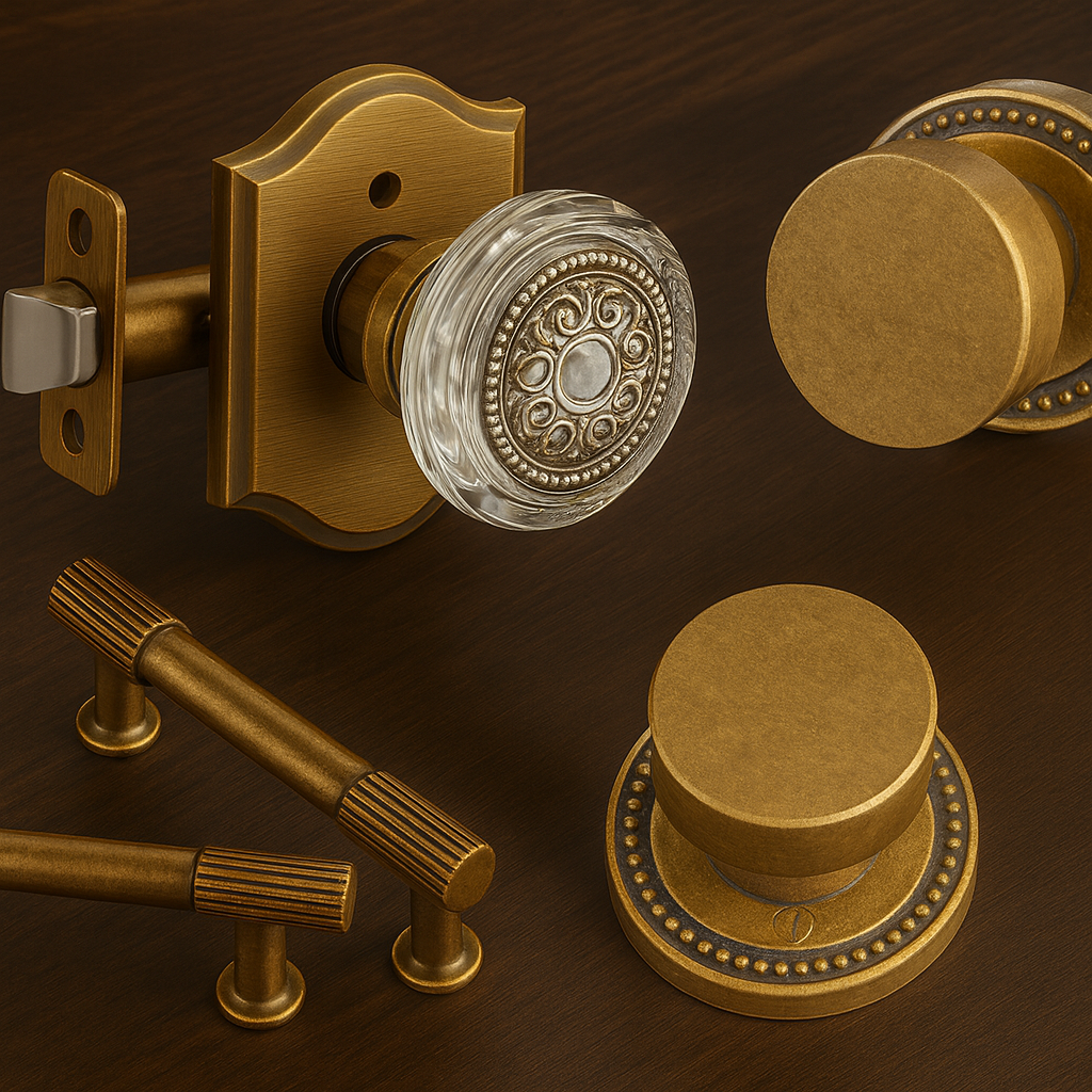
Touch Me Textures: The Hardware Edit
Let’s talk hardware—because she’s not just decorative, she’s the unsung hero of a well-dressed space. What may feel like trivial details to some are actually the most important part of bringing a space together— it’s ALL about the touch points. I went deep into the design rabbit hole and came out holding vintage-inspired brass beauties that are the literal definition of quiet luxury.
Antique Brass Cabinet Pulls
We’re talking warm aged brass with fluted grip detailing—bold without shouting, luxe without trying too hard. The texture gives just enough grip to feel intentional (read: not builder basic), and the profile hits that sweet spot between traditional and tailored. They’re the kind of pulls you notice after the fact—when you catch yourself running your hand over them because they just feel that good.
Fluted Bedroom Knobs
Don’t even get me started on these chunky circular knobs with beaded backplates. They’re giving vintage vault chic. A little industrial, a little Roman revival, and just enough edge to keep things modern without sacrificing the cottagecore aesthetic. I love how they ground the room—literally. There’s something quietly commanding about them. And yes, I did test them in every lighting condition like a psycho.
Glass + Brass Bathroom Doorknobs
As for the bathroom doors? We’re doing glass knobs set in aged brass rosettes with a slight Art Deco flair. It’s serving restored antique but make it curated. They sparkle in the best way—like a design Easter egg when the sun hits just right. You could be wearing a ratty robe and still feel like Old Hollywood just brushing past one of these.
These hardware choices don’t just finish the space—they elevate it. Like couture for your cabinets. Functional, yes. But mostly? Just straight-up FAB.
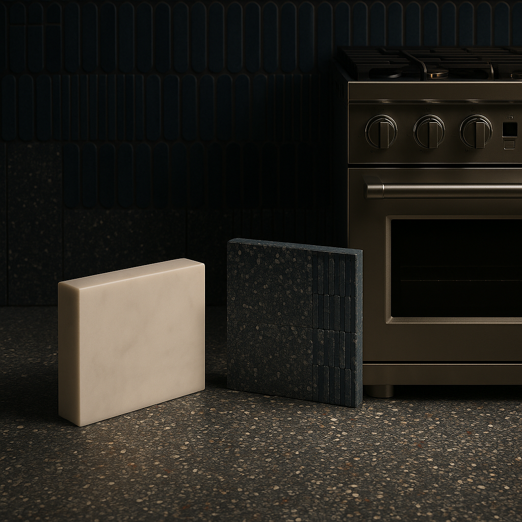
On Deck: Stone Slabs, Dreamy Tile, and Appliance Angst
Every good glow-up has a few cliffhangers. Here’s ours:
Countertops: I’m spiraling between quartz, soapstone, and one statement color that’s so unexpected I kind of love it.
Terrazzo Tile: The hall bath is getting it. Non-negotiable. It’s retro, modern, and quietly expensive-looking all at once. Literal design dream unlocked.
Appliances: Time to make decisions that are both aesthetic and functional. The big players. The stainless steel soldiers. The things that make a kitchen not just pretty, but powerful.
These aren’t just finishing touches—they’re identity-defining choices. The things that move the Teche Flip from "cute Instagram girl" to “she’s got a mortgage and a skincare fridge.”

The Vibe Check: Teche Flip, but Make It Personal
We’re living in the sweet spot of any renovation—the click moment. When everything begins to align. Walls have warmth. Floors feel finished. Light is coming. It’s not just a house anymore—it’s a whole mood.
Modern with a nostalgic wink. Elevated but not unapproachable. A little dramatic, a little romantic, and a whole lot of her.
And while countertops, terrazzo tile, and appliance decisions loom on the horizon, I’m allowing myself this moment of pause to say:
105 Teche is coming together—and she’s everything.
From Chaos to Cottagecore: Teche’s Design Risks, Budget Breakthroughs & Cozy Aesthetic
Flips can feel like spreadsheets in disguise, but at 105 Teche, every risk seems to turn into reward. This Lafayette flip house is shaping up into a modern cottagecore dream—checkerboard floors DIY’d on a budget, moody wallpaper murals in the laundry room, vintage-toned brass fixtures, and paint colors chosen like a playlist. The result? A renovation that feels intentional, warm, and anything but cookie-cutter.

Real Talk Before the Pretty Pictures
Flipping a house is basically like signing up for a group project where you’re the leader, the note-taker, and the one buying snacks—except the snacks are $7,200 worth of tile you absolutely cannot justify.
That’s been the journey at 105 Teche. We started with a house that felt more “structurally haunted” than “dream home”. But after months of foundation fixes, roof replacements, and late-night design debates, it’s turning into something that’s both functional and… dare I say, pretty charming.
If you’ve been following along, you know the vibe has shifted from “what did I get myself into?” to “wait, is this about to be my best flip yet?” Let’s break it down—design risks, budget wizardry, and a heavy dose of modern cottagecore.

Modern Cottagecore Without the Cliché
When you hear cottagecore, you might picture mushroom mugs and gingham everything. Cute, but not sustainable when you’re designing for real buyers (and not just Instagram). What I’m aiming for here is modern cottagecore—which means blending cozy nostalgia with clean, livable updates. This renovation is about enhancing and staying true to the spirit of the home while still giving it the thoughtful updates that still make it not just livable, but a dream living space.
Think:
Textures that feel layered, not chaotic. Plaster walls, warm wood tones, textiles that look collected over time.
Colors with personality. Nothing sterile, nothing too “builder beige.” Just rich hues that feel alive without screaming.
Patterns in moderation. Checkerboard floors, wallpaper in unexpected spots, terrazzo-inspired tile. Small doses that make you pause, not panic.
The point is to create a house that feels warm and welcoming—but still fresh, functional, and move-in ready. A space with soul, not a Pinterest board cosplay.
Budget Tricks That Saved This Flip
I’m all for bold design choices—my budget, not so much. That’s where a little creativity (and a good dose of stubbornness) really saved the day.
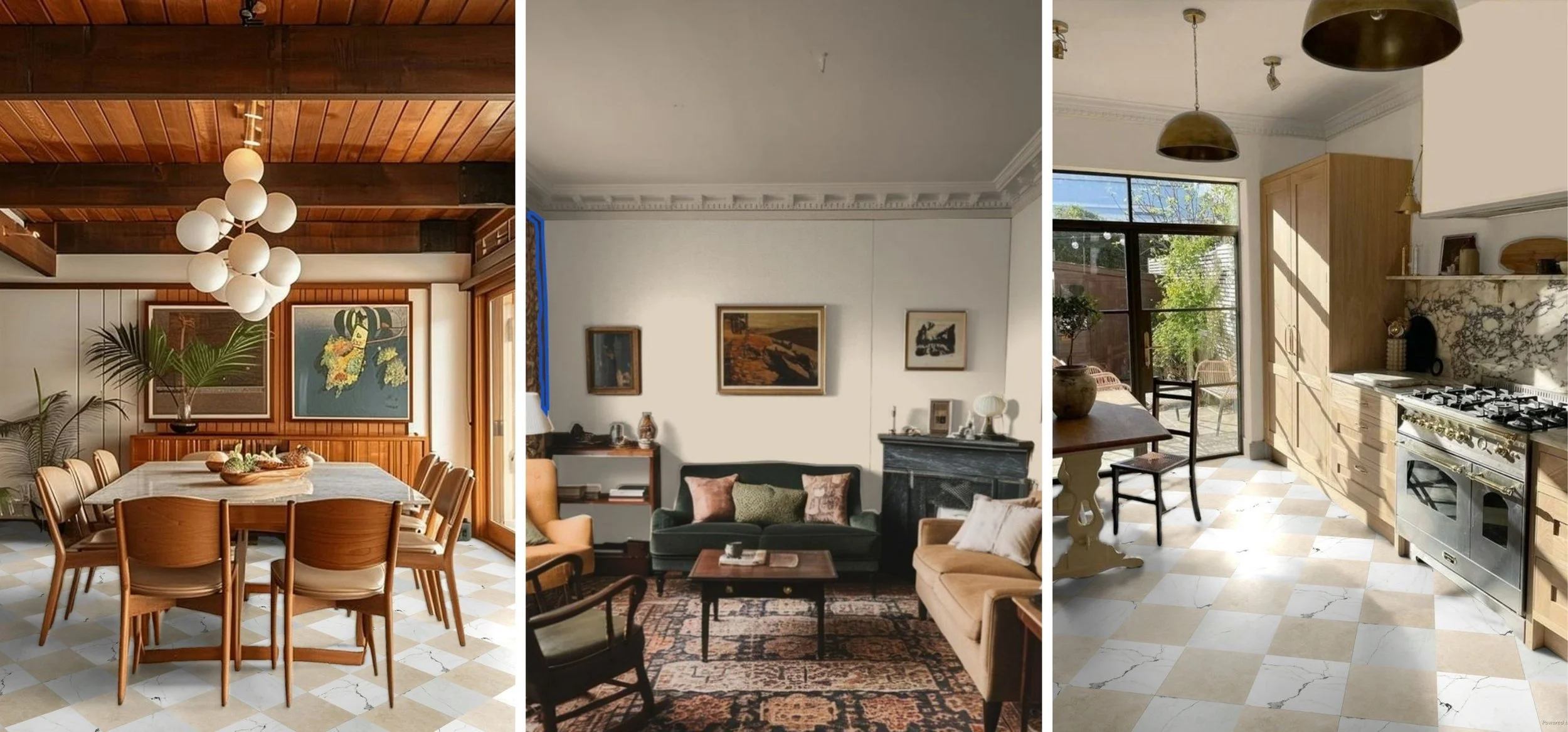
Checkerboard Tile: Dream vs. Reality
In my head: a dramatic, magazine-worthy checkerboard floor running through the kitchen, dining, and laundry.
In reality: $7,200 quotes that made me laugh-cry into my calculator.
Solution? DIY. We got in the car, drove the Great American Race: Lafayette Flip Edition, and finally sourced affordable tile at Lowe’s, laid the pattern ourselves to make sure the thickness/exact LxW measurements were compatible for our pattern, and cut the cost down to a whopping $650. It was a little chaotic, a little back-breaking, but totally worth it. I stood firm on my design non-negotiable that shaped the project from day one, and the budget stayed intact.
Strategic Material Swaps
Sometimes it’s less about compromising and more about pivoting. Instead of overspending on “must-have” finishes, I found affordable dupes: terrazzo-inspired porcelain instead of true terrazzo, plaster-textured paint instead of imported limewash. Luxury materials for accents/small spaces, and tried and true budget friendly tile for larger footprints (while still being on trend and vibe obvi). Each choice keeps the aesthetic intact without tanking the bottom line.
Bathrooms That Refused to Be Basic
Bathrooms are always where flips can tip into either “safe and boring” or “sterile modern style departure” territory. Not at Teche.
Primary Bath
This space got the quiet confidence treatment:
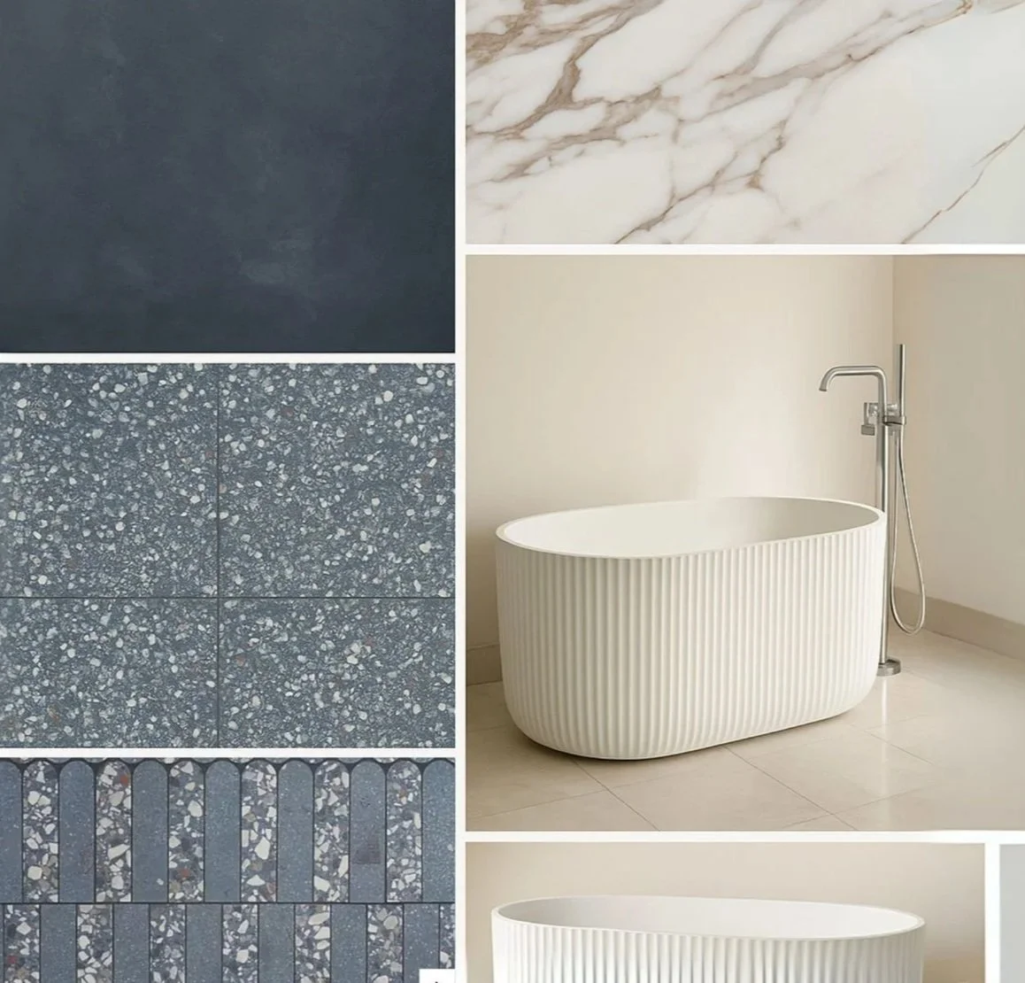
Calacatta Marble inspired floor tile for subtle pattern and texture.
Fluted standalone soaking tub for the vibiest escape of all time.
A layout that feels functional and calm, not fussy.
It’s earthy and understated—but in a way that feels intentional.
Secondary Bath — The Dark Horse
This is the one that surprised me. It’s small, sure, but that just gave me permission to go bold:
Ocean-blue terrazzo floor tile (TileBar’s “Kobe Flakes Ocean Blue”)—playful and moody all at once.
Matte microcement navy shower walls—they absorb light, creating a cocoon-like vibe that makes the tub pop, while still introducing a more natural texture that ties the room into the design flow of the rest of the house.
Shower niche with arched alternating luxury tiles—the kind of unexpected detail that elevates the whole room.
When I shared the mockup with friends, the group chat exploded with heart eyes and “okay but what tile is that??” That’s when you know you’re onto something.

Tiny Details, Big Payoff
Cottagecore doesn’t really live in the oversized gestures—it’s in the details you almost miss at first glance, but can’t stop noticing later.
Like the wallpaper mural in the laundry room, turning what’s usually a “close the door and forget it” space into a spot that actually feels intentional (yes, even folding socks deserves a view). Or the addition of dentil trim accents, those subtle architectural touches that give otherwise plain edges a sense of craftsmanship.
Then there’s the vintage-toned brass plumbing fixtures—warm, lived-in, and just enough patina to avoid the too-shiny “new build” look. Pair that with paint colors chosen like a playlist—every shade in conversation with the next, cohesive without being predictable.
And of course, the lighting. Nothing random, nothing filler. Each fixture placed to shape the mood, not just illuminate it. The result? A house that doesn’t feel “flipped,” it feels considered. Designed. Like someone cared about the small stuff.

Conclusion — Still in Motion
Teche isn’t done yet, but the progress feels exciting. Risks are paying off, the budget hasn’t collapsed, and the house is finally shedding its “before” energy.
We’re heading toward the fun part—staging, finishing touches, and eventually listing—but for now, I’m just enjoying this in-between moment where vision and reality are finally syncing.
And yes, I’m still open to mirror and sconce suggestions. Or laundry wallpaper votes. Or any unsolicited design hot takes. You know where to find me.

Quick FAQs (Because People Always Ask)
-
A: Balance. Too much floral wallpaper and it screams costume, too many niche/trendy light fixtures and it feels cheap. But pair vintage-inspired touches (like brass fixtures and botanical artwork) with modern functionality (like updated layouts and smart lighting), and you get cozy luxury without kitsch.
-
A: Absolutely, when done right. Buyers love character, and the cottagecore aesthetic layers warmth into a renovation. The trick is being intentional: wallpaper in a laundry room instead of every wall, brass plumbing fixtures instead of builder-basic chrome. Those details sell (and I have the eager potential buyer DMs to prove it).
-
A: Paint. Always paint. At Teche, carefully chosen palettes gave each room personality without adding unnecessary budget spend. Lighting comes in second—swap one boring overhead for a statement fixture, and suddenly the whole vibe changes. These are also the most DIY friendly upgrades, and labor costs are always the first to get out of hand in a home renovation. Say it with me: Sweat Equity.
-
A: Like curating a playlist—you want every track to feel different, but still cohesive. Each color was chosen in conversation with the next. Neutrals with depth, moody accents for contrast, and no sterile whites in sight. Unlike most flips that have 2 colors: trim and wall, we really went for maximalism here in color and sheen variation.
-
A: Loaded question, but at the risk of oversimplifying I can attest to this: Buyers are leaning toward cozy, character-driven spaces. Think: textured walls, mixed metals, vintage-inspired furniture, and warm neutrals. The farmhouse-gray trend is fading, and personality is back in.
-
A: Because they make buyers stop and feel something. Anyone can recognize a mass-market flip. But a dentil trim detail or tiled shower niche tells people the house was designed, not just renovated. That’s the emotional hook. This also isn’t your typical “quick flip turned investment property,” at our price point and level of detail, this isn’t so much a “flip” as it is an upscale restoration destined to be a lucky buyer’s forever (or for a long time) home.
-
A: Spend where it matters—tile, fixtures, lighting—and save where you can DIY. At Teche, the checkerboard floor went from an almost 7 figure estimate to a little over $500 total with a scrappy Lowe’s hack. Buyers notice the design, not the receipt.

The Open Floor Plan Debate: Love It, Leave It, or Learn to Live with It?
Open concepts look great in photos—but how do they actually live? Here’s how to know if they’ll work for your vibe, lifestyle, and noise tolerance.
Open floor plans—those dreamy layouts everyone chases in glossy listings—come with a warning label: not everybody wins. In Lafayette, we see the mix: group-chat brunches vs. remote-worker panic. When deciding between open air and cozy corridors, let me help you figure out if it’s love at first sight, or just subliminally imprinted in your mind.

Why Buyers Love Open Layouts
All the Light, All the Time
Sunlight moves freely from kitchen to living to dining—perfect for golden-hour coffee or brunching under Acadiana skies. No dark corners, no cave vibes.
Effortless Entertaining
Hosting feels way less chaotic when you’re not shouting through a wall. You can stir the gumbo, refill the wine, and still stay in the convo.
Small Footprint, Big Energy
Even a cozy Ranch or starter home feels major with fewer barriers. Open layouts stretch the vibe—and make every square foot feel intentional.

Why Others Aren’t So Open to the Idea
Echo Central – Noise travels far. Kids watch cartoons on the couch? You’ll hear it in the home office next door.
Clutter on Display – One messy pile in the living area ruins the whole space. Zero walls = zero escape.
Zero Privacy Zones – Zoom call? Forget it if the kids are home. Hosting a large dinner party? There’s something to be said for the art of conversational zones.

How to Zone Like a Design Genius
Layer Rugs & Furniture
Define zones using rugs. Position a sectional to create a nook without needing walls.
Strategic Bookcases & Shelves
Use double-sided shelves as dividers; they provide structure and storage without losing open-flow vibes. Feeling extra wild? Opt for a sleek mid century slat divider like the one pictured above.Space Planning With Color and Texture
Try painting an accent wall, partitioning out a reading nook with wallpaper, or hanging curtains a little higher on the wall.Area Lighting
Task lighting in one zone, ambient in another. Different light tells each area what role to play.

112 Avoyelles Drive, Lafayette, LA 70508
What Actually Works in Lafayette: Layouts Buyers Love
Lafayette buyers are not one-size-fits-all—and neither are the homes that work for them. But here’s what’s trending (and selling):
Open flow + purposeful definition
Homes that feel open but still have some smart breaks—think arched entryways, soft ceiling transitions, or built-in nooks—are total crowd-pleasers.High ceilings, lots of windows
These aren't just pretty—they make your home feel bigger and brighter, even when square footage is average. (Humidity tip: more airflow = happier living.)Pocket offices & flex zones
Buyers are loving hybrid layouts with that one little space for a desk, a yoga mat, or a post-Zoom-decompression moment. Open doesn’t have to mean everything exposed.Indoor-outdoor blends
Glass sliders to patios, covered outdoor kitchens, and breezy connections to backyards help Lafayette homeowners live large—without needing more interior walls or leaving doors open to the Louisiana heat, humidity, and gulp critters.

Touring Tip-Offs: How to Feel a Floor Plan, Fast
Forget blueprints. When you walk into a space, your body will tell you more than any listing ever could. Here's what to look for:
Where does your eye go?
If everything’s in view and it feels overwhelming, that might be a red flag. Great open plans guide your focus without visual chaos.Try your lifestyle on it
Mentally cook a meal. Have a phone call. Where do you toss your keys? Is the Grande Formal Dining Room a waste of space for your on-the-go lifestyle? Or have you been missing the dedicated space for family meals? If the layout feels exhausting to live in—even in your imagination—it’s not the one.Test the vibe, not just the square footage
It’s not about how big the room is—it’s how it functions. A 1,600 sq ft home can feel more luxurious than a 2,200 sq ft one if it flows right.Noise check = non-negotiable
Bring a friend. Turn on the faucet, the fan, the TV. Can you hear each other clearly from different corners? If not, you’ve got an echo problem.

The Open Floor Plan Litmus Test: What Works for You
Let’s be real: not every lifestyle thrives in an open layout. Some people want the light and freedom; others just want a door they can close and a wall that hides dishes. Here’s your cheat sheet:
Choose Open If:
You love to host, crave natural light, and want to keep the vibe flowing from kitchen to couch to cocktails. Open plans are perfect for big family brunches, casual game nights, or just not feeling boxed in.Choose Zones If:
You work from home, value acoustic privacy, or prefer your messes out of sight. A hybrid layout or strategic partitions (think slatted dividers or floating bookshelves) might be your best friend.The Truth?
Most people want something in between. Total openness can feel exposed. But closed-off rooms can feel claustrophobic. The sweet spot? Layouts that flow with your daily rhythm—not against it.Pro Tip:
You don’t need four walls to create structure. Good furniture placement, lighting, and subtle separations can make even the most open space feel like it was designed just for you.

Open doesn’t mean perfect—and I know the difference. Let’s find a home that flows with your life, not against it. I’ll guide you through the subtleties: sight lines, noise levels, and livability you won’t find in a Zillow scroll.
Bonus: I bring snacks and spatial awareness (and a laser measurer!)